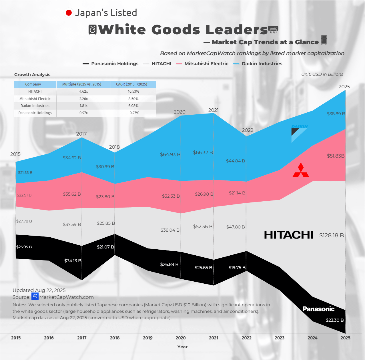
![[OC]Japan’s Listed White Goods Leaders — Market Cap Trends at a Glance](https://www.europesays.com/wp-content/uploads/2025/08/srj6hq8q14lf1-1277x1024.png)
Data Sources: Market Capitalization: Sourced from MarketCapWatch.
We selected only publicly listed Japanese companies (Market Cap>USD $10 Billion) with significant operations in the white goods sector (large household appliances such as refrigerators, washing machines, and air conditioners). Market cap data as of Aug 22, 2025 (converted to USD where appropriate).
FAQ — Understanding This Chart
Q1: Why isn’t Sony included? Sony’s core business is in consumer electronics, gaming, entertainment, and financial services. It does not operate at scale in the white goods category (large household appliances like fridges, washing machines, ovens, and air conditioners), so it falls outside the scope of this chart.
Q2: Why isn’t Toshiba included? Toshiba was delisted from the Tokyo Stock Exchange in December 2023 after a buyout and is now privately held. Because our dataset only covers publicly listed companies, Toshiba is excluded.
Q3: What exactly counts as “white goods” in this analysis? We define white goods as large household appliances for cooling, cleaning, and cooking — e.g., refrigerators, washing machines, ovens, dishwashers, and air conditioners. Companies must have significant sales in these product categories to qualify.
Q4: Why are companies mainly HVAC specialists (e.g., Daikin) included? HVAC products — particularly large air conditioning systems — fall under the “white goods” umbrella in many industry classifications. Companies with significant domestic appliance presence in HVAC are included if they are publicly listed in Japan.
Q5: Why does the market cap vary so much between companies? Some giants (like Hitachi or Mitsubishi Electric) are diversified conglomerates with revenue streams far beyond appliances.
Posted by Proud-Discipline9902
3 comments
I’m not sure why you chose to use a middle-aligned area graph rather than just a normal area graph. I’m also unsure why you’ve chosen to only label/highlight certain years without any annotation as to why those years are important (if they even are). Is it for market expansion/plateau/retraction points?
There doesn’t appear to be any good reason for the middle alignment of the graph, which (at first glance) just gives an initial impression that Panasonic has plummeted calamitously, while in fact it has stayed pretty stable.
Edited to add: Also (please correct me if I am wrong), the graph shows total market capitalisation for companies, such as Hitachi, with significant interests outside white goods, so the graph doesn’t actually tell us anything about who are the leaders in the actual sale of white goods, or (for example) how much of Hitachi‘s massive growth since 2022 was related to white goods (where white goods are ostensibly what the graph is supposed to be about).
Thats a lot of magic wands
Comments are closed.