
Hey everyone,
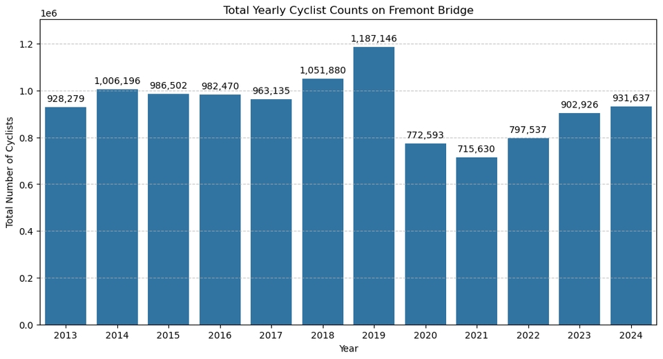
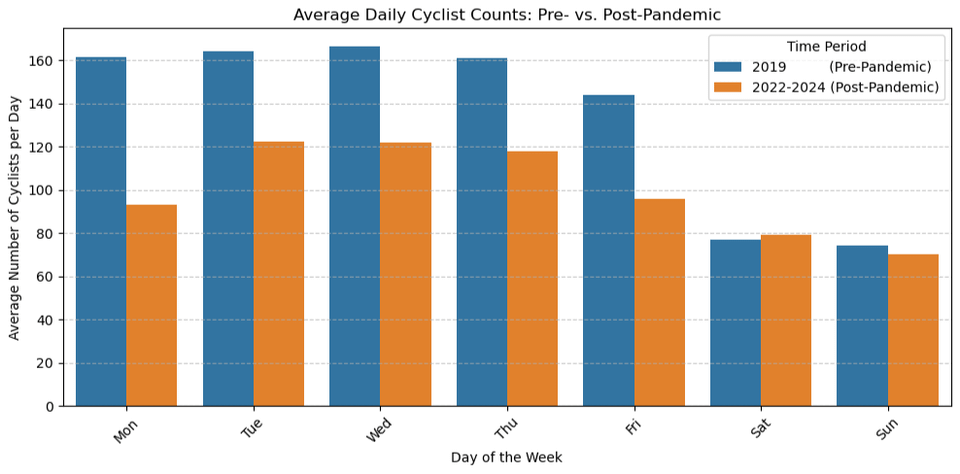
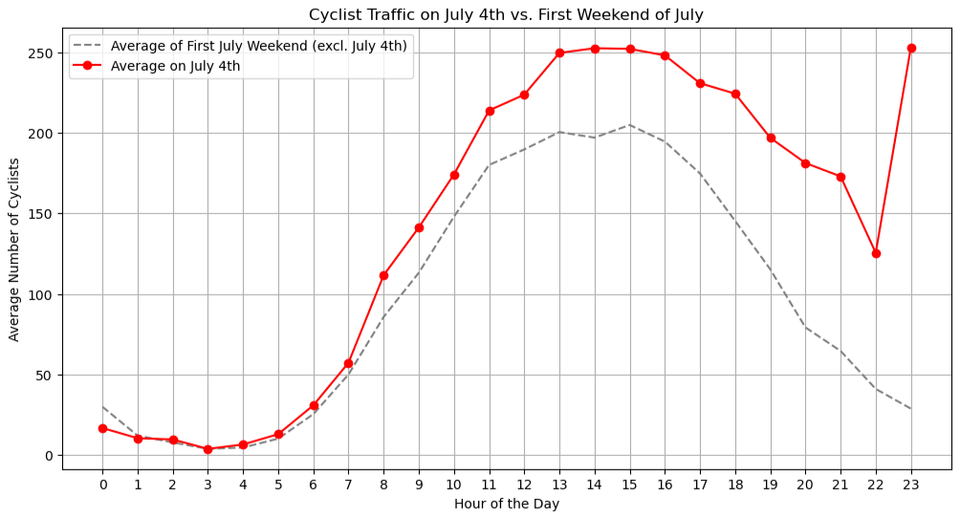
I was curious about the cycling patterns in my city, so I downloaded and analyzed the data from the Fremont Bridge bike counter from 2012 through July 2025.
In this gallery, I've put together a few visualizations that tell a story about how Seattle rides:
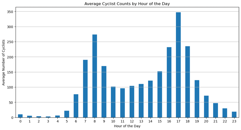
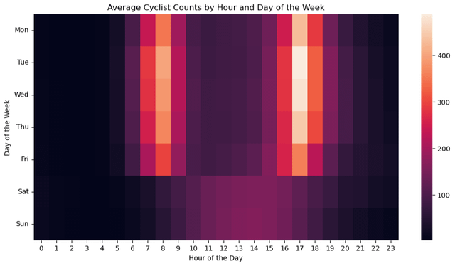
- The distinct hourly patterns of a weekday commute versus a leisurely weekend.
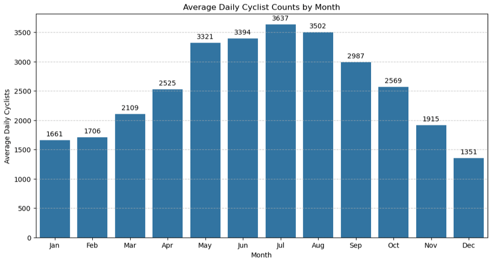
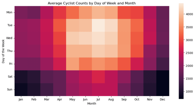
- The strong seasonal ebb and flow of cyclists throughout the year.
- A look at how recent commute patterns compare to the pre-pandemic baseline.
- Finally, a fun dive into a couple of holidays to see if we can spot cyclists heading to New Year's and July 4th fireworks!
Hope you find it interesting!
Posted by dustyave
2 comments
Hi everyone, OP here! I’ve been an avid cyclist since age four and have recently stumbled upon open access bike counter data, so I decided to visualize it. I used Python (Pandas, Matplotlib, Seaborn) to clean the data and create the charts. Data source: [https://www.seattle.gov/transportation/projects-and-programs/programs/bike-program/bike-counters/fremont-bike-counters](https://www.seattle.gov/transportation/projects-and-programs/programs/bike-program/bike-counters/fremont-bike-counters)
Happy to answer any questions you have about the process or findings!
This is great work! Love being able to see the mix of commuters/recreational/revelers. Very nice!
Comments are closed.