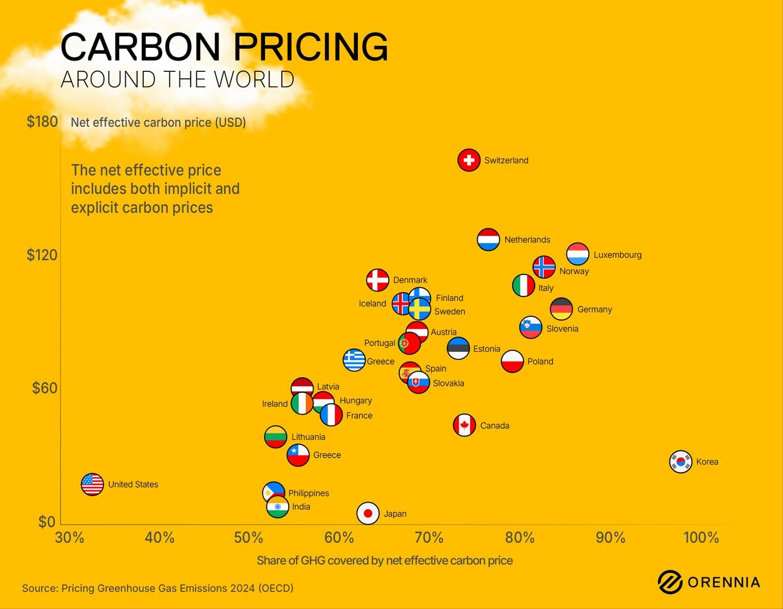
The y-axis is not labelled…is it $ per ton, per tonne, per megaton, other?
What is this graph intend to illustrate? Are countries in upper right more “environmentally aware” than those in the lower left? What does this tell us about the placement of Japan, Korea, or Switzerland?
This is an ineffective chart because it doesn’t communicate the values of what’s graphed.
Is carbon priced high or low a good thing?
What does the % axis represent, is good high or low?
What is the value of GHG being covered by net carbon price?
WTH are implicit/explicit prices?
I’m fairly certain folks are going to respond that I should better educate myself on the subject first, and I wouldn’t entirely disagree. However, the primary design/function of presenting valuable data is that it should easily communicate the meaning of what’s presented without pages of explanation. Its meaning should be fairly obvious on its own.
Any idea what China’s price is?
Genuinely not trying to be funny. I need to know it for this CBAM shit coming in to Europe from 1/1/26
Canada dumped its Carbon Rebate program after electing conservative PM Mark Carney.
Conservatives had blasted the Carbon Rebate program for helping families that produced fewer emissions than carbon gargling oil company executives.
So I’m not sure if your data on Canada is correct or not after our carbon pricing is over.
I too am unsure of what the graph is showing
And where is Australia… I believe we are pretty shit regarding this whole thing
Greece looking kinda weird
Why does the Greek data point have a Texas flag? 😀
![The State of Global Carbon Pricing in 2025 [OC]](https://www.europesays.com/wp-content/uploads/2025/08/nd7ihampnmlf1-1536x1024.jpeg)
10 comments
Source: Pricing Greenhouse Gas Emissions 2024 (OECD)
Tool: Adobe
More Information: [The State of Global Carbon Pricing in 2025 | Orennia](https://orennia.com/insights/the-state-of-global-carbon-pricing-in-2025)
Land of the free (carbon)!
https://preview.redd.it/40bizjo3rmlf1.png?width=1057&format=png&auto=webp&s=55a6a4d7b3ccb8753a52d278ac6c3fc021733d88
The y-axis is not labelled…is it $ per ton, per tonne, per megaton, other?
What is this graph intend to illustrate? Are countries in upper right more “environmentally aware” than those in the lower left? What does this tell us about the placement of Japan, Korea, or Switzerland?
This is an ineffective chart because it doesn’t communicate the values of what’s graphed.
Is carbon priced high or low a good thing?
What does the % axis represent, is good high or low?
What is the value of GHG being covered by net carbon price?
WTH are implicit/explicit prices?
I’m fairly certain folks are going to respond that I should better educate myself on the subject first, and I wouldn’t entirely disagree. However, the primary design/function of presenting valuable data is that it should easily communicate the meaning of what’s presented without pages of explanation. Its meaning should be fairly obvious on its own.
Any idea what China’s price is?
Genuinely not trying to be funny. I need to know it for this CBAM shit coming in to Europe from 1/1/26
Canada dumped its Carbon Rebate program after electing conservative PM Mark Carney.
Conservatives had blasted the Carbon Rebate program for helping families that produced fewer emissions than carbon gargling oil company executives.
So I’m not sure if your data on Canada is correct or not after our carbon pricing is over.
I too am unsure of what the graph is showing
And where is Australia… I believe we are pretty shit regarding this whole thing
Greece looking kinda weird
Why does the Greek data point have a Texas flag? 😀
Comments are closed.