it makes you realize the cold deserts near the poles really are deserts
Looks like Manchuria has my kinda weather
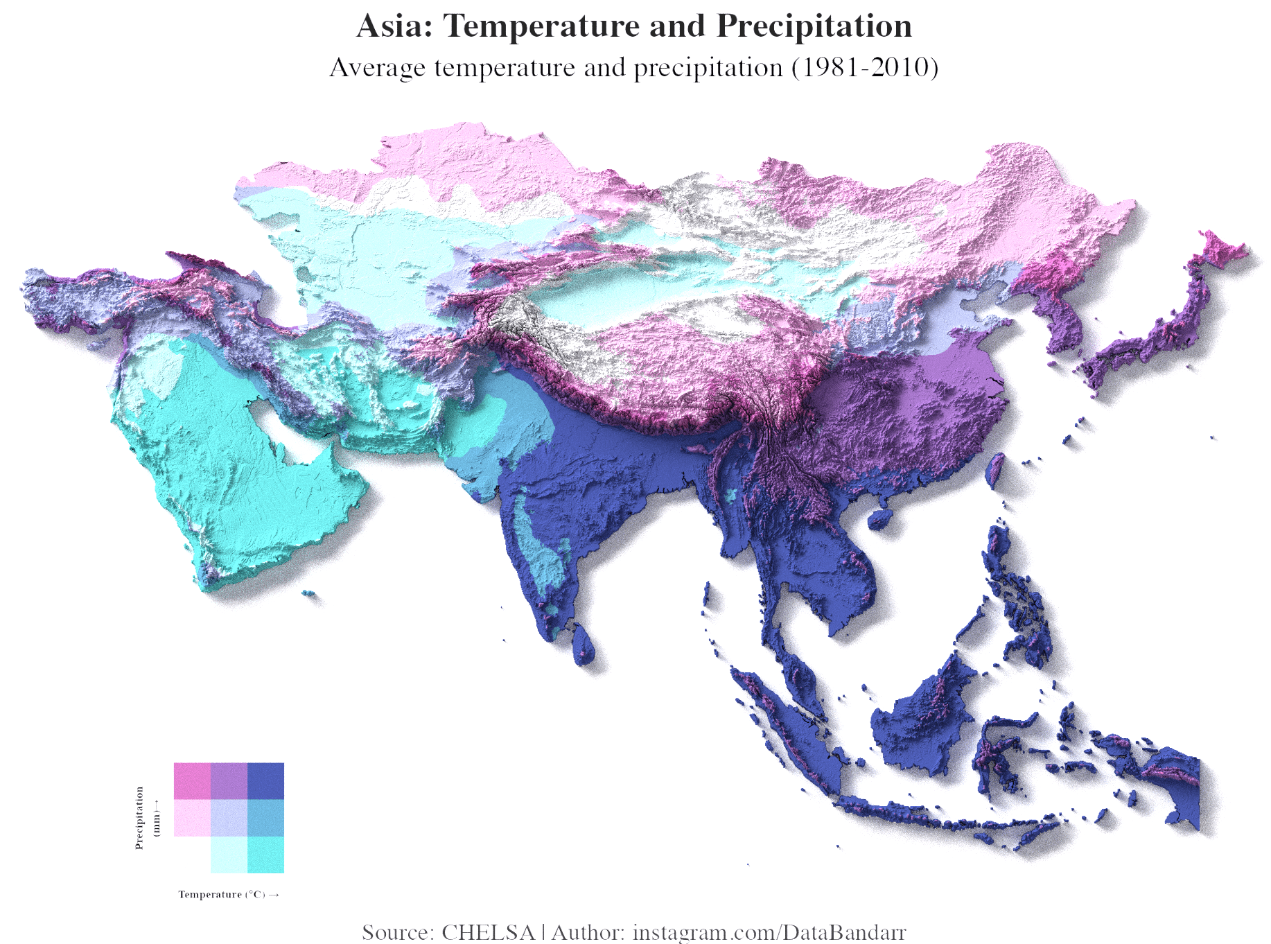
Crazy to see southeast Asia just drowning in blue while central Asia looks bone dry.
Your scale is unintuitive and should be flipped – more red = hotter (intuitively), you have red for precip. More precip should be more blue, because water is blue.
it’s pretty but man I have a hard time comprehending the colors
Super pretty visual, takes a little looking to understand at first. Would be interested to see a live motion version. Maybe averages throughout the seasons? go by month perhaps. Or by year to see if/how things have changed from 1981-2010.
This map includes the European part of Kazakhstan but not the Asian part of Russia
That oval white patch in the middle looks roughly like the exact borders of Mongolia.
The effect of the Himalayas was never clearer
Finally some actual beautiful data!
Colorblind me staring at this:
“What in the fuck am I looking at? The legend means nothing”
Temperature states Celsius then doesn’t have any numbers… it could be any system. What was the point?
![[OC] Temperature and Precipitation Across Asia (1981-2010)](https://www.europesays.com/wp-content/uploads/2025/08/dtann83tnrlf1-1834x1024.png)
13 comments
**Source:** [CHELSA Climate Data](https://chelsa-climate.org/?utm_source=chatgpt.com) (1981–2010).
**Tools:** R + Rayshader. Code: [GitHub](https://github.com/databandar/asiatempvsprec?utm_source=chatgpt.com).
Adapted from [u/milosmakesmaps](https://x.com/milosmakesmaps/status/1908898897646268686?utm_source=chatgpt.com), modified for Asia.
Colors represent **temperature (x-axis)** vs **precipitation (y-axis)** (quantile-based 3×3 bivariate scale). also here is another version of same plot , upvote this if you prefer this version.
https://preview.redd.it/sq4yd58bprlf1.png?width=1920&format=png&auto=webp&s=193182d79926c883d50f9d467a064adb215479f9
it makes you realize the cold deserts near the poles really are deserts
Looks like Manchuria has my kinda weather
Crazy to see southeast Asia just drowning in blue while central Asia looks bone dry.
Your scale is unintuitive and should be flipped – more red = hotter (intuitively), you have red for precip. More precip should be more blue, because water is blue.
it’s pretty but man I have a hard time comprehending the colors
Super pretty visual, takes a little looking to understand at first. Would be interested to see a live motion version. Maybe averages throughout the seasons? go by month perhaps. Or by year to see if/how things have changed from 1981-2010.
This map includes the European part of Kazakhstan but not the Asian part of Russia
That oval white patch in the middle looks roughly like the exact borders of Mongolia.
The effect of the Himalayas was never clearer
Finally some actual beautiful data!
Colorblind me staring at this:
“What in the fuck am I looking at? The legend means nothing”
Temperature states Celsius then doesn’t have any numbers… it could be any system. What was the point?
Comments are closed.