![[OC] Google Cloud salary scatter plot: 10,880 job postings show L8 Principal roles hitting $421K base while L3-L5 cluster tightly. Premium skills (orange borders) create salary outliers at every level.](https://www.europesays.com/wp-content/uploads/2025/09/f2caglqr5pmf1-1600x1024.jpeg)
Data Source:
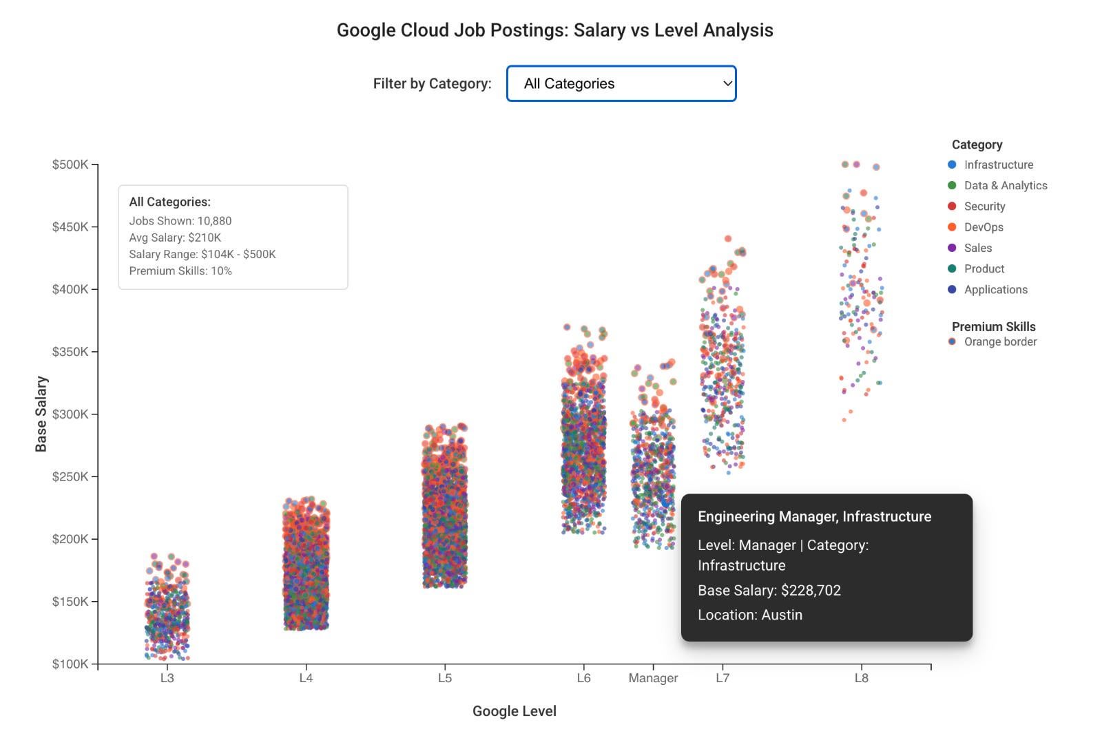
Google Cloud job postings from June-August 2025, extracted from BigQuery jobs database. Interactive scatter plot shows 10,880 individual data points with salary vs level distribution across 7 technology categories.
Tools Used:
- D3.js for interactive scatter plot with category filtering and hover tooltips
- Python for realistic salary data generation based on Google's L3-L8 leveling system
- Material Design styling with proper axis labeling and legend
Methodology:
- Each dot represents one job posting with base salary (85% of posted maximum) plotted against Google level (L3-L8 + Manager)
- Color coding by technology category (Infrastructure, Data & Analytics, Security, DevOps, Sales, Product, Applications)
- Orange borders indicate premium skills roles (PhD Research, Security Clearance, AI/ML expertise) with 15-25% salary premiums
- Slight horizontal jitter added for better visualization of overlapping data points
Key Insights:
- Clear salary bands: Distinct compensation tiers by level with realistic variance within each band
- Premium skill impact: Orange-bordered dots show salary outliers at every level, not just senior roles
- L8 ceiling: Principal roles cap around $421K base, creating visible salary ceiling in upper right
- Category clustering: Security and Data & Analytics roles (red/green dots) trend toward higher compensation
- Experience premiums: Wider salary spread at L6+ levels shows location and skills impact on compensation
Technical Notes:
- Interactive tooltips show job title, level, category, base salary, location, and premium skills status
- Category filter dropdown allows focused analysis of specific technology domains
- 10,880+ individual data points with realistic salary variance and geographic premiums built into distribution
Full interactive scatter plot: https://storage.googleapis.com/gcp-final-scatter-jan2025/index.html
Posted by aaghashm
8 comments
Data Source: Google Cloud job postings June-August 2025 from BigQuery jobs database. Each of 10,880 dots represents one job posting with base salary vs Google level.
Methodology: Base salary calculated as 85% of posted maximum compensation. Color coding by technology category. Orange borders indicate premium skills roles (PhD Research, Security Clearance, AI/ML) with 15-25% salary boosts.
Key Patterns: Clear salary bands by level, premium skills create outliers at every level, L8 roles cap around $421K base, Security/Data Analytics trend higher, wider spread at L6+ shows location/skills impact.
Interactive Features: Hover tooltips show job title/location/skills, category filter dropdown for focused analysis of specific domains.
Full interactive scatter plot: [https://storage.googleapis.com/gcp-final-scatter-jan2025/index.html](https://storage.googleapis.com/gcp-final-scatter-jan2025/index.html)
Needs jitter to communicate anything indicated by the legend
Can confirm, infra pay is low and devops just keeps getting higher… which is funny considering how closely related they are. Big brain drain in infra to devops because the pay isn’t there. Often devops roles are just infra in sheep’s clothing
Why not violin plot ? It’s so hard to understand the distribution of each factor
What does “Premium skills” even mean?
The US tech market is wild. I’m below the displayed y-axis (and living a good life).
> Python for realistic salary data generation
What?
Is this synthetic data or actual data?
Here’s the problem , no matter how good you are they may just decide to lay you off for the sake of shareholders . It’s not a career anymore . It’s a temp agency . Fuck google .
Comments are closed.