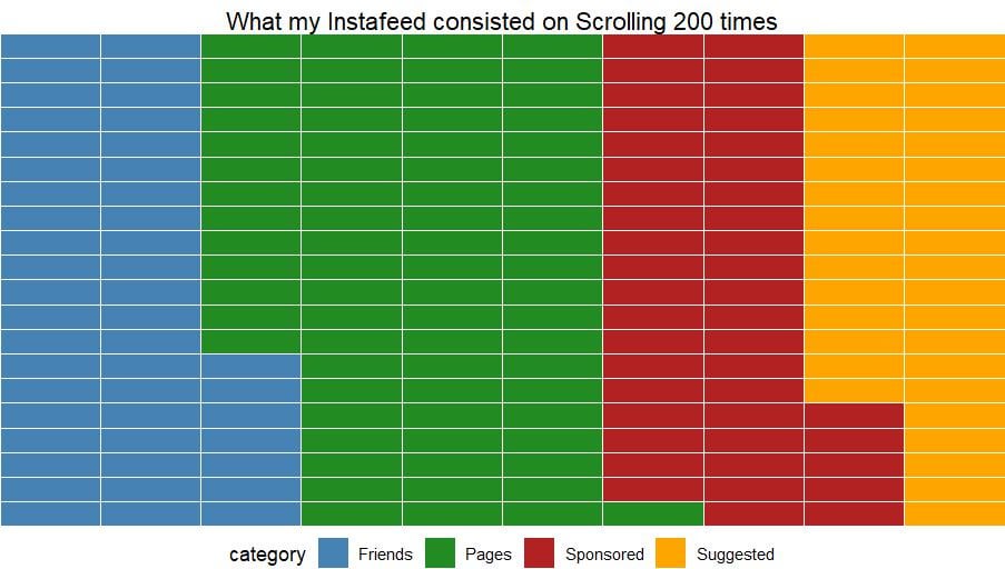
Friends – Individual accounts of those who I know
Pages – Meme pages, celebrity pages etc
Sponsored – The post was labelled sponsored by Instagram
Suggested – The post was labelled Suggested by Instagram
Posted by baelorthebest
![[OC] I scrolled Instagram 200 times to see what type of posts appear on my feed.](https://www.europesays.com/wp-content/uploads/2025/09/9bl66q5awbnf1.jpeg)

Friends – Individual accounts of those who I know
Pages – Meme pages, celebrity pages etc
Sponsored – The post was labelled sponsored by Instagram
Suggested – The post was labelled Suggested by Instagram
Posted by baelorthebest
14 comments
Source – Primary Data
Software used – R Studio
What was the thought process that yielded the decision about this being the best visual representation of 4 values?
This is a good chunk of why I decided to delete my account.
A bit much sponsored. But overall the split seems good enough
Do I have to count the rectangles to get quantitative data?
What is the purpose of the boxes? What message is this conveying that a bar or pie/donut chart can’t achieve?
This ia probably one the worst ways to represent the data.
Cool data collection, not necessarily how I would visualize it though.
A pie or donut chart with quantitative labels would be better imo
I don’t understand what I am looking at. It looks consistent but I don’t understand what it’s consistent at? Are the horizontal lines days? I think it is saying that you get about 2 friend posts, then 4 page posts then 2 each of the others? Is it in that order. You’re doing me a confuse
that’s a very weird way to represent frequencies of classes
The biggest issue with this display is the use of color. I guarantee that some folks will have issues distinguishing between the values. I work in digital a11y and the go to for color contrast for differentiation is at least 3:1 for these adjacent colors. Otherwise, rip to your feed
Just a pie chart with data labels showing counts would be more informative in my opinion. Or a bar chart with data labels showing counts. I really don’t mind this representation, but I would like to immediately see the actual information, which without the counts I cannot. I would probably also sort the categories from the most frequent to least.
Thats alot of suggestions bulking in a row.
Comments are closed.