Not trying to be mean, but this feels like one of those visualizations that is trying harder to look cool than actually provide any useful information
This is really good. The one thing I’d change, though, would be the colour scheme. I don’t love that one of the line colours is white, and it’s really not ideal to have one of the line colours being the same as the background. Other than that I think the concept and the layout is great.
4 comments
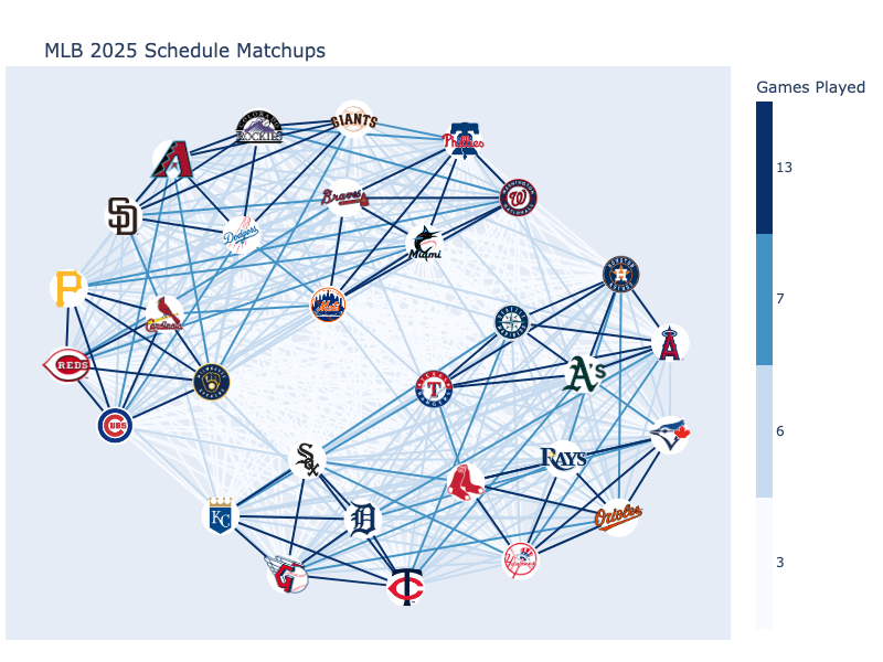
This graph network shows the number of matchups between MLB teams. Edges represent the number of games played between teams. I used the game schedule data from [Retrosheet](https://www.retrosheet.org/schedule/index.html), Pandas, and Plotly to create this visualization. Source code and full write-up can be found [here](https://runningonnumbers.com/posts/mlb-realignment-graph-theory/).
Not trying to be mean, but this feels like one of those visualizations that is trying harder to look cool than actually provide any useful information
This is really good. The one thing I’d change, though, would be the colour scheme. I don’t love that one of the line colours is white, and it’s really not ideal to have one of the line colours being the same as the background. Other than that I think the concept and the layout is great.
Oh how my sport has been ruined
Comments are closed.