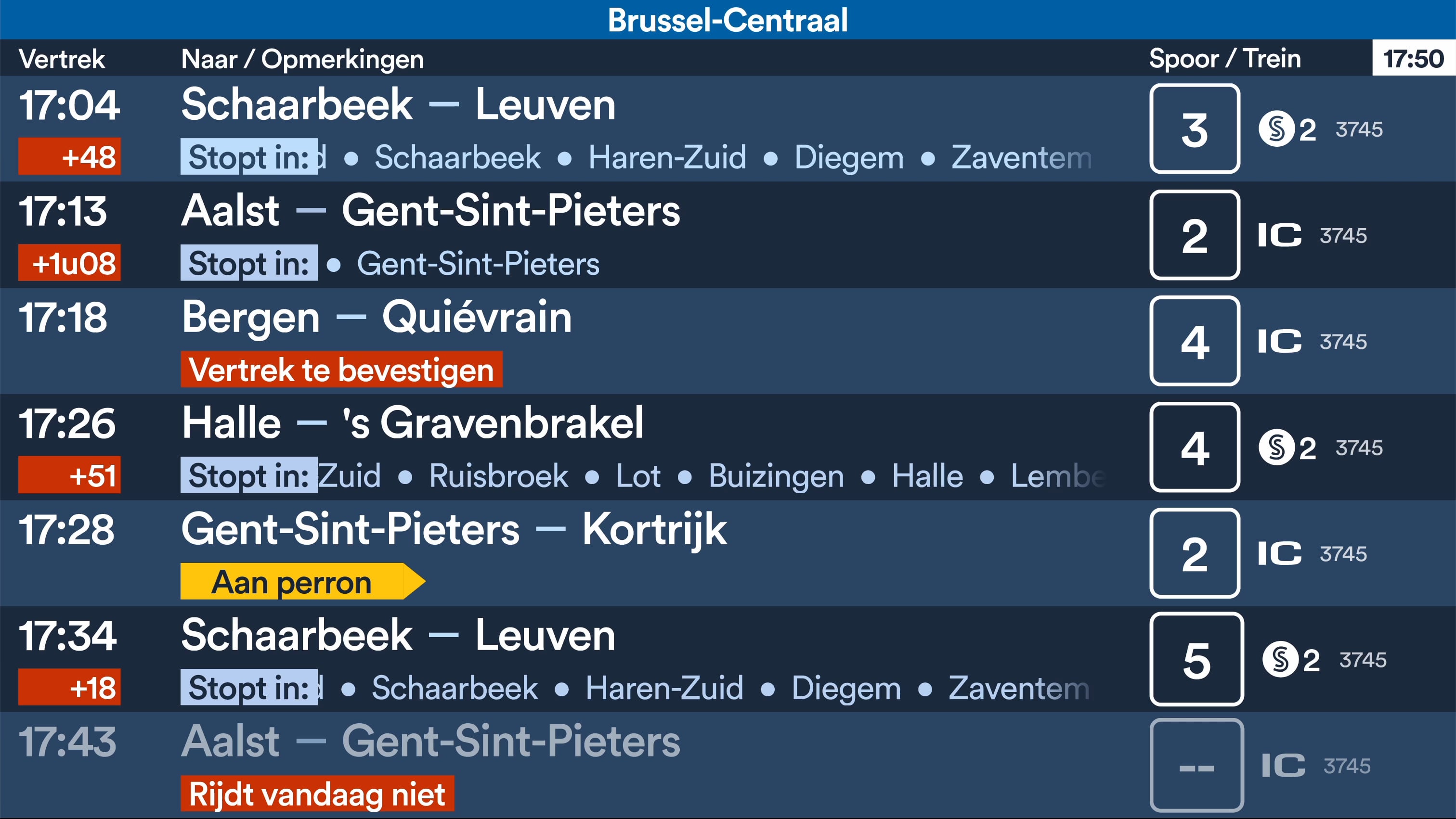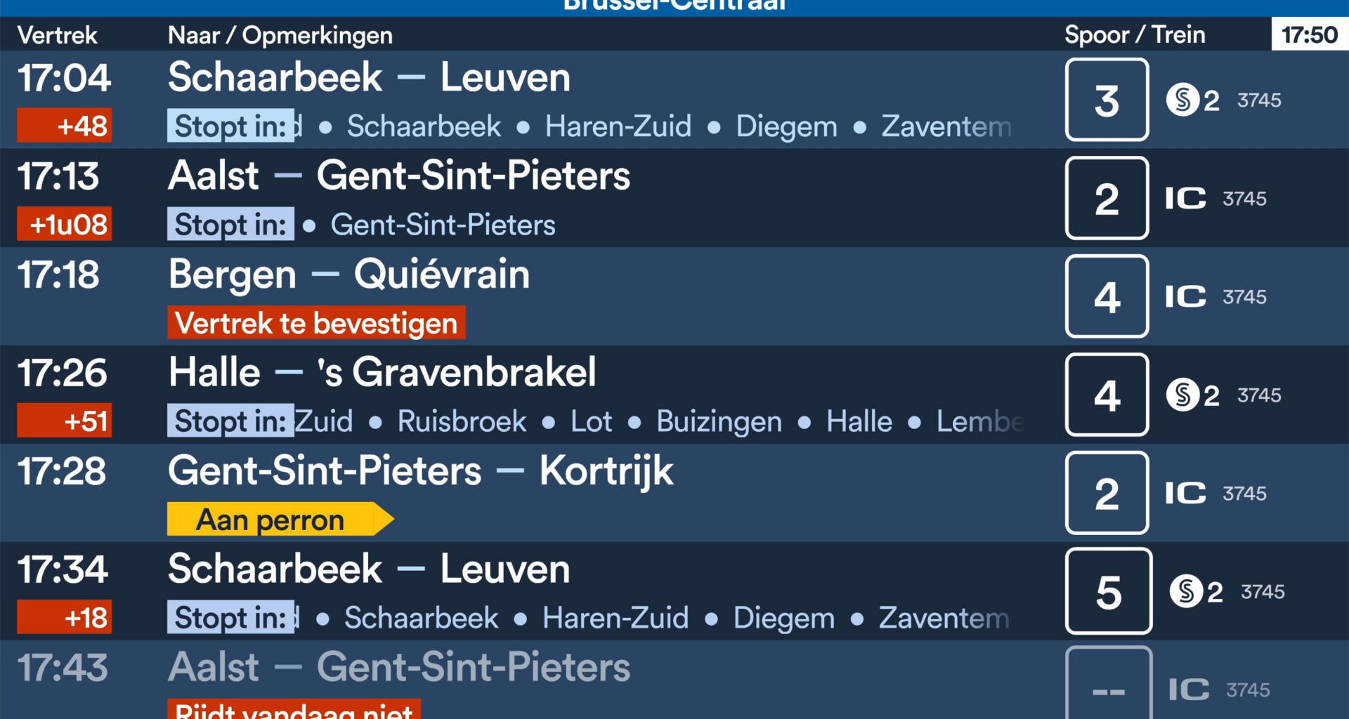
I know, guys, it's been a while. Most of you are probably already used to the departure board, but I thought it would be fun to try to redesign the screen. I worked on it here and there in my spare time over a period of two years. I've gone through many iterations, and this is my final version. I'm also thinking of developing this myself and hosting it as a public website, hence the station name at the top.
by Lost-Quality-3161

14 comments
That’s kind of what it used to look like before they went for the current tile approach… I still don’t get the modern day fetish with presenting tabular data in anything other than a table.
The most accurate thing is the delays.
It’s better but if you show to them the unions will strike because the employees have to do something.
Their systems are also not intended to be transparent but to be complex so you need time to figure out the situation instead of being able to complain.
Cool concept. But i’m a “less is more” kind of person. Are people actually using the train IDs to identify which train they need to take?
Die ‘stopt in’ kan weggelaten worden. Dan oogt het ook wat minder druk
Nice
The ‘3745’ number in the train column not being aligned directly under each other is annoying me. But it’s better than the tiles thing
Didn’t know it could be even worse … but reddit never stops amazing me
wil ik wel graa
The animation of the first row moves faster than the animation of the second row
4 trains are delayed, 1 isn’t even driving, 1 hasn’t even left and only 1 is on time. Seems pretty accurate.
If you take away the animations, it would be solid. The animations make it too busy to my liking. Most of the time this information should be readable in a flash
i’d ditch the text animation
is Erps-Kwerps really a station
Comments are closed.