![[OC] Teen birth rate per 1,000 females ages 15–19 by US state](https://www.europesays.com/wp-content/uploads/2025/09/hu1bqpsahunf1-1920x1024.png)
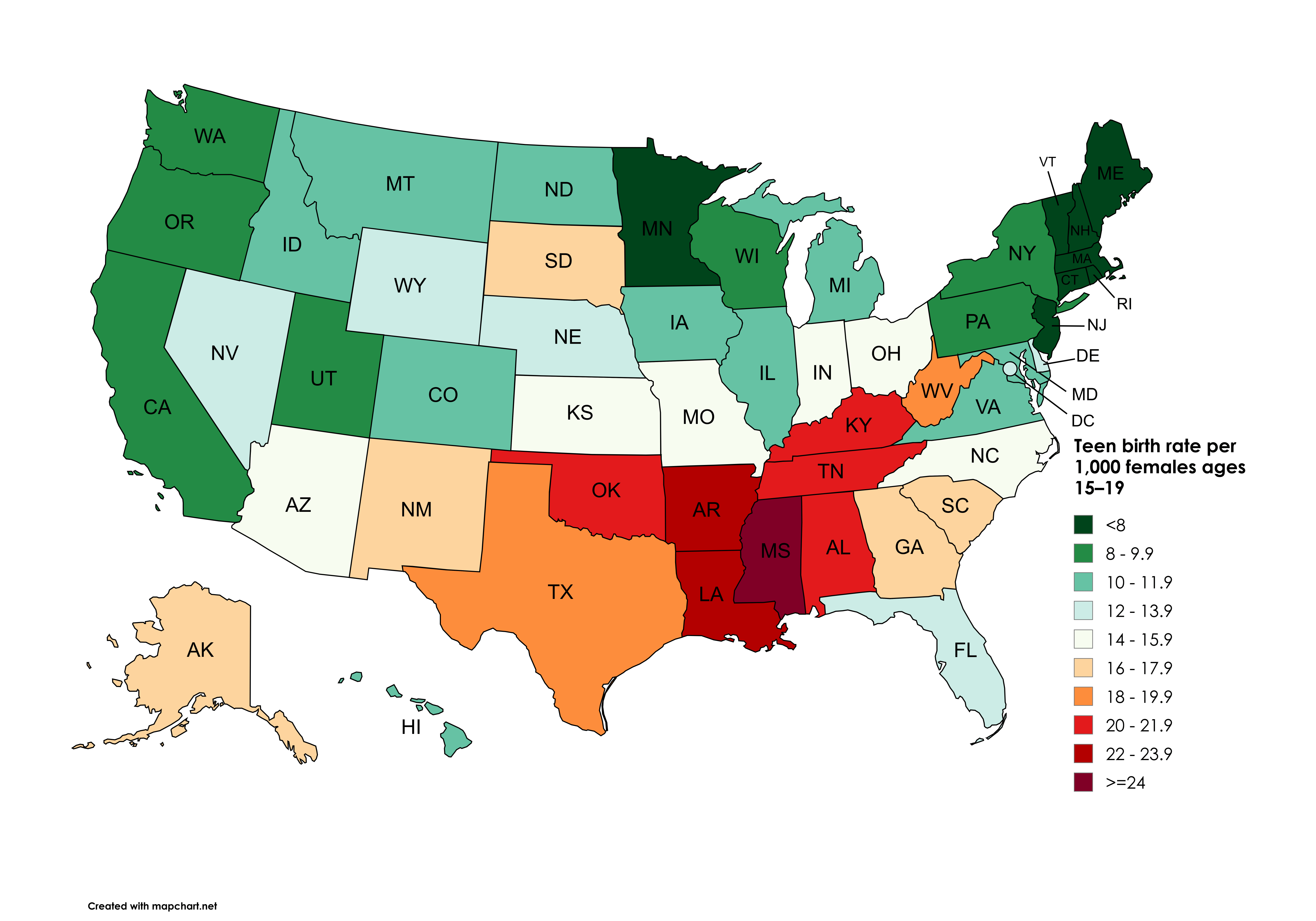
Data: 2023 National Vital Statistics System birth data (https://www.cdc.gov/nchs/state-stats/births/teen-births.html?CDC\_AAref\_Val=https://www.cdc.gov/nchs/pressroom/sosmap/teen-births/teenbirths.htm)
Tool: Mapchart (https://www.mapchart.net/usa.html)
Posted by snakkerdudaniel
25 comments
Data: 2023 National Vital Statistics System birth data (https://www.cdc.gov/nchs/state-stats/births/teen-births.html?CDC_AAref_Val=https://www.cdc.gov/nchs/pressroom/sosmap/teen-births/teenbirths.htm)
Tool: Mapchart (https://www.mapchart.net/usa.html)
Mississippi strikes again! It’s been on fire with these charts recently!
Honestly the really impressive thing is [how much it has declined in the US and how quickly](https://commons.wikimedia.org/wiki/File:Teenage_Pregnancies_in_the_US_by_Age_(CDC).png#mw-jump-to-license), particularly among 15-17 year olds who are much less equipped to deal with it.
Correlates with overall TFR, as theorized. These states are in the 1.8-1.89 range, while it is much lower in green areas on average. Notable exceptions are the Dakotas and Nebraska, which have the highest TFR without the highest teen birth rates, though still above average.
Ah, the Bible Belt. I thought premarital sex was a sin?
I’ve noticed, in so many of these posts about death, poverty, and just bad things overall, a consistent pattern. I appreciate living in Colorado.
The further you get from Canada, the worse it gets. Coincidence? I think not.
Ah the usual suspects are at the “top “ of the class once again
I wouldve thought itd be higher than that
These maps are always the same lmao
Based New England strikes again.
Mississippi #1 on yet another map. Go Mississippi.
This sub has convinced me that statistics are partisan
Correlates pretty well with voting patterns
Before 2014, the average for the entire US was greater than Mississippi is today.
Of the 9 states that are dark orange or red, all have banned abortion.
There are three other states that have banned abortion (S Dakota, Idaho, Indiana)
Our smartest and wealthiest areas are not having children. Next generations are cooked
Nice! Now break it down further by demographic. How does it look now?
Why 15? What about 14?
I’d like to something like teen birth rate to teen abortion ratio. It only makes sense that you’d have more teen births in areas with restrictive laws regarding abortion (or defacto bans these days)
Poverty alongside high black and Hispanic population.
Now, overlap the data from abstinence-only education being the only provided sex ed and look we have the same map.
I an shocked at Utah being that low. I see women who are clearly in their early 20s dragging 4 kids around with them
Now overlay this with the other map showing maternal mortality. I’m sure there are strong correlations.
A bit a criticism, as a colorblind, this kind of color palette is very misleading. A palette that simply ranges from lightest to darkest would be much more effective.
Comments are closed.