I used ChatGPT to help clean and combine the 43 raw CSVs (each ranging 13K-300K rows).
Here’s the exact prompt I ran on each file:
*Delete the first 7 rows (junk headers).*
*Insert a new column titled “Airport” in Column A: I will give you the airport code (e.g., “ATL”, “DEN”) — fill the entire column with it.*
*Delete columns named “Flight Number” and “Tail Number” (if they exist).*
*Create two new columns:*
*• “Time Slot” — bucket Scheduled Departure Time into:*
*- Early AM: before 09:00*
*- Mid-Morning: 09:00–12:00*
*- Early Afternoon: 12:00–15:00*
*- Late Afternoon: 15:00–18:00*
*- Evening: 18:00–21:00*
*- Late Night: 21:00+*
*• “Delay Flag (>15min)” — if Departure delay (Minutes) is >15, set to 1; else 0.*
*⚠️ Column name matching must be case-insensitive for:*
*• “Scheduled Departure Time”*
*• “Departure delay (Minutes)”*
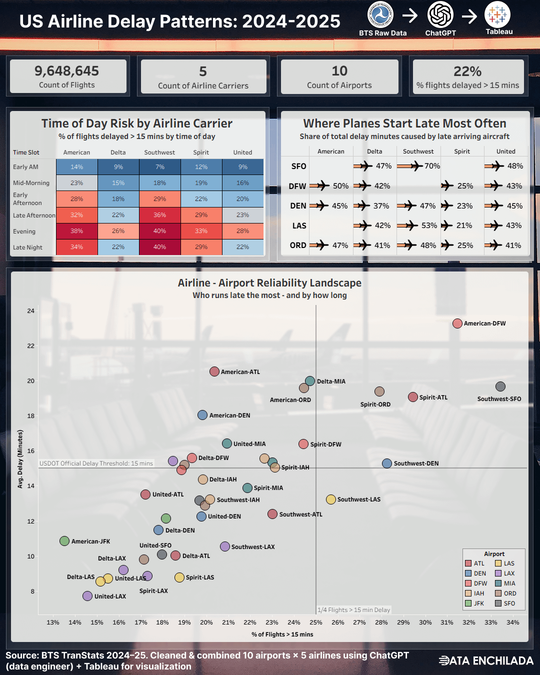
Cool chart. Can you try re-coloring by Airline instead of Airport?
At first glance, I’m not seeing any signal in the airport coloring. But I think we will see some if we look at it by airline. A good rule in data viz is that our choices should illuminate some insight. I think changing the color scheme to airline will show something interesting.
Damn – Southwest has issues in SF
How much of this is the airport? For example, SFO is notorious for bumping smaller airlines to the back of the line to keep their big international flights on time.
Conclusions: Morning flights are better, American airlines is better, Spirit is not particularly worse than other big name carriers.
The only time you can say LAX ftw
Is Avg Delay the Avg Delay of all flights (including on-time) or the avg delay of flights that were delayed?
Was EWR purposely left off because it would skew all of the data?
Interesting but not a particularly great use of data visualization. Colors are awfully close together – difficult to find/tell the difference between ORD and IAH, for instance. Also, why are they all the same size circles? That’s another variable that could convey information – color for airport, shape for airline, size for number of flights – etc.
For instance, generally people can’t control the airport they fly out of or into, or at least not much. But, they can control the carrier that they use – I for instance, am interested in all United flights / performance – hard to find them here.
Definitely should include frontier on this list, given that spirit is going bankrupt for the second time.
Americans east coast hub, Charlotte, is not included.
How on earth is DCA not on this
Spirit Airlines: we might not vacuum the cabin or clean the sticky tray tables between flights but we’ll take off on time
Bad sloppy data. Good attempt but no error bars. Swa doesn’t have a hub at iah, so you aren’t taking into account number of flights.
Is there some adjustment to show as a percentage of total flights, similar to how in economics numbers are per capita?
I ask because seeing American – DFW in the upper right makes me think it might just be the biggest airline at a single busy airport.
Otherwise all DFW would be in the upper right or all American would be in the upper right.
***
Also, I want to see alternate airports. Like the chart shows American at DFW is often late. Does it make sense to use Southwest at DAL instead? I can’t tell from the graph, because I don’t know which circle is Southwest-DAL.
You should include all the major hubs. EWR is a glaring omission.
I’m looking at this on my phone, I’m assuming I need a computer to see EWR since it would be way off my screen 😅
Alaska carries more passengers than Spirit, so not sure why the latter was chosen here besides maybe greater variety of airports serviced?
NVM, Alaska is 5th largest US carrier by destinations serviced, Spirit is 14th behind Sun Country. I really don’t get it now
This is wild. I had 6 united flights in the last month and 4 were delayed (some by cities on here)
I’ve flown ~15 Southwest flights the last 2 years and had 0 delays
Had 6 delta flights since May (2 delays)
Data does not match my reality (almost all flights were cities on here)
Am I missing the flight count? Like all of southwest flights from sfo could be delayed by a lot, but it’s not that a big deal if they only run 10 flights.
Size of bubble could be indicate that maybe?
Currently boarding an afternoon American flight that was delayed two hours at DFW. Checks out.
The big 4 plus NK? That’s odd; where are the players inbetween?
![[OC] Airline delays across 10 major U.S. airports (2024–25, ~10M flights)](https://www.europesays.com/wp-content/uploads/2025/09/hw6y3kngcrof1-1080x1024.png)
26 comments
Full interactive dashboard on [Tableau Public](https://public.tableau.com/app/profile/data.enchilada/viz/TMAIUSAirlineDelayPatterns20242025/Dashboard2)
Data source: [U.S. Bureau of Transportation Statistics](https://www.transtats.bts.gov/ONTIME/Departures.aspx)
I used ChatGPT to help clean and combine the 43 raw CSVs (each ranging 13K-300K rows).
Here’s the exact prompt I ran on each file:
*Delete the first 7 rows (junk headers).*
*Insert a new column titled “Airport” in Column A: I will give you the airport code (e.g., “ATL”, “DEN”) — fill the entire column with it.*
*Delete columns named “Flight Number” and “Tail Number” (if they exist).*
*Create two new columns:*
*• “Time Slot” — bucket Scheduled Departure Time into:*
*- Early AM: before 09:00*
*- Mid-Morning: 09:00–12:00*
*- Early Afternoon: 12:00–15:00*
*- Late Afternoon: 15:00–18:00*
*- Evening: 18:00–21:00*
*- Late Night: 21:00+*
*• “Delay Flag (>15min)” — if Departure delay (Minutes) is >15, set to 1; else 0.*
*⚠️ Column name matching must be case-insensitive for:*
*• “Scheduled Departure Time”*
*• “Departure delay (Minutes)”*
Cool chart. Can you try re-coloring by Airline instead of Airport?
At first glance, I’m not seeing any signal in the airport coloring. But I think we will see some if we look at it by airline. A good rule in data viz is that our choices should illuminate some insight. I think changing the color scheme to airline will show something interesting.
Damn – Southwest has issues in SF
How much of this is the airport? For example, SFO is notorious for bumping smaller airlines to the back of the line to keep their big international flights on time.
Conclusions: Morning flights are better, American airlines is better, Spirit is not particularly worse than other big name carriers.
The only time you can say LAX ftw
Is Avg Delay the Avg Delay of all flights (including on-time) or the avg delay of flights that were delayed?
Was EWR purposely left off because it would skew all of the data?
Interesting but not a particularly great use of data visualization. Colors are awfully close together – difficult to find/tell the difference between ORD and IAH, for instance. Also, why are they all the same size circles? That’s another variable that could convey information – color for airport, shape for airline, size for number of flights – etc.
For instance, generally people can’t control the airport they fly out of or into, or at least not much. But, they can control the carrier that they use – I for instance, am interested in all United flights / performance – hard to find them here.
Definitely should include frontier on this list, given that spirit is going bankrupt for the second time.
Americans east coast hub, Charlotte, is not included.
How on earth is DCA not on this
Spirit Airlines: we might not vacuum the cabin or clean the sticky tray tables between flights but we’ll take off on time
Bad sloppy data. Good attempt but no error bars. Swa doesn’t have a hub at iah, so you aren’t taking into account number of flights.
Is there some adjustment to show as a percentage of total flights, similar to how in economics numbers are per capita?
I ask because seeing American – DFW in the upper right makes me think it might just be the biggest airline at a single busy airport.
Otherwise all DFW would be in the upper right or all American would be in the upper right.
***
Also, I want to see alternate airports. Like the chart shows American at DFW is often late. Does it make sense to use Southwest at DAL instead? I can’t tell from the graph, because I don’t know which circle is Southwest-DAL.
You should include all the major hubs. EWR is a glaring omission.
I’m looking at this on my phone, I’m assuming I need a computer to see EWR since it would be way off my screen 😅
PHL not being on here is surprising
The Flight Aware misery index is a great complement to this viz. [https://www.flightaware.com/miserymap/](https://www.flightaware.com/miserymap/)
Why did you include spirit over JetBlue, AirCanada, and Alaska?
Your post got me thinking and inspired this post, which is now trending in r/NoStupidQuestions:
https://www.reddit.com/r/NoStupidQuestions/comments/1nf9btm/if_an_airport_had_a_mostly_covered_runway_then/
Alaska carries more passengers than Spirit, so not sure why the latter was chosen here besides maybe greater variety of airports serviced?
NVM, Alaska is 5th largest US carrier by destinations serviced, Spirit is 14th behind Sun Country. I really don’t get it now
This is wild. I had 6 united flights in the last month and 4 were delayed (some by cities on here)
I’ve flown ~15 Southwest flights the last 2 years and had 0 delays
Had 6 delta flights since May (2 delays)
Data does not match my reality (almost all flights were cities on here)
Am I missing the flight count? Like all of southwest flights from sfo could be delayed by a lot, but it’s not that a big deal if they only run 10 flights.
Size of bubble could be indicate that maybe?
Currently boarding an afternoon American flight that was delayed two hours at DFW. Checks out.
The big 4 plus NK? That’s odd; where are the players inbetween?
Comments are closed.