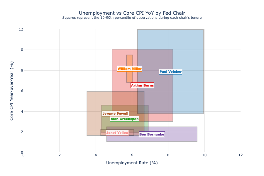
Monthly U.S. data, 1970–2025.
Shaded squares show the 10th–90th percentile range of outcomes for that chair. What stands out:
- Burns = no bueno
- Miller tenure was super short hence the thin rectangle.
- Volcker’s wide range—started with double-digit inflation, then brought it down.
- Greenspan’s long tenure clusters unemployment near 5–6%.
- Bernanke and Yellen show the post-crisis low-inflation regime.
- Powell: very low unemployment with a wide inflation swing ("but it was transitory!").
It’s a compact view of the varied macro outcomes from each chair's era.
Further explanation, if needed:
- -left of square: 10th percentile unemployment observations
- -right of square: 90th percentile unemployment observations
- -top of square: 90th percentile inflation observations
- -bottom of square: 10th percentile inflation observations
Posted by DataVizHonduran
11 comments
Source: Fred, Tools: Python and Plotly
And big respects to paul volcker, he did what many were afraid to do in a very chaotic time, and he caught a lot of flack for it, but he did a very good job. Truly one of the greats.
https://preview.redd.it/x5ic5klk4qpf1.png?width=2643&format=png&auto=webp&s=98460c19b07e41ec16e69950516d5b9cc97faa97
Paul Volcker was the best fed chairman. Because he did what was necessary to bring down inflation and restore trust in the Dollar. Even if it came with two very severe recessions. The man had balls of steel bigger than ANY politician today.
Imagine a politician doing the right thing today, even if it means they would never be re-elected. That would never happen.
Would be cool if you could do a heat map where inflation was most concentrated over the period
Here are the dates I used fed_chairs = [
(‘Arthur Burns’, ‘1970-02-01’, ‘1978-01-31’),
(‘William Miller’, ‘1978-03-08’, ‘1979-08-06’),
(‘Paul Volcker’, ‘1979-08-06’, ‘1987-08-11’),
(‘Alan Greenspan’, ‘1987-08-11’, ‘2006-01-31’),
(‘Ben Bernanke’, ‘2006-02-01’, ‘2014-01-31’),
(‘Janet Yellen’, ‘2014-02-03’, ‘2018-02-03’),
(‘Jerome Powell’, ‘2018-02-05’, ‘2025-09-30’)
]
Each square is basically the ‘fingerprint’ of a Fed Chair’s style)
Good job, very nice! I dig it a lot.
The fact that your formulas makes squares tells me that it’s possible to make an even more meaningful graph with this idea. I think you can convey even more data in this plot if, for every CPI value, the X axis shows the range of employment. Of course, it may get tricky with limited data points and continuous values, but discretizing the steps and ploting splines will likely help.
The resulting graph should be a few blobs that may tell these stories you posted.
Be nice to have a number by their name so we know how many years/months they were the fed chair
This is a really really good visualization. Which is sadly rare for this sub.
Interesting visualization!
Each square could have an arrow going from one corner to the opposite, showing trajectory.
You could even be tempted to plot values over time in each square (so you get a squiggly line in each square touching each edge at some point.
I have no idea how to represent length of term well.
> “but it was transitory!”
It was. And relatively low.
Comments are closed.