Would you need a chart removing 9/11 if the chart was for the murderers and not the victims?
Worth noting is that the source for this is the Cato Institute, a Koch-funded think tank with particular political leanings.
If this is the maximum amount of lipstick they can find to put on the pig of right-wing extremism in the United States, you know it’s bad.
would help if the chart said clearly “murders =victims” – ppl confuse it with number of attackers. 9/11 skews the victim count hard, but was just a handful of perpetrators.
Categorizing these is an admittedly tough task, but didnt immediately pass the sniff test.
Robert Allen Long, for example murdered 8 Asian massage workers which would likely seem racial in nature, but county investigators saw no evidence of racial bias, and by his admission, “wanted to punish those that enabled his sex acts”.
What would then be the rationale for it to be labeled ‘right’?
Aaaaand now you will be cancelled by the FCC
When even the Caro Institute has to acknowledge that the majority of political violence is perpetrated by the right wing, you know it must be true. This is like Trump conceding that he’s bad at golf.
Really puts into perspective how many people died on 9/11.
I hate that the party colours are reverse in the US compared to the rest of the world.
I found it! The stupidest take on this. And it’s from a dAtA sCiEnTiSt!
Seems all right wing groups should be labeled as domestic terrorist organizations.
This is a super weird and misleading chart. For starters, it’s unclear that you are showing victims, by calling it murders.
Second, the ideology is of the murderer, so showing how many victims they killed it a little misleading, as it makes it look like there were more for one type over other, based on victims. It should be ideology of the murderer and show the total number of murderers (aka perpetrators), rather than their victims, since one perpetrator can kill a lot of victims, as evident by 9/11 or the OKC bombing.
Quick reminder that Conservatives represent the minority of the country despite what is often attempted to be portrayed through aggressive media campaigns and red maps full of empty land.
Why on earth would you count victims and not incidents or perpetrators?
Pretty much everything classified under “left idealism” is a stretch as well. Other than the shooting of Steve Scalise, there isn’t another memorable case of someone clearly, violently going after the right from a left-wing terrorism perspective.
Yes… this is a challenge to name and shame. Give me the evidence of how I’m wrong.
I think the number of incidents is more telling than the number of victims. These graphs basically reward ideologies whose followers are bad at terrorism.
It would help if terms were defined. ‘Left’ and ‘Right’ include too many, often contradictory or opposed factions.
If you showed a graph with the total number of attacks/events resulting in deaths by ideology, it would give a better picture of the rate of attacks.(Kind of like the Propensity of a specific political ideology to commit an act resulting in deaths).
Not sure if that makes sense… Either way, it is an interesting graph.
This right here – is the only context in which moron MAGA is allowed to tell you that they are half the country
Is this chart showing the number of victims, organized by ideology of the terrorist? Really confusing and not well thought out.
Republicans seeing this chart: wow democrats have become twice as dangerous
This is inaccurate, and still can not find on google..
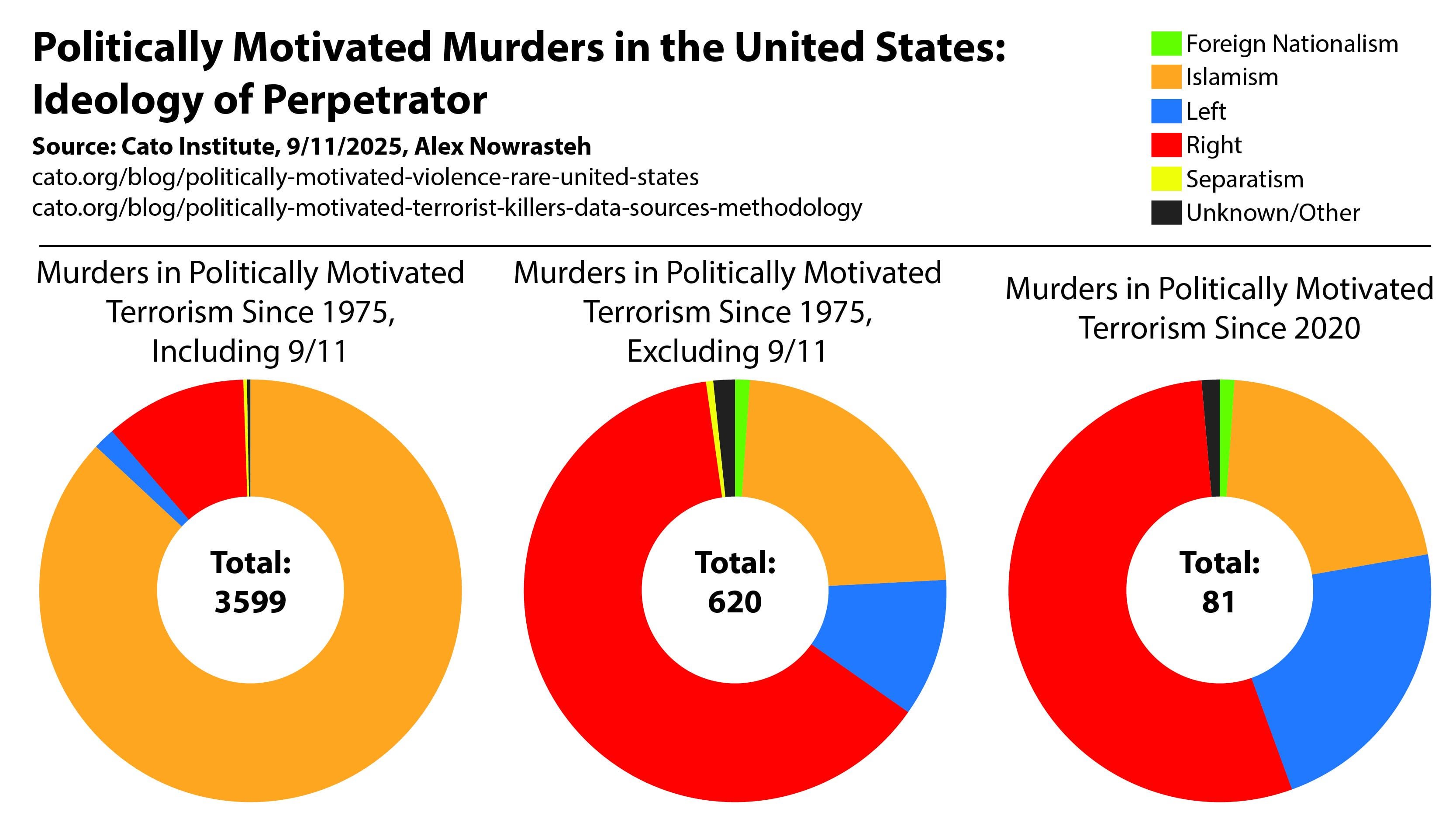
![Politically Motivated Murders in the US, by Ideology of Perpetrator [OC]](https://www.europesays.com/wp-content/uploads/2025/09/wkuosua44xpf1-1920x1024.jpeg)
23 comments
Created in Illustrator. Data from Cato Institute Blog: [https://www.cato.org/blog/politically-motivated-violence-rare-united-states](https://www.cato.org/blog/politically-motivated-violence-rare-united-states) and [https://www.cato.org/blog/politically-motivated-terrorist-killers-data-sources-methodology](https://www.cato.org/blog/politically-motivated-terrorist-killers-data-sources-methodology)
Would you need a chart removing 9/11 if the chart was for the murderers and not the victims?
Worth noting is that the source for this is the Cato Institute, a Koch-funded think tank with particular political leanings.
If this is the maximum amount of lipstick they can find to put on the pig of right-wing extremism in the United States, you know it’s bad.
would help if the chart said clearly “murders =victims” – ppl confuse it with number of attackers. 9/11 skews the victim count hard, but was just a handful of perpetrators.
Categorizing these is an admittedly tough task, but didnt immediately pass the sniff test.
Robert Allen Long, for example murdered 8 Asian massage workers which would likely seem racial in nature, but county investigators saw no evidence of racial bias, and by his admission, “wanted to punish those that enabled his sex acts”.
What would then be the rationale for it to be labeled ‘right’?
Aaaaand now you will be cancelled by the FCC
When even the Caro Institute has to acknowledge that the majority of political violence is perpetrated by the right wing, you know it must be true. This is like Trump conceding that he’s bad at golf.
Really puts into perspective how many people died on 9/11.
I hate that the party colours are reverse in the US compared to the rest of the world.
Red is left dammit.
Define “politically motivated”
Define the sample data context and the measures
Define the data validation process
https://preview.redd.it/eq9keukrhxpf1.png?width=603&format=png&auto=webp&s=4f17fd0f8117c1a3e13f2fc17fd5451b20e7c596
I found it! The stupidest take on this. And it’s from a dAtA sCiEnTiSt!
Seems all right wing groups should be labeled as domestic terrorist organizations.
This is a super weird and misleading chart. For starters, it’s unclear that you are showing victims, by calling it murders.
Second, the ideology is of the murderer, so showing how many victims they killed it a little misleading, as it makes it look like there were more for one type over other, based on victims. It should be ideology of the murderer and show the total number of murderers (aka perpetrators), rather than their victims, since one perpetrator can kill a lot of victims, as evident by 9/11 or the OKC bombing.
Quick reminder that Conservatives represent the minority of the country despite what is often attempted to be portrayed through aggressive media campaigns and red maps full of empty land.
Why on earth would you count victims and not incidents or perpetrators?
Pretty much everything classified under “left idealism” is a stretch as well. Other than the shooting of Steve Scalise, there isn’t another memorable case of someone clearly, violently going after the right from a left-wing terrorism perspective.
Yes… this is a challenge to name and shame. Give me the evidence of how I’m wrong.
I think the number of incidents is more telling than the number of victims. These graphs basically reward ideologies whose followers are bad at terrorism.
It would help if terms were defined. ‘Left’ and ‘Right’ include too many, often contradictory or opposed factions.
If you showed a graph with the total number of attacks/events resulting in deaths by ideology, it would give a better picture of the rate of attacks.(Kind of like the Propensity of a specific political ideology to commit an act resulting in deaths).
Not sure if that makes sense… Either way, it is an interesting graph.
This right here – is the only context in which moron MAGA is allowed to tell you that they are half the country
Is this chart showing the number of victims, organized by ideology of the terrorist? Really confusing and not well thought out.
Republicans seeing this chart: wow democrats have become twice as dangerous
This is inaccurate, and still can not find on google..
Comments are closed.