“In short, if making monetary policy is like driving a car, then the car is one that has an unreliable speedometer, a foggy windshield, and a tendency to respond unpredictably and with a delay to the accelerator or the brake.” -Ben Bernanke, Dec 2004
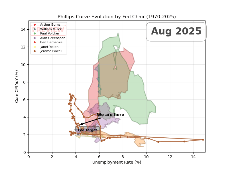
X-axis is unemployment, Y-axis is core CPI
The goal of each Fed chair is to be as close to the target zone as possible. I shaded 2–3% inflation and 4–6% unemployment as the rough ‘target zone’ — 2% is the official goal, and most NAIRU estimates land around 4–6%.
All I can say is, Greenspan truly was the GOAT.
Posted by DataVizHonduran
44 comments
Source: Fred, Tools: Python and Matplotlib. TIL matplotlib is eons faster than plotly at rendering animations.
Why fill in these shapes? The first and last point for each Fed Chair is unconnected in time and I don’t think the area enclosed by these curves is meaningful.
Greenspan had it easy. Powell has a pretty comparable profile aside from COVID. And Powell had to deal with Trump.
Thanks for sharing this. Would you be able to layer in target rate chanfe with a colour instead of the fed minister
This is one of the better posts I’ve seen recently. Thanks.
It’s not a game where the person who gets closest wins. It’s who can overcome dire economic headwinds and lead the economy through it, as much as getting closest to target.
That’s why Ben Bernanky would have my vote over Alan Greenspan. Led the US out of an incredibly difficult spot.
People don’t have any idea how important a competent independent reserve bank is, look at Türkiye…
Volcker is the goat.
Greenspan didn’t need to do the hard shit he did because Volcker did it.
And for context, raising the fed rate is expected to move the point down and to the right, while lowering the fed rate is expected to move the curve up and to the left.
There is no simple policy that we know of that consistently moves the point down and to the left.
Greenspan and Yellen the only ones to keep it remotely near the box
If anything this is more ammo that the Phillips Curve is a lie
This is beautiful! Why isn’t this how the data is always shown, fantastic job!
[deleted]
Finally, some beautiful data presented in a beautiful way.
This is a great illustration of the maxim “soldiers are always preparing to fight the last war”. Every chair has had very different conditions, and every significant deviation from target has been in a different direction, so the lessons learned from the last one don’t directly apply to the next one.
Cool way to present this data. I might use this idea
Wow this is great! I love the different color segments.
It’s definitely one of the best presentations I have seen!
One small note to make about this visualization is that its using core CPI while the Fed targets core PCE. CPI tends to be overestimate inflation a little bit compared to PCE, so this would look slightly different with PCE vs CPI.
This is truly a first rate post. Well done.
Weird cut but watching this felt like playing Kerbal Space Program with a rocket that’s way too fucking big.
Come on, just keep it on the ~~prograde vector~~ fed target, come on, nearly there, fuck fuck fuck shit fuck dammit fuck, okay we got this, ease it back around, alright, FUCK
I’m ngl, I’m so chronically online that I thought I was looking at CS Spray patterns
Man for all the hate Greenspan got he seemed to do the best over all under him at staying. The target.
Presidenta and congressional acts make huge impacts on the economy. Do not forget who was captaining those behemoth ships.
We actually have good posts today. What is happening?!?!?
Finally some beautiful data
I thought that the Fed only recently put in the 2% inflation target? Around 2008-2013 is when they established it, after the financial crisis.
Volcker was fighting some battles man what a job he did, sorta looking like Powell is going through the same thing
Great job. Very creative way to show this data.
Powell’s handling of COVID was a masterclass
I’d love to see a 3D model and where the z-axis is the Fed funds rate during these data points.
Yellen was really good at it too.
Would love to see recent years too. Nice work.
Excellent visualization. I think it highlights the slippery slide of increasing CPI and transitional decreases in unemployment before full blown curving to higher inflation and unemployment. Looks like Powell successfully navigated back down that “spiral”.
This is awesome. Only critique is I would have left the final state up longer at the end of the animation, but yeah.
Wow.
cool graph! do you have github?
This is one of the best visualizations I’ve ever seen.
If this chart is used to describe the country….
I’m assuming last year(2024) was pretty good?
r/mapmaking just found new inspiration
Question for clarification – where does the 4-6% unemployment rate target come from? I know they are mandated to target “maximum employment”, but didn’t realise it had been formalised into that range.
Very cool. Slow it down a bit and that’s it for me
You can make a lot of money presenting data like this to corporations.
I thought it was some how going to draw a european map.
I graduated high school in 2011, and college in late 2019..
Being a milennial sucks.
Wow. This is very digestible thanks OP
Really cool, but using this data to conclude “Greenspan truly was the GOAT” is misinformed. It was Greenspan’s “easy money” policies that created the conditions for the great recession. Bernanke just inherited the house of cards.
Comments are closed.