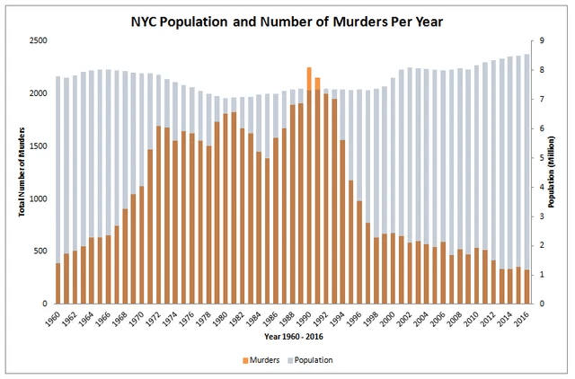
The homicide numbers in NYC have fluctuated massively over the years. There was a gradual increase in violent crime throughout the 1960s before it began skyrocketing during the 1970s and 1980s (the two decades that are often seen as the “darkest times” in the city’s history) before it hit a peak in 1990 with 2245 homicides. However, this number has gradually declined since its peak in the early 1990s with 2016 having only 330 homicides, which is lower than any other point in this graph’s timeline.
With a homicide rate of 4.1 per 100k in 2024, NYC is now statistically one of the safest cities in the United States.
I know this isn’t what the graph actually says, but at a glance it does look like, for a while, everyone was murdered in New York. Plus a few extra.
Trump would have you believe that it’s worse now than any time in history.
This makes it look like at its peak there were more murders than people. Lol
Wow, in ’90 to ’92, there were more homicides than people in NYC, that’s crazy 🤯
Would be cool to have a plot of the price of the median home v murder date in present value dollars.
The “years of lead” was a period in the 70s and 80s where people with brain damage from exposure to leaded petrol fumes caused huge spikes in violent crime. This worldwide trend largely explains various terrorist campaigns, organised crime and spikes in murder rate during that period, including the IRA, ETA, RAF, etc. Once the generation of terrorists with brain damage got older, the next generation didnt continue the violence and realised it was actually very fucked up.
Imagine being a 25 year old in New York City in 1960. You are used to the 1960 crime level and think it’s the way things are. Then over the next 30 years you see it rise and rise and rise. By the time you are 55 you would probably think that your city in in genuine real danger of societal collapse.
If you are using quantities on different scales to show trends you really shouldn’t use a bar chart. If there is no visually significant correlation I’d prefer seperate graphs. If you are showing correlated trends in different units over an ordered variable and you still want just one graph you should use a **line graph**, then color code your y-axis as well. It also helps to label certain interesting data points to further drill down that they are different quantities and you want to illustrate a trend.
This graph is alright for personal exploratory analysis but I won’t use it to communicate findings.
Is 2016 really the most recent data set you could find?
I don’t like this representation. Normalize it and use a line chart
that goddamned motherflipping leaded gasoline
The jump from the late 60s to the 90s are the Baby Boomers entering prime ‘crime age’.
17 comments
I thought the 1970’s would have the peak rate.
Now show my home city of Detroit. I dare you. I’ll win this competition of who has more.
What has led to the decrease?
I never realized how stable the population is.
Source: [Number of Homicides in NYC by Year ](https://en.wikipedia.org/wiki/Crime_in_New_York_City#Murders_by_year)
The homicide numbers in NYC have fluctuated massively over the years. There was a gradual increase in violent crime throughout the 1960s before it began skyrocketing during the 1970s and 1980s (the two decades that are often seen as the “darkest times” in the city’s history) before it hit a peak in 1990 with 2245 homicides. However, this number has gradually declined since its peak in the early 1990s with 2016 having only 330 homicides, which is lower than any other point in this graph’s timeline.
With a homicide rate of 4.1 per 100k in 2024, NYC is now statistically one of the safest cities in the United States.
I know this isn’t what the graph actually says, but at a glance it does look like, for a while, everyone was murdered in New York. Plus a few extra.
Trump would have you believe that it’s worse now than any time in history.
This makes it look like at its peak there were more murders than people. Lol
Wow, in ’90 to ’92, there were more homicides than people in NYC, that’s crazy 🤯
Would be cool to have a plot of the price of the median home v murder date in present value dollars.
The “years of lead” was a period in the 70s and 80s where people with brain damage from exposure to leaded petrol fumes caused huge spikes in violent crime. This worldwide trend largely explains various terrorist campaigns, organised crime and spikes in murder rate during that period, including the IRA, ETA, RAF, etc. Once the generation of terrorists with brain damage got older, the next generation didnt continue the violence and realised it was actually very fucked up.
Imagine being a 25 year old in New York City in 1960. You are used to the 1960 crime level and think it’s the way things are. Then over the next 30 years you see it rise and rise and rise. By the time you are 55 you would probably think that your city in in genuine real danger of societal collapse.
If you are using quantities on different scales to show trends you really shouldn’t use a bar chart. If there is no visually significant correlation I’d prefer seperate graphs. If you are showing correlated trends in different units over an ordered variable and you still want just one graph you should use a **line graph**, then color code your y-axis as well. It also helps to label certain interesting data points to further drill down that they are different quantities and you want to illustrate a trend.
This graph is alright for personal exploratory analysis but I won’t use it to communicate findings.
Is 2016 really the most recent data set you could find?
I don’t like this representation. Normalize it and use a line chart
that goddamned motherflipping leaded gasoline
The jump from the late 60s to the 90s are the Baby Boomers entering prime ‘crime age’.
Comments are closed.