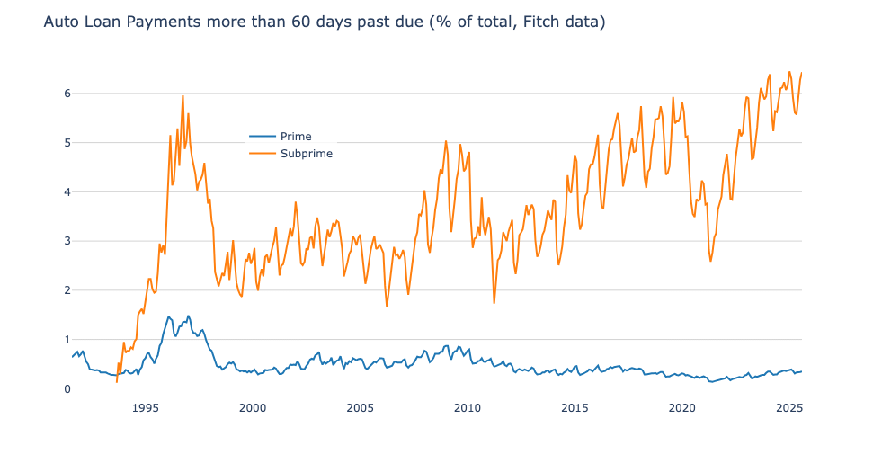
Interesting how prime loans are still at (fairly) low levels. To me this stands out as an illustration of the (US) inequality issue. Lower income households are feeling the crunch far more than upper income households.
Isn’t this what they saw with subprime housing a year or two before the crash? Or do I have that wrong? I thought one of the warning signs was the large amount of homeowners not being able to keep up with their mortgages that they couldn’t afford in the first place? Not saying I think that’s happening, just genuinely curious.
Would be cool to see another piece of data: mean loan payment in current/constant dollars.
Nice chart.
My instinctive read of the chart prior to 2020 and knowing the economic history is that there were a couple of spikes caused by issues in the economy. However there was also a general rise 2013-2019 that I didn’t think correlated to an issue in the economy… And what we see today is likely a continuation of that trend.
So what is that trend? Is that the growth in companies that make money by financing those with poor credit for cars that they repo every few months? Is this sparked by companies figuring out that this is profitable?
why is the data periodic? there is a yearly high-default season with two peaks a year. Does it have anything to do with taxation frequency in the US or something? Or do the dips cooincide with common bonusses or alloance?
Could this indicate a higher default opportunity leading to a potential surplus of houses on the market meaning possible lower house prices?
because incomes have lagged for decades. and once you’re poor it costs you more on every level to even make basic requirements.
You make less $ so you have less cushion.
Your job is probably lower tier work, you’re more likely to be fired or replaced.
You have to have reliable transport, but all truly reliable transport is out of reach or costs some crazy amount. They will only loan you so much, but at a shit rate.
auto companies and dealerships have started to really focus on bundling these debts and selling them. They have to sell cars and move loans and so they search out buyers, not really caring how realistic it is, or if the loan will be paid at all, because in a few months they won’t own the loan any longer.
Many similarities to the 2008 crash and bubble. Shady paperwork and inflated costs and really poor risk loans being spread out. You think a stripped out house with a bad roof is shitty collateral? Think about these automobiles. Scrap metal
Add a line for the inflation-adjusted average car price. It just hit $50,000 in the US, and that’s straight up crazy.
Thank you for including plenty of history! So many of these charts on Reddit are like “Doh! This indicator hit a 2 year high! We’re going to crash!”
Worth noting that subprime make up around 15% of loans.
I worked in suprime auto loans. I beg of everyone to buy a used clunker until you can get your credit back up and have at least 20% cash down.
Otherwise you are paying your car TWICE over because of interest.
So 1k a month car notes aren’t sustainable…wow
20% of new vehicles this year had a payment north of a thousand bucks a month
Are auto loans mostly from dealerships? Trying to find the angle here to make money off this and nothing is coming.
Forgive my ignorance… What technically constitutes an auto loan as subprime?
What is the y-axis scale? 1%, 2%, etc.?
Interesting just from my own experience in finance. Lower wage/credit tend to be more “invested” in the car they drive. As a point of pride. Higher wage earners tend to see it as just another expense. Also why you tend to see higher net worth individuals buying collector cars even if they aren’t car people. They view it as an investment or at least an asset that’s full depreciated and/or possibly more likely to gain value.
The answer to how one goes into poverty:
-very slowly at first, then all of a sudden-
Would love to see the rates and profits even with this many behind, I’ll bet it’s outrageous. Preying on poor people, do payday loans next.
Given how prevalent “rolling negative equity” is these days, I can not imagine consumers are in a strong position
No surprise when, in the USA, you see every other vehicle is a brand-new $60K+ super-truck.
I wish this graph had vertical lines marking the start of each year. There’s a clear annual cycle here, but it’s hard to see how it lines up with the seasons.
My guess is that overdue loans drop at Christmas as everybody finances a car they can’t pay for, and then those loans come overdue gradually over the year. But I can’t quite see the lineup to be sure.
I just bought a car yesterday and sitting with the finance guy he told me some stories about the people they deal with there. Hardly scrapping by and getting ridiculous loans that they can’t afford.
They get the loan, then dump the insurance right away as the first thing because they can’t afford it.
Then they end up either crashing it and losing everything or getting behind on the payments and trying to trade it in to roll the payments into a new loan.
He mentioned that the average loan interest rate on cars is 12% because more people are buying new cars that have poor credit than people with good credit.
Nice chart. Can we see next:
Volume of loans over time
Adjacent/related credit markets with similar views
SP500/Equity performance to see crash correlation
Moltes Gracies!
A lot of people paying a lot of money (that is maybe outside their means) to look like they’re doing ok by having the 5 series on the drive and the instagram post.
Crazy.
This is from an axios article from March 2025
Guy with shorts posts bearish data
Great visualization! The request for overlaying loan payment data is excellent – seeing the correlation between rising loan amounts and delinquency rates would add crucial context.
The seasonal patterns are really interesting too. The January/February spikes from holiday spending and the dips during tax refund season tell a compelling story about how subprime borrowers manage cash flow. This cyclical pattern has been remarkably consistent even as the overall trend line rises.
What’s most concerning is comparing this to 2008 levels – we’re well above those peaks now. While the risk profiles may be better modeled today, the sheer volume of stressed borrowers suggests systemic issues beyond individual credit decisions. Would be valuable to see this alongside average vehicle prices and real wage growth data.
Trackers mean repo men won’t have any trouble collecting these vehicles
This is 6% of 15% of the total auto loan market. So less than 1% of the entire market.
Total dollar amount estimate if that entire 6% defaulted is ~$17B. That is a pittance in a $12.5 Trillion market cap financial sector.
31 comments
Source: Fitch, Tools: Python and Plotly
Interesting how prime loans are still at (fairly) low levels. To me this stands out as an illustration of the (US) inequality issue. Lower income households are feeling the crunch far more than upper income households.
Isn’t this what they saw with subprime housing a year or two before the crash? Or do I have that wrong? I thought one of the warning signs was the large amount of homeowners not being able to keep up with their mortgages that they couldn’t afford in the first place? Not saying I think that’s happening, just genuinely curious.
Would be cool to see another piece of data: mean loan payment in current/constant dollars.
Nice chart.
My instinctive read of the chart prior to 2020 and knowing the economic history is that there were a couple of spikes caused by issues in the economy. However there was also a general rise 2013-2019 that I didn’t think correlated to an issue in the economy… And what we see today is likely a continuation of that trend.
So what is that trend? Is that the growth in companies that make money by financing those with poor credit for cars that they repo every few months? Is this sparked by companies figuring out that this is profitable?
why is the data periodic? there is a yearly high-default season with two peaks a year. Does it have anything to do with taxation frequency in the US or something? Or do the dips cooincide with common bonusses or alloance?
Could this indicate a higher default opportunity leading to a potential surplus of houses on the market meaning possible lower house prices?
because incomes have lagged for decades. and once you’re poor it costs you more on every level to even make basic requirements.
You make less $ so you have less cushion.
Your job is probably lower tier work, you’re more likely to be fired or replaced.
You have to have reliable transport, but all truly reliable transport is out of reach or costs some crazy amount. They will only loan you so much, but at a shit rate.
auto companies and dealerships have started to really focus on bundling these debts and selling them. They have to sell cars and move loans and so they search out buyers, not really caring how realistic it is, or if the loan will be paid at all, because in a few months they won’t own the loan any longer.
Many similarities to the 2008 crash and bubble. Shady paperwork and inflated costs and really poor risk loans being spread out. You think a stripped out house with a bad roof is shitty collateral? Think about these automobiles. Scrap metal
Add a line for the inflation-adjusted average car price. It just hit $50,000 in the US, and that’s straight up crazy.
Thank you for including plenty of history! So many of these charts on Reddit are like “Doh! This indicator hit a 2 year high! We’re going to crash!”
Worth noting that subprime make up around 15% of loans.
I worked in suprime auto loans. I beg of everyone to buy a used clunker until you can get your credit back up and have at least 20% cash down.
Otherwise you are paying your car TWICE over because of interest.
So 1k a month car notes aren’t sustainable…wow
20% of new vehicles this year had a payment north of a thousand bucks a month
Are auto loans mostly from dealerships? Trying to find the angle here to make money off this and nothing is coming.
Forgive my ignorance… What technically constitutes an auto loan as subprime?
What is the y-axis scale? 1%, 2%, etc.?
Interesting just from my own experience in finance. Lower wage/credit tend to be more “invested” in the car they drive. As a point of pride. Higher wage earners tend to see it as just another expense. Also why you tend to see higher net worth individuals buying collector cars even if they aren’t car people. They view it as an investment or at least an asset that’s full depreciated and/or possibly more likely to gain value.
The answer to how one goes into poverty:
-very slowly at first, then all of a sudden-
Would love to see the rates and profits even with this many behind, I’ll bet it’s outrageous. Preying on poor people, do payday loans next.
Given how prevalent “rolling negative equity” is these days, I can not imagine consumers are in a strong position
No surprise when, in the USA, you see every other vehicle is a brand-new $60K+ super-truck.
I wish this graph had vertical lines marking the start of each year. There’s a clear annual cycle here, but it’s hard to see how it lines up with the seasons.
My guess is that overdue loans drop at Christmas as everybody finances a car they can’t pay for, and then those loans come overdue gradually over the year. But I can’t quite see the lineup to be sure.
I just bought a car yesterday and sitting with the finance guy he told me some stories about the people they deal with there. Hardly scrapping by and getting ridiculous loans that they can’t afford.
They get the loan, then dump the insurance right away as the first thing because they can’t afford it.
Then they end up either crashing it and losing everything or getting behind on the payments and trying to trade it in to roll the payments into a new loan.
He mentioned that the average loan interest rate on cars is 12% because more people are buying new cars that have poor credit than people with good credit.
Nice chart. Can we see next:
Volume of loans over time
Adjacent/related credit markets with similar views
SP500/Equity performance to see crash correlation
Moltes Gracies!
A lot of people paying a lot of money (that is maybe outside their means) to look like they’re doing ok by having the 5 series on the drive and the instagram post.
Crazy.
This is from an axios article from March 2025
Guy with shorts posts bearish data
Great visualization! The request for overlaying loan payment data is excellent – seeing the correlation between rising loan amounts and delinquency rates would add crucial context.
The seasonal patterns are really interesting too. The January/February spikes from holiday spending and the dips during tax refund season tell a compelling story about how subprime borrowers manage cash flow. This cyclical pattern has been remarkably consistent even as the overall trend line rises.
What’s most concerning is comparing this to 2008 levels – we’re well above those peaks now. While the risk profiles may be better modeled today, the sheer volume of stressed borrowers suggests systemic issues beyond individual credit decisions. Would be valuable to see this alongside average vehicle prices and real wage growth data.
Trackers mean repo men won’t have any trouble collecting these vehicles
This is 6% of 15% of the total auto loan market. So less than 1% of the entire market.
Total dollar amount estimate if that entire 6% defaulted is ~$17B. That is a pittance in a $12.5 Trillion market cap financial sector.
Comments are closed.