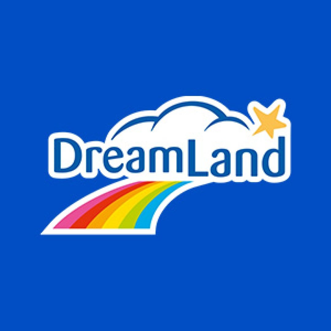
Goh, de wolk was toch altijd een essentieel deel van het logo, vind ik toch.
New owners new logo 🤷♂️
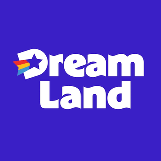
It looks a bit like the logo of a cheap chain, which dreamland isn’t
Didn’t they go out of business a couple of years ago?
🙁
No.
Er is iets dat me stoort aan de golvende letters..
Previous one is better. Dreamland nicely on top of the rainbow.
This one looks…anything but magical.
I do however really like the font of the new logo
A brand image consultant made easy money there
Wtf, wa is er mis met het oude?
Sowieso dat er iemand het woord “knipoog” in de voorstelling van het nieuwe logo gebruikt heeft.
Looks a bit “Murica” to me

It’s the first time I notice there was a star in their logo. They should’ve kept the cloud.
My favourite thing about this is imagining the tens of the thousands of euros some consulting firm got paid to come up with the new logo and the thousands more that will be required to update it everywhere.
The logo is fine with today’s standards of logo’s but their AI generated mascot (no joke) is crazy.

Awful
Ik zeg toch nog altijd de Lima.
ah the classic minimalist logo thats all the rage nowadays…its horrible
Thanks dreamland for clarifying what type of queer you are (pansexual)
Crap
Looks more American (just the name instead of an actual logo), so boring, bland, uninspired, which is BAD for a toy store.
Don’t like the new logo
Disgusting
For the ignorant or oblivious people here:
1. Toy Champ has ownership of all Dreamland stores. It has been quite a while like this.
2. For the rebranding they where searching to have the same name for all stores. In the end Dreamland name was kept and applied to the Toy Champ stores.
3. The mascot of Toy Champ was a monkey named ‘Champy’. This monkey was also rebranded to ‘Dreamy’. This is also a monkey but with rainbow hair.
My kid loves the monkey ‘Champy’ so she is glad it’s kinda kept in this way.
Also, that blue? Ugh.
Bof.
I don’t like it

Lijkt op een donut shop logo ofzo ????
When is the last time you heard of Dreamland? This post is the exact point of a logo change. It’s not to look better, it is to get people talking about it, and it is working.
I personally prefer the full rainbow over the accidental pansexual pride flag.

36 comments
Yea that’s a no from me.
🤢
I do not care.
Goh, de wolk was toch altijd een essentieel deel van het logo, vind ik toch.
New owners new logo 🤷♂️
It looks a bit like the logo of a cheap chain, which dreamland isn’t
Didn’t they go out of business a couple of years ago?
🙁
No.
Er is iets dat me stoort aan de golvende letters..
Previous one is better. Dreamland nicely on top of the rainbow.
This one looks…anything but magical.
I do however really like the font of the new logo
A brand image consultant made easy money there
Wtf, wa is er mis met het oude?
Sowieso dat er iemand het woord “knipoog” in de voorstelling van het nieuwe logo gebruikt heeft.
Looks a bit “Murica” to me

It’s the first time I notice there was a star in their logo. They should’ve kept the cloud.
My favourite thing about this is imagining the tens of the thousands of euros some consulting firm got paid to come up with the new logo and the thousands more that will be required to update it everywhere.
The logo is fine with today’s standards of logo’s but their AI generated mascot (no joke) is crazy.

Awful
Ik zeg toch nog altijd de Lima.
ah the classic minimalist logo thats all the rage nowadays…its horrible
Thanks dreamland for clarifying what type of queer you are (pansexual)
Crap
Looks more American (just the name instead of an actual logo), so boring, bland, uninspired, which is BAD for a toy store.
Don’t like the new logo
Disgusting
For the ignorant or oblivious people here:
1. Toy Champ has ownership of all Dreamland stores. It has been quite a while like this.
2. For the rebranding they where searching to have the same name for all stores. In the end Dreamland name was kept and applied to the Toy Champ stores.
3. The mascot of Toy Champ was a monkey named ‘Champy’. This monkey was also rebranded to ‘Dreamy’. This is also a monkey but with rainbow hair.
https://preview.redd.it/r80zey0k6wwf1.jpeg?width=674&format=pjpg&auto=webp&s=618f163ee9cdea997ac0ab6925482bcab574d626
My kid loves the monkey ‘Champy’ so she is glad it’s kinda kept in this way.
Also, that blue? Ugh.
Bof.
I don’t like it

Lijkt op een donut shop logo ofzo ????
When is the last time you heard of Dreamland? This post is the exact point of a logo change. It’s not to look better, it is to get people talking about it, and it is working.
I personally prefer the full rainbow over the accidental pansexual pride flag.
Comments are closed.