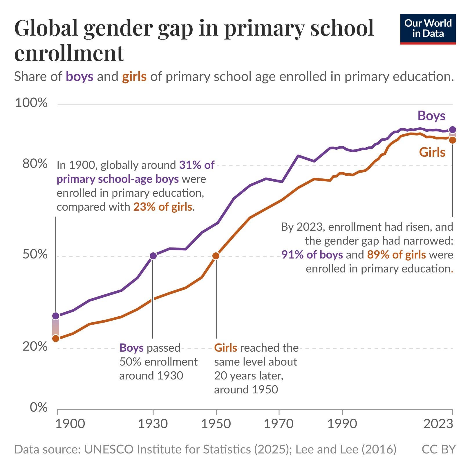
I work at Our World in Data and made this chart for one of our Data Insights, where I explain better what's behind the data: https://ourworldindata.org/data-insights/a-century-of-progress-in-access-to-primary-education
Posted by eortizospina
![[OC] A century of progress in access to primary education](https://www.europesays.com/wp-content/uploads/2025/10/mwq33j3jqgyf1-1620x1024.jpeg)
I work at Our World in Data and made this chart for one of our Data Insights, where I explain better what's behind the data: https://ourworldindata.org/data-insights/a-century-of-progress-in-access-to-primary-education
Posted by eortizospina
12 comments
I work at Our World in Data and made this chart for one of our Data Insights: [ourworldindata.org/data-insights/a-century-of-progress-in-access-to-primary-education](https://ourworldindata.org/data-insights/a-century-of-progress-in-access-to-primary-education)
You can find an interactive version of this chart with data for every country here: [ourworldindata.org/grapher/gender-gap-education-levels](http://ourworldindata.org/grapher/gender-gap-education-levels)
I made this chart using data from UNESCO for recent years, and an academic paper (Lee and Lee 2016) for the historical estimates.
In terms of tools, I used the OWID Grapher for a first version (https://ourworldindata.org/faqs#what-software-do-you-use-for-your-visualizations-and-can-i-use-it) and then I made annotations and improvements in Figma.
A very uplifting graph, thank you.
I’ve seen the US graph for gender and tertiary education but I’d love to see a global one
Is this normalized by the amount of boys and girls? Since there are more boys than girls being born?
does this factor in birth rates or just enrollments? Because arguably speaking if more females are born than ever before then wouldn’t that affect the enrollment numbers as well?
Looks like a ton of progress happened in the late 90s – early 2000s.
Amazing thing is, In secondary and higher education, women are now crushing men.
This would make a good series of graphs that include secondary and tertiary education.
This isn’t a global stat, but I wanted to add something that’s even more impressive: the [gender divide in higher education](https://www.pewresearch.org/short-reads/2024/11/18/us-women-are-outpacing-men-in-college-completion-including-in-every-major-racial-and-ethnic-group/) (in the US). It just continues to widen… which is bad.
123 years is not a century.
What made the gap open up again?
It’s great that so much progress has been made, but it’s sad that globally about 1 in 10 kids is still being left behind and never receiving even a basic education.
Also, it looks like progress has stagnated since the mid to late 2000s.
Comments are closed.