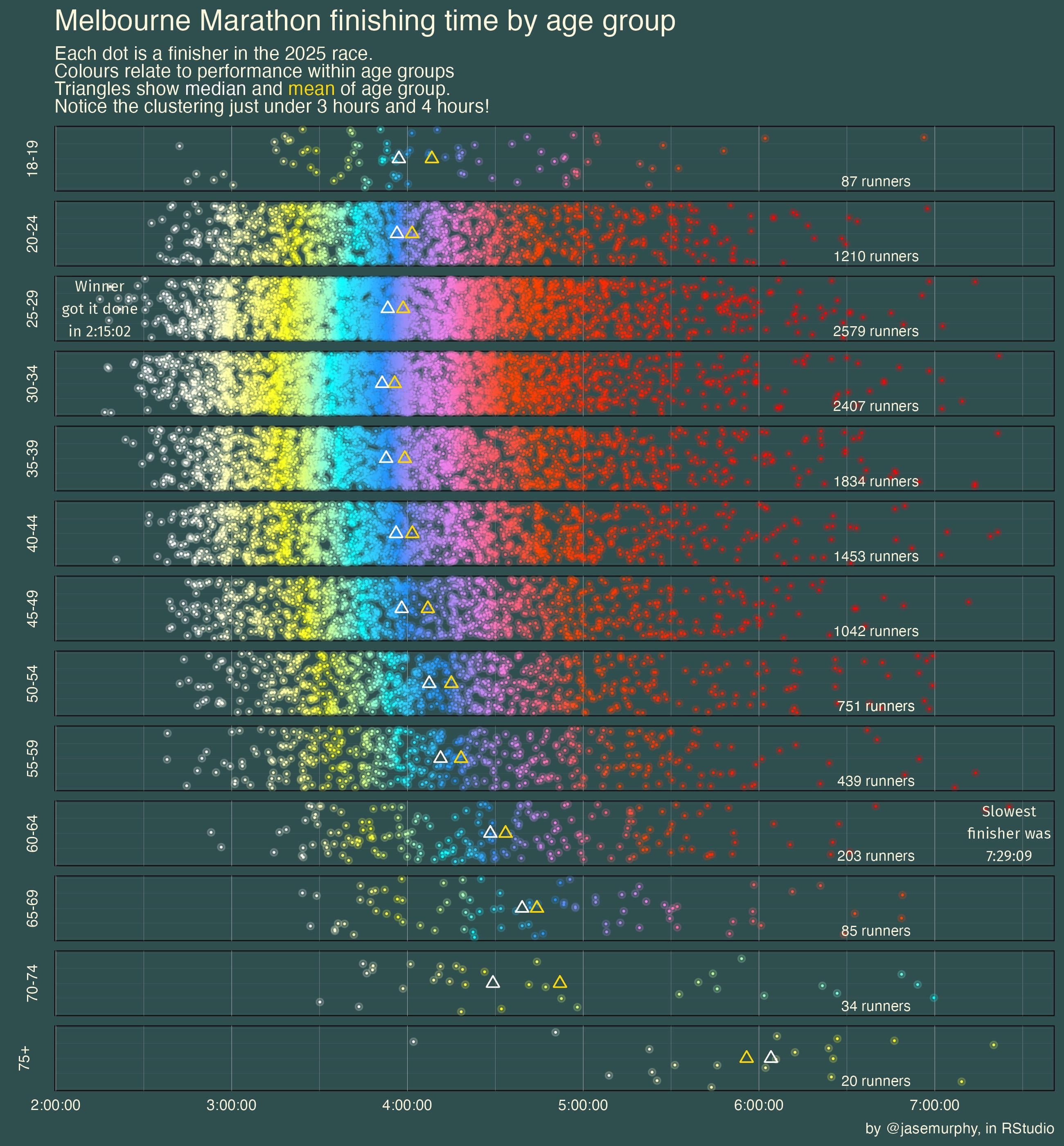
made in RStudio by scraping the multisport Australia website. My favourite part of this visualisation is overlaying two separate geom_points to create a glowing look with a bright dot surrounded by a faint little halo. 🙂
That is a really nice graph! You can see the decline by age and speed groups pretty vell, which is a totally fun extra layer of information.
so, why the cluster just under 3h?
That is a really nice visualization. So much data but clear in many different ways.
Scientific research regarding aging points to stronger setbacks at 44 and sixty (and maybe 78). I imagine that I can see those setbacks here.
Cool visualization but what about gender?
If you’re not breaking down by gender, then each of these age-tranche distributions is going to be massively bimodal.
focusing purely on the presentation:
It makes sense to have the youngest age group at the bottom and the oldest on the top. You already are respecting the left-right transposed to bottom-top for the bounds of the age groups.
Reading them as 75+, 70-74, 65-69, 60-64 is less pleasant than reading 60-64, 65-69, 70-74, 75+
This is great.
I’d love to see a # of runners by time on the X axis similar to the age ground numbers on the right side of the graph.
Mostly because I want to see what impressive % the sub 3.5hr older folks landed in.
![Melbourne Marathon 2025 Finishing Times by age group[OC]](https://www.europesays.com/wp-content/uploads/2025/11/6iu1zfonjiyf1-1920x1024.jpeg)
10 comments
Running a 4 hour marathon at 75+ is insane work
made in RStudio by scraping the multisport Australia website. My favourite part of this visualisation is overlaying two separate geom_points to create a glowing look with a bright dot surrounded by a faint little halo. 🙂
library(rvest)
library(tidyverse)
marathonresults <- vector(mode = “list”, length = length(242))
for (i in 1:242){
marathonresults[[i]] <- paste0(“https://www.multisportaustralia.com.au/races/melbourne-marathon-2025/events/1?page=”, i)
}
marathonresults <- unlist(marathonresults)
marathonresults2 <- vector(mode = “list”, length = 242)
for (i in seq_along(marathonresults)){
marathonresults2[[i]] <- read_html(marathonresults[[i]]) %>% html_table()
}
stragglers<- read_html(“https://www.multisportaustralia.com.au/races/melbourne-marathon-2025/events/1?page=243″) %>% html_table()
stragglecrew<- stragglers[[1]] %>% select(-8) %>%
filter(Pos!=”DNS”) %>% select(time = `Net Time`, age = `Category (Pos)`)
mara3<- marathonresults2 %>% bind_rows() %>% select(time = `Net Time`, age = `Category (Pos)`) %>%
rbind(stragglecrew)
I wonder how much of the shape is selection bias
That is a really nice graph! You can see the decline by age and speed groups pretty vell, which is a totally fun extra layer of information.
so, why the cluster just under 3h?
That is a really nice visualization. So much data but clear in many different ways.
Scientific research regarding aging points to stronger setbacks at 44 and sixty (and maybe 78). I imagine that I can see those setbacks here.
Cool visualization but what about gender?
If you’re not breaking down by gender, then each of these age-tranche distributions is going to be massively bimodal.
focusing purely on the presentation:
It makes sense to have the youngest age group at the bottom and the oldest on the top. You already are respecting the left-right transposed to bottom-top for the bounds of the age groups.
Reading them as 75+, 70-74, 65-69, 60-64 is less pleasant than reading 60-64, 65-69, 70-74, 75+
This is great.
I’d love to see a # of runners by time on the X axis similar to the age ground numbers on the right side of the graph.
Mostly because I want to see what impressive % the sub 3.5hr older folks landed in.
Comments are closed.