I want to preface everything with the disclaimer that my area of expertise is not stock analysis. I’m good with getting data, cleaning data and graphing said data.
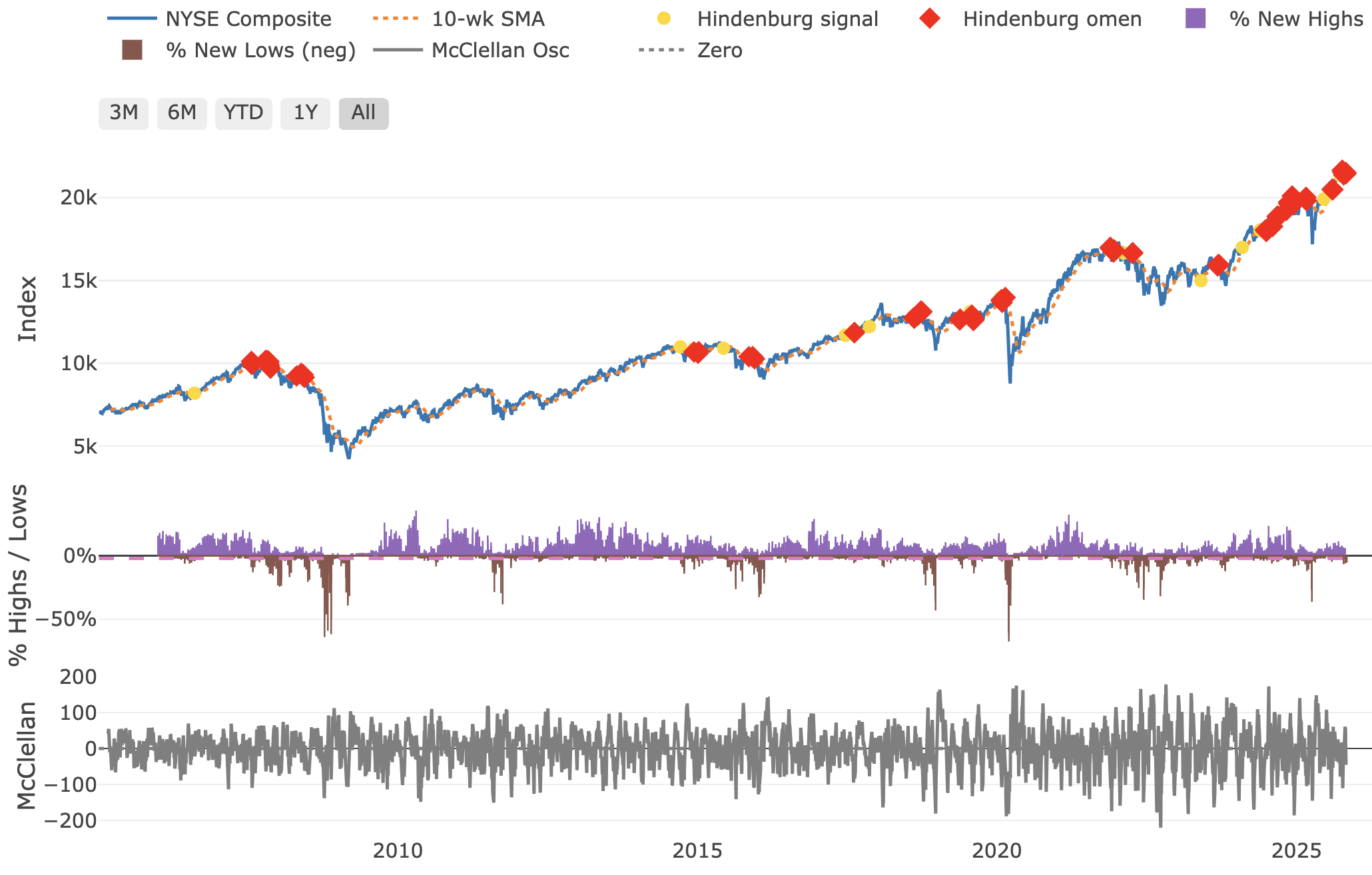
So what is the Hindenburg Omen?
*”The Hindenburg Omen is a combination of technical signals that together forecast the likelihood of a stock market crash. The technical inputs are the 10 Week Simple Moving Average, New 52 week highs on the NYSE, New 52 Week lows on the NYSE, and the McClellan Oscillator. If, on the same day, a) the 10 Week Moving Average is rising, b) New Highs and New Lows are greater than [2.2]% of total issues traded, c) the McClellan Oscillator is negative, and d) New Highs are less than or equal to twice the New Lows then a Hindenburg Signal is indicated by a yellow circle. Two such signals within a 36-day period is considered a Hindenburg Omen and is indicated by a red diamond. The Hindenburg Omen portends a serious decline within the next 40 days.”*
When I look at this data, a few things stands out to me:
1. Late 2014 and early 2015 look to be signaling a crash. While it dipped slightly, there was not a crash.
2. The fall in 2011 has no indicators before it. This isn’t as extreme of a crash as we see elsewhere in the plot
3. There does appear to be some accuracy to it. Even before Covid at the start of 2020, there were multiple indicators signaling the crash.
So what does this all mean? I think there is some truth to this idea but I wouldn’t go so far as to call it an omen. It’s just an indicator we don’t want to see.
This is a plotly object in R. The reason it’s got a ton of stuff is because I can zoom in and turn on or off anything in the plot. Here is the most recent part of the series with what I found interesting.
*Maybe* there is something if you start getting a bunch of signals. But, what is a bunch?
what im seeing here is that apart from 2008 and whatever happened in ~2022 – even right before covid, if you bought stocks when there was an “omen” you would still have made a profit within months to maybe a year
Perhaps it would make sense to analyze each event and whether or not such a decline indeed occurred within the forecast time period. Find n, find magnitude of the median and average decline within each window, compare against randomly chosen dates as “triggers”, look for significance?
Don’t show this to the folks at r/economiccollapse . Those folks seem to want a major depression and crash. I saw a graph there where they basically said the dollar had devalued so much that it was the equivalent of the fall of the Roman Empire….
You can fit anything to *prior data* with 100% accuracy. Go make millions with this model if you think it predicts the future.
What’s the overall success rate? I think it’s around 1/4. Better than a broken clock but not exactly groundbreaking.
My question is will stocks continue to climbong term as the population contracts?
Lol i think any statistical crash indicator is just blaring red alarms every other day in the current economy/market. What this tells me is that the market right now is just straight up operating differently that it has in the past. Interesting chart though.
I believe the longest a bull run has lasted after widespread talk of bubble began was a little over a year back in 1920s. Based on that, crash should be early next summer
![[OC] How Accurate is the Hindenburg Omen?](https://www.europesays.com/wp-content/uploads/2025/11/zr20sawuqgyf1-1920x1024.png)
12 comments
I want to preface everything with the disclaimer that my area of expertise is not stock analysis. I’m good with getting data, cleaning data and graphing said data.
So what is the Hindenburg Omen?
*”The Hindenburg Omen is a combination of technical signals that together forecast the likelihood of a stock market crash. The technical inputs are the 10 Week Simple Moving Average, New 52 week highs on the NYSE, New 52 Week lows on the NYSE, and the McClellan Oscillator. If, on the same day, a) the 10 Week Moving Average is rising, b) New Highs and New Lows are greater than [2.2]% of total issues traded, c) the McClellan Oscillator is negative, and d) New Highs are less than or equal to twice the New Lows then a Hindenburg Signal is indicated by a yellow circle. Two such signals within a 36-day period is considered a Hindenburg Omen and is indicated by a red diamond. The Hindenburg Omen portends a serious decline within the next 40 days.”*
When I look at this data, a few things stands out to me:
1. Late 2014 and early 2015 look to be signaling a crash. While it dipped slightly, there was not a crash.
2. The fall in 2011 has no indicators before it. This isn’t as extreme of a crash as we see elsewhere in the plot
3. There does appear to be some accuracy to it. Even before Covid at the start of 2020, there were multiple indicators signaling the crash.
So what does this all mean? I think there is some truth to this idea but I wouldn’t go so far as to call it an omen. It’s just an indicator we don’t want to see.
This is a plotly object in R. The reason it’s got a ton of stuff is because I can zoom in and turn on or off anything in the plot. Here is the most recent part of the series with what I found interesting.
https://preview.redd.it/ndy3av2rrgyf1.png?width=2164&format=png&auto=webp&s=2a75fcaef778d8e5900994aed3f0897f4622309c
It’s just an unreliable bear cope
*Maybe* there is something if you start getting a bunch of signals. But, what is a bunch?
what im seeing here is that apart from 2008 and whatever happened in ~2022 – even right before covid, if you bought stocks when there was an “omen” you would still have made a profit within months to maybe a year
Perhaps it would make sense to analyze each event and whether or not such a decline indeed occurred within the forecast time period. Find n, find magnitude of the median and average decline within each window, compare against randomly chosen dates as “triggers”, look for significance?
Don’t show this to the folks at r/economiccollapse . Those folks seem to want a major depression and crash. I saw a graph there where they basically said the dollar had devalued so much that it was the equivalent of the fall of the Roman Empire….
You can fit anything to *prior data* with 100% accuracy. Go make millions with this model if you think it predicts the future.
What’s the overall success rate? I think it’s around 1/4. Better than a broken clock but not exactly groundbreaking.
My question is will stocks continue to climbong term as the population contracts?
Lol i think any statistical crash indicator is just blaring red alarms every other day in the current economy/market. What this tells me is that the market right now is just straight up operating differently that it has in the past. Interesting chart though.
I believe the longest a bull run has lasted after widespread talk of bubble began was a little over a year back in 1920s. Based on that, crash should be early next summer
Comments are closed.