Data Source – data.un.org
I’ve been visualizing data from UN and U.S. sources recently, and this one focuses on refugees resettled to the USA.
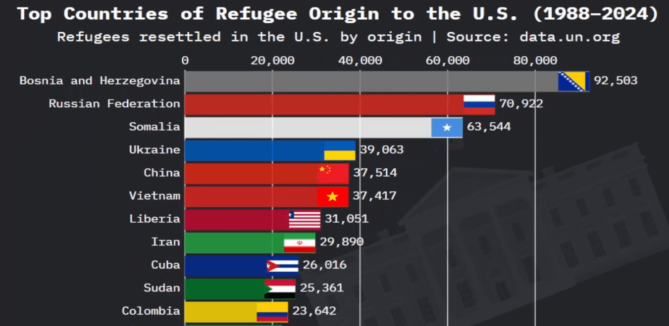
It’s not political, just a way to show how the numbers actually look when turned into a visual.
The data comes from UNHCR and the U.S. Department of Homeland Security’s Yearbook of Immigration Statistics . 2001, Bosnia & Herzegovina dominated that year, followed by Vietnam, Somalia, and Ukraine.
You can see the full animated version here → https://www.youtube.com/watch?v=YXIQo58IUGE&t=1s
It’s part of a bigger project tracking global refugee trends year by year.
Posted by Dismal-Remove4070
2 comments
A little confused by the years. 2001 vs 1988-2024
Crikey. What software was used for that graph, Lotus 1-2-3?
Comments are closed.