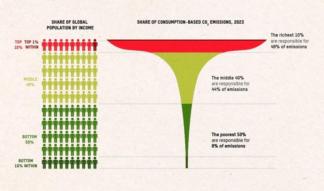
Header says richest 1% while the text says richest 10% based on income which is basically anyone with an above average income in western Europe, US, Australia, Japan,…
It says richest 10%, not 1%
What a piece of dumb propaganda this is…
The headline is wrong. Based on the chart, 1% is responsible for ~15%, and the next 9% is responsible for ~30%. I know the math doesn’t check out. The original article mentions something else that’s interesting. If everyone lived like the richest 0.1%, we would surpass the CO2 emission threshold target in three weeks.
If you double count the emissions made by the consumers of the products manufactured by the companies owned by the 1%.
Wrong title as other comments say.
I also find it unfair that they include their corporations, I think the emissions of a corporation should be shared among all its consumers. That wouldn’t change the fact that the richest produce more CO2, but it would be more accurate.
This post belongs to r/dataiswrong
Your picture says wealthiest **10%** not 1%
Top 10% global income is $15k and top 1% is $50k
title is misleading. This said, that’s good information.
Also i am curious on how the population is divided.
Is it equally divided? And top 10% is the tenth of worldwide population that lives above a certain threshold?
Or is it all the people above an equally divided threshold?
I guess it is the former, ti makes more sense.
A lot of this data is junk, because it all depends on how you attribute carbon emissions.
Some researchers attribute carbon emissions along an entire supply chain and beyond (eg, if you buy an iPhone, the carbon emissions of the workers working in the lithium mines will be attributed to you) others only attribute immediate carbon emissions, some stop somewhere in the supply chain, others stop in different places in the supply chain etc.
Like lots of soft sciences, researchers just get the results they want by fudging the definitions.
How is this beautiful data made?
Is it their personal spending or is it the emissions from their companies (that we all buy from)?
Oxfam is a very leftish organisation, so they tend to “bend” data to fit their narrative, so I’d like to be sure this is presented properly?
I wonder how many think „Those pesky elites“ not knowing they are the pesky elite.

12 comments
Header says richest 1% while the text says richest 10% based on income which is basically anyone with an above average income in western Europe, US, Australia, Japan,…
It says richest 10%, not 1%
What a piece of dumb propaganda this is…
The headline is wrong. Based on the chart, 1% is responsible for ~15%, and the next 9% is responsible for ~30%. I know the math doesn’t check out. The original article mentions something else that’s interesting. If everyone lived like the richest 0.1%, we would surpass the CO2 emission threshold target in three weeks.
If you double count the emissions made by the consumers of the products manufactured by the companies owned by the 1%.
Wrong title as other comments say.
I also find it unfair that they include their corporations, I think the emissions of a corporation should be shared among all its consumers. That wouldn’t change the fact that the richest produce more CO2, but it would be more accurate.
This post belongs to r/dataiswrong
Your picture says wealthiest **10%** not 1%
Top 10% global income is $15k and top 1% is $50k
title is misleading. This said, that’s good information.
Also i am curious on how the population is divided.
Is it equally divided? And top 10% is the tenth of worldwide population that lives above a certain threshold?
Or is it all the people above an equally divided threshold?
I guess it is the former, ti makes more sense.
A lot of this data is junk, because it all depends on how you attribute carbon emissions.
Some researchers attribute carbon emissions along an entire supply chain and beyond (eg, if you buy an iPhone, the carbon emissions of the workers working in the lithium mines will be attributed to you) others only attribute immediate carbon emissions, some stop somewhere in the supply chain, others stop in different places in the supply chain etc.
Like lots of soft sciences, researchers just get the results they want by fudging the definitions.
How is this beautiful data made?
Is it their personal spending or is it the emissions from their companies (that we all buy from)?
Oxfam is a very leftish organisation, so they tend to “bend” data to fit their narrative, so I’d like to be sure this is presented properly?
I wonder how many think „Those pesky elites“ not knowing they are the pesky elite.
Comments are closed.