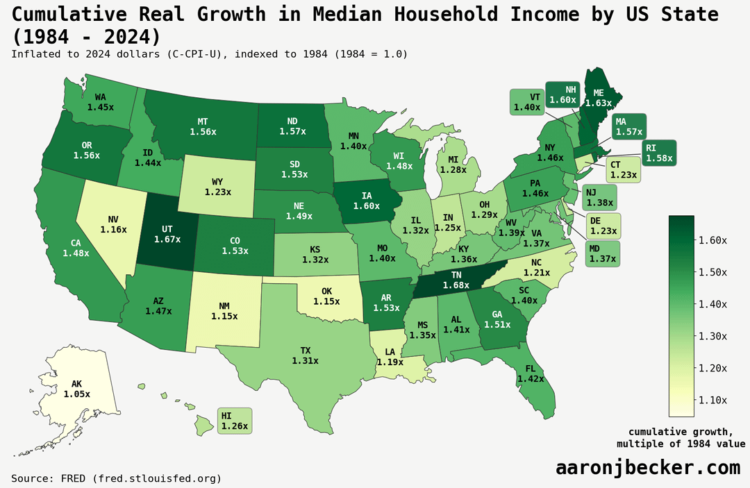
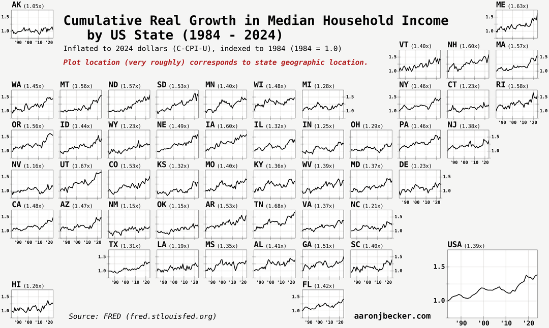
Swipe for grid cartogram with trends. Median household income is mostly relevant as a measure of housing affordability, since the only constant in what defines a household is living together. Code and analysis: https://aaronjbecker.com/posts/real-median-household-income-growth-by-state-since-1984/
Posted by aar0nbecker
15 comments
Data source: FRED ([link to table with all series](https://fred.stlouisfed.org/release/tables?rid=249&eid=259515))
Tools: python, pandas/polars, matplotlib, geopandas
[link to blog post with code walkthrough](https://aaronjbecker.com/posts/real-median-household-income-growth-by-state-since-1984/)
Reddit armchair economic experts on their way now to explain how this is wrong:
“Finally some good content”
But seriously, I find this well presented. I wish there was some incorporation of the absolute values, but otherwise very neatly done. I like plots.
It’s interesting to see how the mountain west seemed to be both more affected by the ’08 crash and overperform afterwards.
The interesting part of this is that there isn’t some obvious difference between regions like north vs south or east vs west. The highest 4 states are Utah, Iowa, Tennessee, and Maine, which are pretty spread out.
maybe kinda nitpicking here but the difference between “grew BY 1.5x” and “grew TO 1.5x” is not made very clear on the first map, although it is clear on the second map from context.
edit never mind its like, written right below the oclor bar but i still dont love it. i have no better suggestion really but could the wording of the title somehow make it more clear? idk. lazy reader here
I think the numbers should’ve been in % instead of ×. So like +67% for Utah instead of 1.67 times. Otherwise great map.
Per-state data is tolerable, but per-county data is better.
Income up by 53%; home prices up 129%; car prices up 140%; Cost of living up 200%. I see no problems here at all.
Neat. What’s driving Tennessee?
Does the data take into account government transfer payments, especially for **Alaska** where the oil fund is universal and pretty substantial?
(I really like the geographic grid of state-label plots by the way. Best way I’ve seen this kind of data arranged!)
Utah’s growth in income has a lot to do with their burgeoning tech sector and highly educated populace. Utah has a diversified economy, so even when coal mining (a big business in the aptly-named Carbon County) declined, the state as a whole fared well.
I live in NM, but occasionally travel to Utah to visit family. The contrast is stunning. Utah is a much more prosperous and economically vibrant state.
Reminds me of [this report](https://www.commerce.gov/news/blog/2023/09/income-ranking-metros-has-changed-little-1980) from a few years ago. I hadn’t realized that New England outside of Connecticut wasn’t as relatively wealthy as it is now. Also, it seems states were generally a little more similar across metros across metros than they are now.
While I need the South had been poor, it was *really* poor bad then. Now, Birmingham’s the median for the top 110 metros (Charlotte, Nashville, Fayetteville AR all *really* rose.).
Does “inflated to 2024 dollars” mean this growth is adjusted for inflation? Because if not – with 40 years of 2% inflation, this makes everything x2.21 times more expensive. So effectively all salaries have decreased instead of increased?
I know Utah’s huge growth must have something to do with the Mormons. FLDS used to scam the shit out of the US govt.
if you had asked me to guess, I would have put North Dakota, Colorado and Washington first. I certainly never would have guessed Tennessee or Maine, though Utah isn’t so surprising.
Comments are closed.