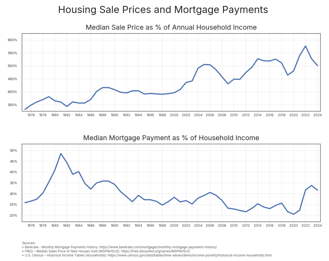
I hope that all the Millennials and GenZs who think they are uniquely screwed by home mortgage costs look at this graph. Your parents had it worse.
So house prices are going up(as a percentage of income), but mortgages going down? So the loans are longer then?
You can really see when housing shortages began to become significant – from the late 1990s onward. After that point the price is entirely correlated with purchasing power, which is caused because if there is a shortage of supply compared to demand, the price is entirely determined by how much people have available to pay.
This.
People forget (and GenZ never learned in the first place) how high interest rates were in the early 1980ies.
Everyone thinks interest rates should be 3%, and that “6% is super-high!”.
While it’s very clear that the housing costs have been rising very rapidly, and we need more new construction, less NIMBY-isms etc. – let’s also have some perspective – paying ~30% of your household income for mortgage (or rent) is not *that* crazy, historically – and history exits before 2020.
A “household” also used to be mostly couples, but nowadays it’s a lot of singles, as people get married later (if at all). But they also buy homes later as a result, lots of different trends.
A lot of the housing market over the last 4 decades has been driven by 30 year mortgage interest rates continuously decreasing.
That ended a few years ago.
It’s been fun, but that party’s over.
The graph above displays structural factors like supply and demand. Corporations can often outbid families, while there is insufficient supply due to zoning laws.
The graph below reflects monthly affordability for homeowners, mostly driven by interest rate. But that only indicates those who can afford buying a home, not (young) people who are entirely left behind from the market. There are many people who can’t buy a house.
This data is not beautiful, it’s woefully incomplete and downright moronic to glean anything serious from.
For starters, we would need the following charts:
* How many people were purchasing homes
* What were the ages of people purchasing homes
* What was the home inventory during this period
* How many of these loans were subsidized
* Breakdown of this data by cities/states/population, etc
* Total paid over life of a loan, were extra payments being made
Even with that other data, which is dang near impossible to obtain with any fidelity, the only correlation here is how economically illiterate a person actually is vs how much engagement it deserves.
Edit: account is less than a day old and starts shitposting moron crap immediately. You guys are wasting your time.
Now do Australian state capital cities, you will never believe it when you see it. Then do Auckland
The [MSPNHSUS series on FRED that you used](https://fred.stlouisfed.org/series/MSPNHSUS) only includes new construction houses, which are a negligible portion of the overall housing market in many areas, especially the expensive ones.
Great illustration of how availability of money has translated into higher house prices.
![[OC] Housing Sale Prices and Mortgage Payments](https://www.europesays.com/wp-content/uploads/2025/11/6in3zy71ea0g1-1324x1024.png)
10 comments
I hope that all the Millennials and GenZs who think they are uniquely screwed by home mortgage costs look at this graph. Your parents had it worse.
So house prices are going up(as a percentage of income), but mortgages going down? So the loans are longer then?
You can really see when housing shortages began to become significant – from the late 1990s onward. After that point the price is entirely correlated with purchasing power, which is caused because if there is a shortage of supply compared to demand, the price is entirely determined by how much people have available to pay.
This.
People forget (and GenZ never learned in the first place) how high interest rates were in the early 1980ies.
Everyone thinks interest rates should be 3%, and that “6% is super-high!”.
While it’s very clear that the housing costs have been rising very rapidly, and we need more new construction, less NIMBY-isms etc. – let’s also have some perspective – paying ~30% of your household income for mortgage (or rent) is not *that* crazy, historically – and history exits before 2020.
A “household” also used to be mostly couples, but nowadays it’s a lot of singles, as people get married later (if at all). But they also buy homes later as a result, lots of different trends.
A lot of the housing market over the last 4 decades has been driven by 30 year mortgage interest rates continuously decreasing.
That ended a few years ago.
It’s been fun, but that party’s over.
The graph above displays structural factors like supply and demand. Corporations can often outbid families, while there is insufficient supply due to zoning laws.
The graph below reflects monthly affordability for homeowners, mostly driven by interest rate. But that only indicates those who can afford buying a home, not (young) people who are entirely left behind from the market. There are many people who can’t buy a house.
This data is not beautiful, it’s woefully incomplete and downright moronic to glean anything serious from.
For starters, we would need the following charts:
* How many people were purchasing homes
* What were the ages of people purchasing homes
* What was the home inventory during this period
* How many of these loans were subsidized
* Breakdown of this data by cities/states/population, etc
* Total paid over life of a loan, were extra payments being made
Even with that other data, which is dang near impossible to obtain with any fidelity, the only correlation here is how economically illiterate a person actually is vs how much engagement it deserves.
Edit: account is less than a day old and starts shitposting moron crap immediately. You guys are wasting your time.
Now do Australian state capital cities, you will never believe it when you see it. Then do Auckland
The [MSPNHSUS series on FRED that you used](https://fred.stlouisfed.org/series/MSPNHSUS) only includes new construction houses, which are a negligible portion of the overall housing market in many areas, especially the expensive ones.
Great illustration of how availability of money has translated into higher house prices.
Comments are closed.