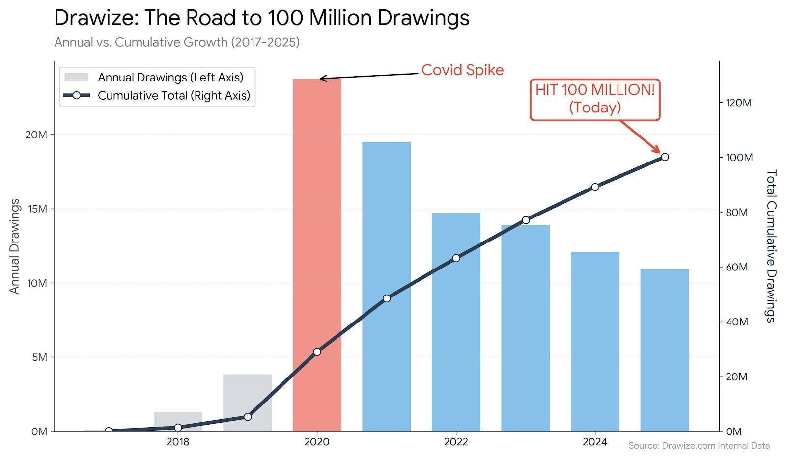
[OC] I processed 100 million drawings on my web game over 8 years. This chart visualizes the massive ‘Lockdown Spike’ vs. the ‘New Normal’.
Posted by lombarovic
[OC] I processed 100 million drawings on my web game over 8 years. This chart visualizes the massive ‘Lockdown Spike’ vs. the ‘New Normal’.
Posted by lombarovic
1 comment
Source: Internal database logs from my web game, Drawize.
Tools: Python (Matplotlib).
Context: I launched this game in 2017 as a solo developer for a contest (which I lost). I kept it running on the side.
The chart shows three distinct phases:
The Slow Start: 2017-2019.
The Covid Spike: In 2020, traffic exploded by 600% as schools and friends played remotely.
The Retention: While the viral spike ended, the “New Normal” settled at ~3x the pre-pandemic volume.
Yesterday, we hit the 100,000,000th drawing. The backend runs on .NET on just 2 servers.
Comments are closed.