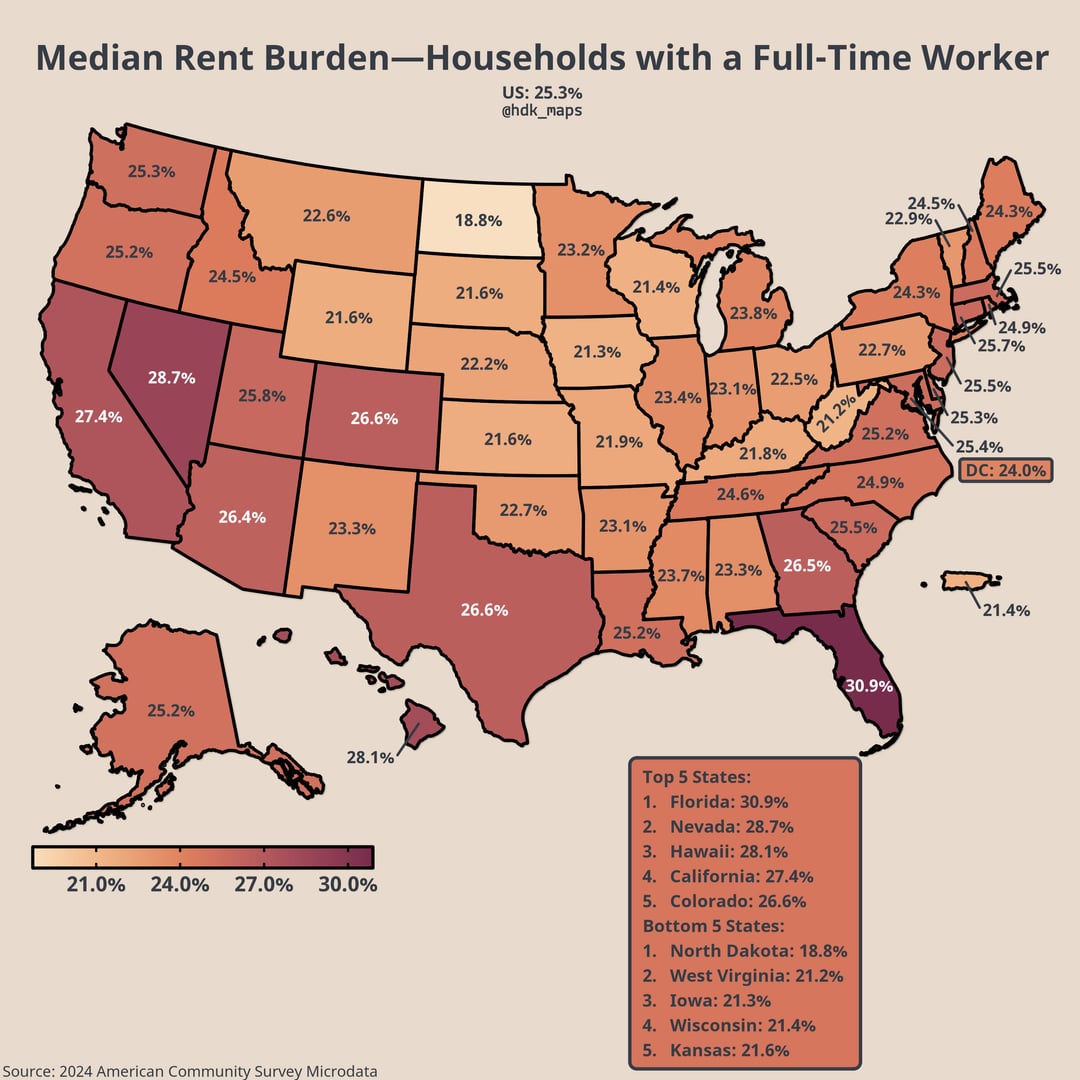
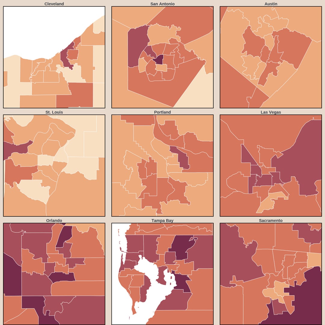
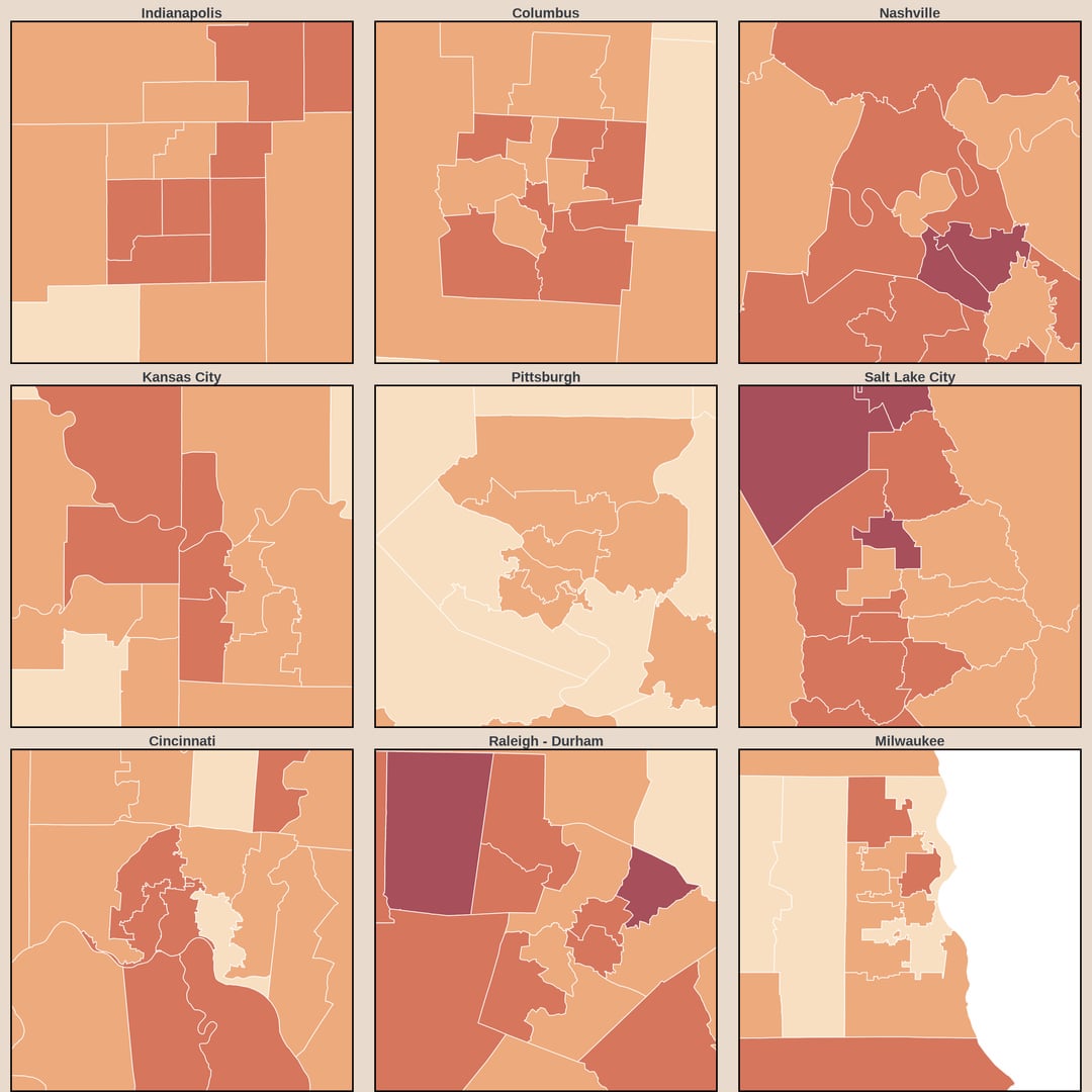
Rent burden is a commonly use metric of housing affordability which is calculated by dividing annual rent by annual household income (for these maps I used gross rent which includes utilities). While it has some value, it seems open to misinterpretation because of how heterogenous households are. To answer “where do renters face the most difficulty paying rent?”, it is necessary to place some restrictions on the population of interest. I decided to count only households with a full-time workers because the ratio of rent to income for households without a full-time worker (such as college students and retirees) is much more likely to be uninformative. The American Community Survey doesn’t directly ask who is a full-time worker, so I defined it as those who worked 48+ weeks in the past year and worked more than 30 hours in a typical week. While the rent burden among households with a full-time worker still has some issues such as failing to account for taxes or transfers, I think it gives a good sense of where people earning local wages can afford local housing.
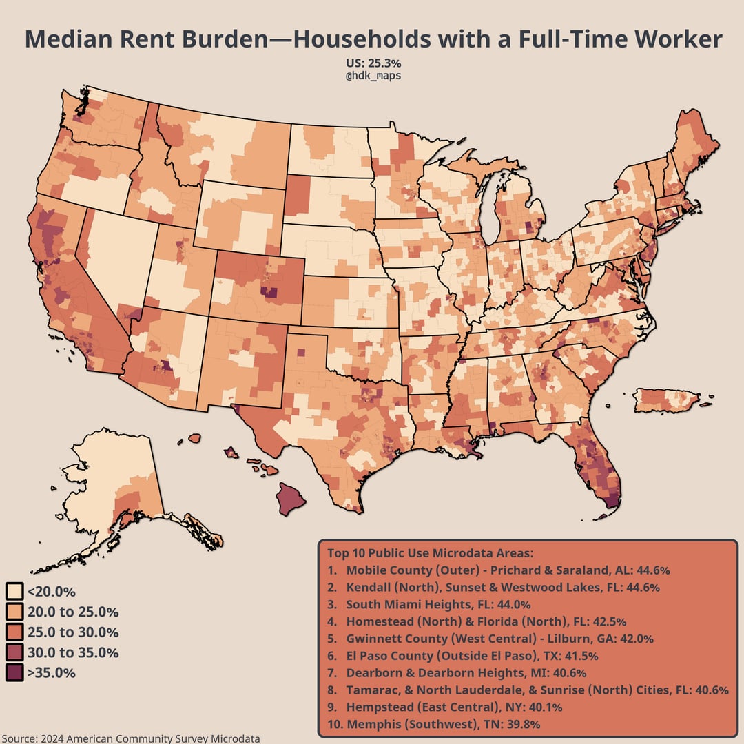
You may be wondering what a Public Use Microdata Area (PUMA) is…
PUMAs are areas designated by the Census Bureau for statistical reporting. They each have between 100k and 200k residents, don’t cross state lines, and follow county and city boundaries when possible. Their big advantage over county maps is letting us see much more detail in urban areas, but it does come at the cost of being able to present all the information in one image. Additionally, many counties often have very high margins of error for survey data like this. The relatively consistent size of PUMAs ensures reasonably low margins of error across the whole map.
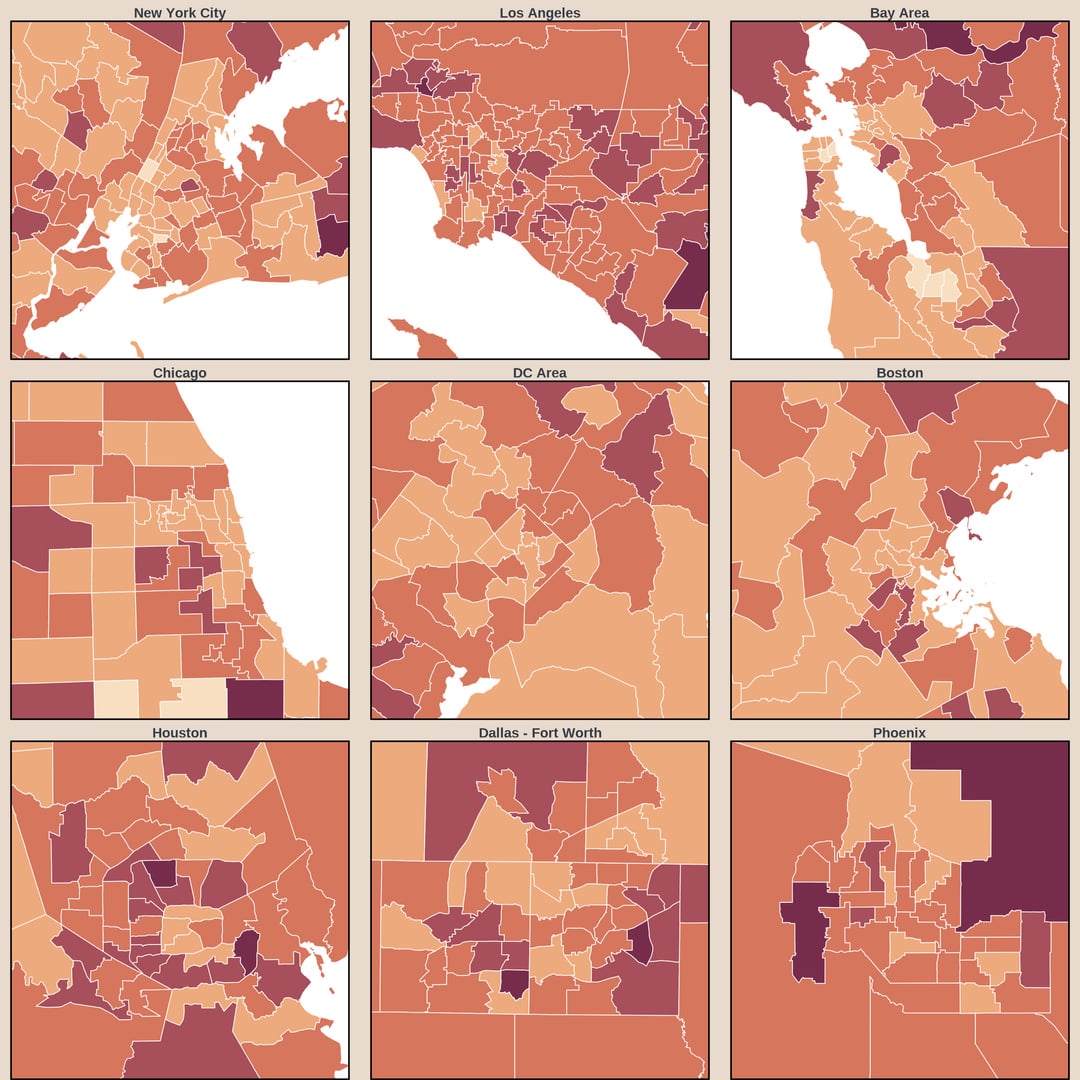
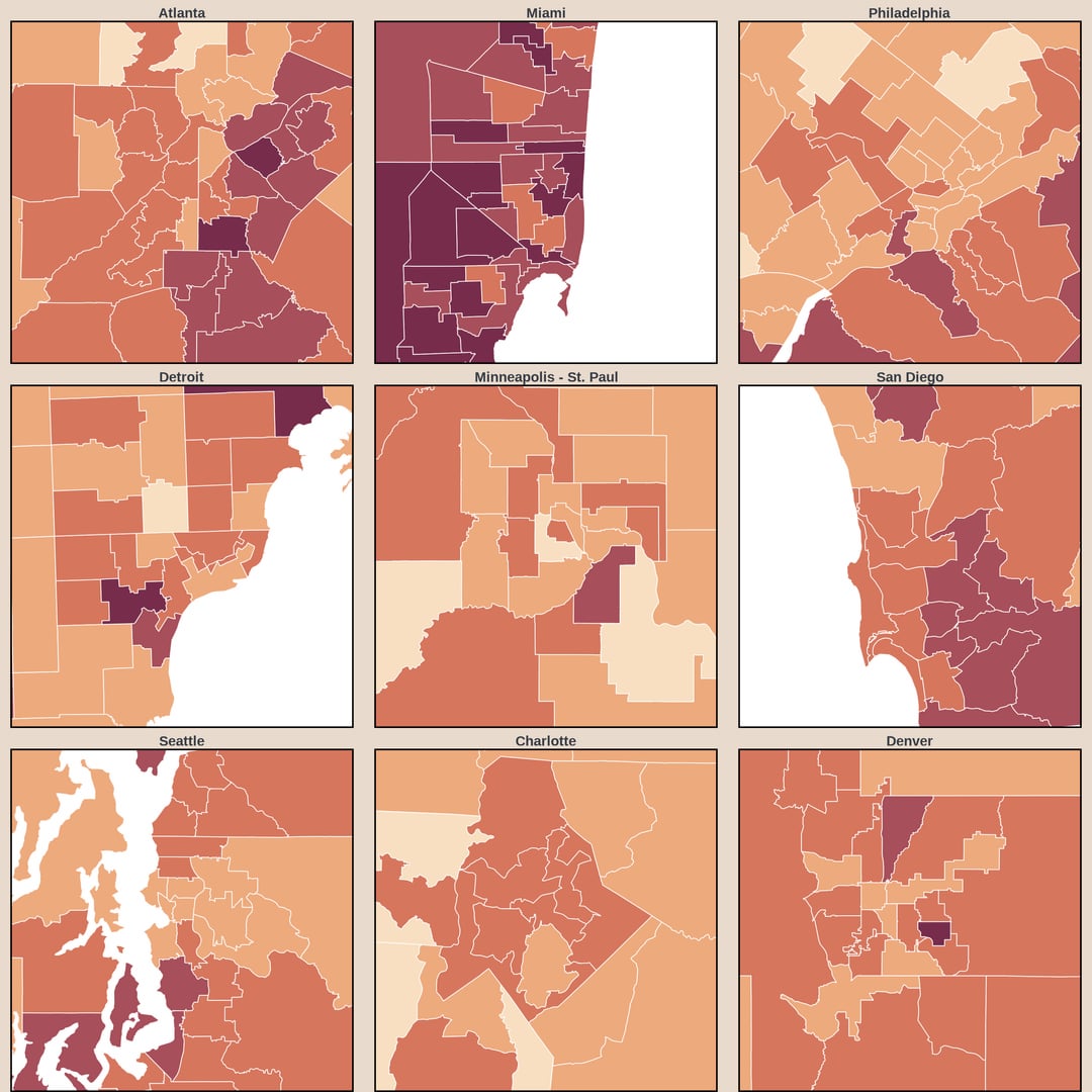
This is really cool, I like seeing this broken down by metro.
WTF is going on in Florida and particularly Miami?
FYI I think this will get removed if you don’t say what tools you used
Really crazy that In colorado this checks out, rent is almost *exactly 26%* of my take home 🤣
This is what this sub is about baby! Good stuff.
How can florida be higher than Hawaii?
Interesting how the highest rent burden states skew strongly with the ratio of urban / rural residents. Nevada has a small population, but nearly everybody who lives there lives in either the Las Vegas or Reno metropolitan areas.
it would be interesting to see whether/how this has changed over time, too– maybe pre and post covid, to see whether the housing boom had significant impacts?
California should be darker but I suppose the less expensive valleys mediate the coast
Yay for maps that include Puerto Rico!
must be nice, my rent is about 70% of my take home pay every month
![[OC] Median Rent Burden Among Households with a FT Worker in the US](https://www.europesays.com/wp-content/uploads/2025/12/pjdsng91jr8g1-1080x1024.jpg)
10 comments
Source: IPUMS USA Census Microdata – 2024 1-year data
Data citation: IPUMS USA, University of Minnesota, [www.ipums.org](http://www.ipums.org/)
Tools: R (packages: dplyr, ggplot2, sf, usmap, tools, ggfx, grid, scales, cowplot, showtext, sysfonts, colorspace)
Rent burden is a commonly use metric of housing affordability which is calculated by dividing annual rent by annual household income (for these maps I used gross rent which includes utilities). While it has some value, it seems open to misinterpretation because of how heterogenous households are. To answer “where do renters face the most difficulty paying rent?”, it is necessary to place some restrictions on the population of interest. I decided to count only households with a full-time workers because the ratio of rent to income for households without a full-time worker (such as college students and retirees) is much more likely to be uninformative. The American Community Survey doesn’t directly ask who is a full-time worker, so I defined it as those who worked 48+ weeks in the past year and worked more than 30 hours in a typical week. While the rent burden among households with a full-time worker still has some issues such as failing to account for taxes or transfers, I think it gives a good sense of where people earning local wages can afford local housing.
You may be wondering what a Public Use Microdata Area (PUMA) is…
PUMAs are areas designated by the Census Bureau for statistical reporting. They each have between 100k and 200k residents, don’t cross state lines, and follow county and city boundaries when possible. Their big advantage over county maps is letting us see much more detail in urban areas, but it does come at the cost of being able to present all the information in one image. Additionally, many counties often have very high margins of error for survey data like this. The relatively consistent size of PUMAs ensures reasonably low margins of error across the whole map.
This is really cool, I like seeing this broken down by metro.
WTF is going on in Florida and particularly Miami?
FYI I think this will get removed if you don’t say what tools you used
Really crazy that In colorado this checks out, rent is almost *exactly 26%* of my take home 🤣
This is what this sub is about baby! Good stuff.
How can florida be higher than Hawaii?
Interesting how the highest rent burden states skew strongly with the ratio of urban / rural residents. Nevada has a small population, but nearly everybody who lives there lives in either the Las Vegas or Reno metropolitan areas.
it would be interesting to see whether/how this has changed over time, too– maybe pre and post covid, to see whether the housing boom had significant impacts?
California should be darker but I suppose the less expensive valleys mediate the coast
Yay for maps that include Puerto Rico!
must be nice, my rent is about 70% of my take home pay every month
Comments are closed.