![[OC] Does traffic have a personality? How Kolkata, Mumbai, and New Delhi move differently through a year (2025)](https://www.europesays.com/wp-content/uploads/2025/12/1xlw1qewbw8g1-1920x1024.png)
After going through so many beautiful posts on this subreddit, here is my attempt at creating one. I analysed hourly traffic data for Kolkata, Mumbai, and New Delhi across 2025 (updated till the early hours of December 22, 2025) to see whether congestion behaves the same way everywhere — or whether cities have distinct “rhythms.”
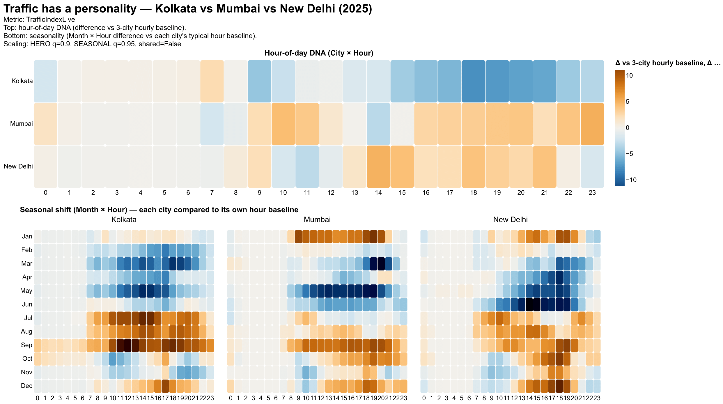
The charts focus on patterns, not rankings. Following is a brief explanation of the panels.
Top panel — Hour-of-day “DNA”
Each cell shows how a city behaves at a given hour relative to the combined average of all three cities at that same hour.
- Blue = calmer than the shared baseline
- Orange/Red = more congested than the shared baseline
This normalisation lets the cities be compared fairly without turning it into a “who’s worst” contest.
Bottom panels — Seasonal shifts (Month × Hour)
Here, each city is compared to its own typical hour-of-day baseline.
This reveals how monsoon months, winter, and late-year periods reshape daily traffic rhythms within each city.
The data itself does not reveal any major surprises regarding the traffic flow in each city.
- Mumbai is the steady grinder, consistently above the shared baseline from late morning through late night.
- New Delhi is the volatile city, with more conspicuous contrasts between the calm and chaos hours
- Kolkata is the breather, with the usual evening congestion, but overall the traffic comes in bursts, not as a constant state.
About the metric
The metric used is TrafficIndexLive, which is commonly associated with TomTom’s Traffic Index methodology.
In simple terms, TrafficIndex reflects how much longer a trip takes compared to free-flow conditions, based on aggregated probe data from navigation devices and apps.
It’s not a direct count of vehicles, and it’s not a single sensor — it’s a modeled index derived from many moving sources.
Tools used: Python and Altair
Data: https://www.kaggle.com/datasets/bwandowando/tomtom-traffic-data-55-countries-387-cities
Posted by VegetableSense
5 comments
Great work! Can you suggest online sites where I can find traffic data for indan cities
Did you use one colour legend for all the cities?
The idea is great, I find the comparison a bit hard to read due to the coloring being relative to itself. Ideally you build a reference and plot according to the reference all plots. You have difference references in the plot.
Nevertheless still a cool idea and plots!
Do check for the traffic data of Bengaluru for comparison, if possible. As the city is infamous for its traffic congestions.
Apart from monsoons, there are definitely spikes around major festivals.
Kolkata has distinct spikes just before and coinciding with Durga Puja – evident in September.
Comments are closed.