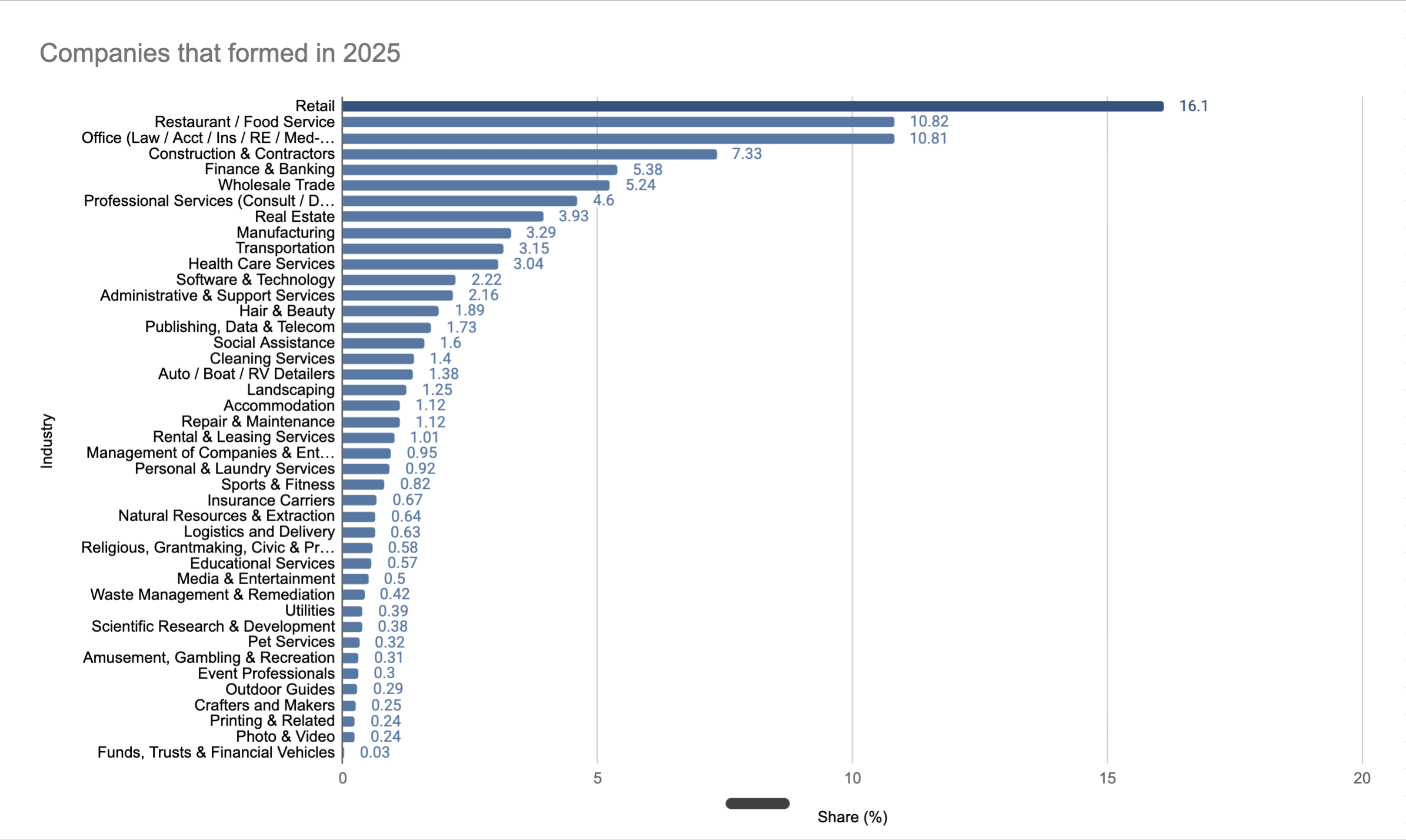
![[OC] Types of businesses being formed in the United States 2025](https://www.europesays.com/wp-content/uploads/2026/01/ftguf4886sag1-1920x1024.png)
The data was collected by our product, which aggregates U.S. business formation records.
I posted this on a pie chart a couple of days ago and received some constructive criticism, so I changed the visual to a bar chart and created better buckets for the industries.
Hope y'all enjoy!
Posted by Practical_Surround_8
13 comments
Data source: Our own product. Company name is Potarix
Tools used: Our product and excel
No yeah, everything is fine. This is all going great.
Is there no real numbers and only percentages available? Using real numbers of businesses, the graph would look the same but we’d know how many were formed
What are independent contractors such as Uber drivers who create their own business for tax purposes classified as? (If you don’t mind my asking).
I feel like there’s nothing that really jumps out as surprising here.
The majority of people opening a small business is doing something like opening up a restaurant or food truck, creating a wedding photography business, etc. Startup costs for a few people involved are generally manageable, and if it doesn’t work they’re out a small investment and can do it again if they still have the funding.
Creating a new tech company or something is going to be significantly more involved and it happens less often. If this changes to invested dollars, you will end up with a significantly different graph.
Is this interesting? Nothing here really sticks out to me
Turning into red light district. Only service/ dick sucked feeling that last a few hours with nothing to show for later.
I’d love to see this data-set with an overlay that also showed business that survived their first 12months of trading – Whilst the UK is a different market, a huge number of retail and food services that start up here, especially with a physical store, struggle to survive their first year.
Main thing this shows me is how “services” is swallowing everything, but that bucket still hides a ton of different realities (solo consultants vs VC-backed platforms, local trades vs online agencies). If you’ve got NAICS or similar under the hood, a second pass breaking out the biggest 10–15 service categories would be killer. I use tools like Stripe Atlas and Clerky data for context; stuff from business-in-a-box players like doola helps sanity-check how many of these are remote founders vs local brick-and-mortar. Main takeaway: services dominate, but it’d be great to see which service niches are actually exploding.
I wonder what this looks like normalized to something like percent of GDP for each industry as sort of ratio.
Is very interesting.
I would love to see this in the context of the share of existing businesses each type of business represents.
Publishing, data and telecom together? I can accespt data and telecom together, but publishing? I do t get it.
Where are Somali daycares
Comments are closed.