
While it’s true that AI coding agents never get tired, they still tap out on you in the form of usage limits. Because of my endless need for revisions, I would just burn through my usage quickly. Since I have subscriptions to Claude Pro and ChatGPT Plus, I wondered if one coding agent could pick things up where the other left off.
And it turns out, it kind of did. I didn’t even bother messing with memory stuff — I simply copied the latest CLAUDE.md into AGENTS.md (and vice versa), and the coding agents were able to figure it out, and I could continue vibe-coding.
Of course, it’s all fun and games until you look under the hood and discover what a mess the coding agents have been making. In my case, I was trying to debug an element when I discovered the reason updates weren’t reflecting on the front end: there were two map renderers in one of the pages. While the agent was updating one renderer, the server was delivering the other.
That was the impetus for me to start thinking about the architecture of the project more seriously. I wasn’t starting from scratch since the agents had already done plenty of work. Understanding what they had done, I standardized everything into a simple architecture:
Presentation layer. I asked Codex to create standard blank templates for Maps, Charts (both lollipops and waffles), and Data Tables, which I should have had there from the beginning, since it allows me to quickly check the accuracy of the data extraction, and gives users a more transparent way to check the provenance of the data. Later, I added another section for AI-generated insights. Whenever a new data page is created, the coding agent simply copies a template and customizes it for the available data. After I did this, I asked the coding agent to standardize all the pages according to the templates.
Extraction layer. For every page on the dashboard, the coding agent writes a script to extract the data from the original spreadsheet and save it into a JSON file. This means that if an error is found in the extraction of the data, the coding agent would just patch the extraction script, run it again, and update the data on the dashboard. When I implemented this architecture, most but not all of the existing pages already had these.
Data layer. Each page has a data.json file that acts as the handoff between extraction and presentation. It stores the structured content for that page (map values, chart blocks, table blocks, notes, and insights), so the UI can stay reusable while the data stays page-specific. Before I implemented this, a handful of pages still wrote data directly in HTML files.
Having this structure makes coding agents more efficient in a few ways. Because they mostly patch existing scripts and files, they do not need to generate large chunks of code from scratch, which reduces token usage. Standard templates also make updates easier to implement, since the same patterns are reused across pages. The separate data layer helps with debugging by making it easier to tell whether an issue is in the rendering code or in the extracted data. Despite these, there are still plenty of inconsistencies across pages, and it would probably need to be refactored at some point to be more maintainable and scalable.
Speaking of more efficient agents, I found that using an older model — in this case GPT-5.3-codex medium on Codex — was less expensive in terms of usage, while still being good enough to take the project through the finish line. I ended up using Codex for most of the rest of the project, only using Claude Code to debug some things the rest of the way.
AI-generated insights can add a lot of value to a data project
I wanted to experiment with using AI to generate insights from the data. To do this, I went through a two-step process. I had the coding agent generate a prompt and save it into a prompt library. I then reviewed the prompt before having the agent run it. The output was then stored before being inserted into the data page.
There are a couple of reasons for this. I wanted to be able to review and edit the prompt manually before running and check the output individually, to see if the prompt was working. Once, when generating insights on teen pregnancy, the AI declared its big discovery: 19-year-olds were much more likely to get pregnant than 15-year-olds. It was accurate, of course, but hardly the groundbreaking insight that the agent thought it had discovered. The prompt needed further revision.
Generating the prompts first for review also prevents overfitting, where the agent writes the instruction already containing its analysis of the data, which prevents it from finding more insightful patterns. It also allows me to use well-performing prompts as templates, again allowing me to save on token usage.
The insights themselves were quite valuable in terms of presenting information that would be hard to glean from maps, charts, and data tables. Consider this paragraph from the AI-generated insights on Intimate Partner Violence: “High-headline regions are not identical in composition. Caraga combines very high emotional violence (21.8) with elevated physical (6.8) and sexual (3.7) violence. Bicol is high across all three major components, including physical violence at 9.1. Central Luzon’s 20.5 headline is driven heavily by emotional violence (18.9) relative to lower sexual violence (2.1).”
Fact-checking workflows can help the auditing process, but strong guardrails are necessary
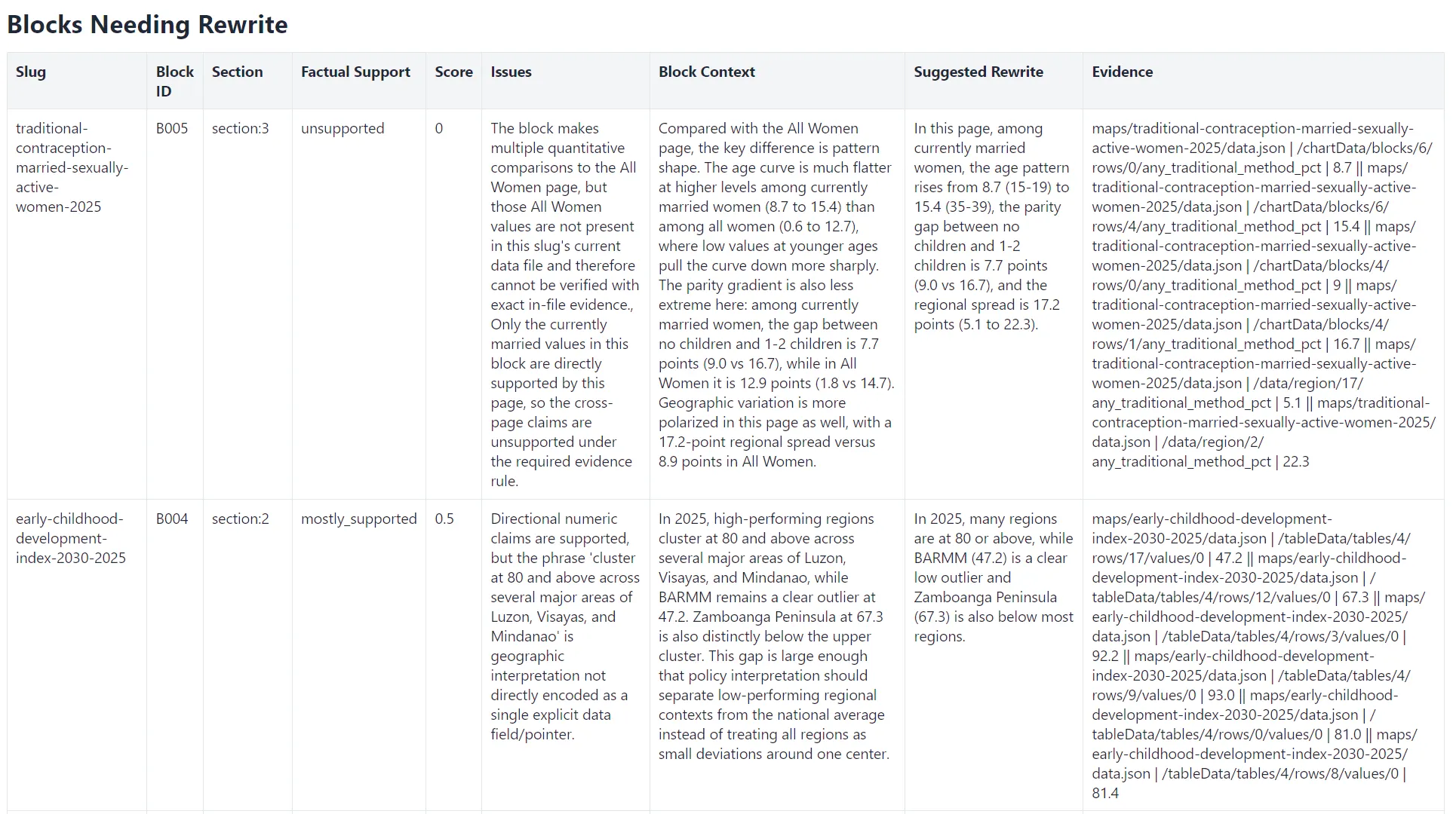 A report from the fact-checking sub-agent, flagging a couple of issues while showing the data to support the scores.
Of course, there’s the first question in journalists’ minds whenever they’re presented with anything AI-generated: is it accurate?
To address this, I built a fact-checking workflow inside the coding agent to check the insights against the data. At first, the fact-checking agent pulled out individual claims, verified them, and suggested rewrites. But checking claims in isolation often stripped away context already present in the same insight block, so the rewrites became repetitive.
I then shifted to block-level fact-checking, where each insight block is checked as a whole against the data. Each block is scored as supported, mostly supported, partly supported, or unsupported. Rewrites are only required for blocks that are not fully supported; supported blocks are left unchanged.
In practice, that still wasn’t enough. When runs got long, agents tended to take shortcuts: they reused familiar evidence patterns, cited nearby but wrong values, or pointed to fields that looked right but did not exactly match the source cell. The output could sound convincing while still being wrong.
So I added stronger guardrails. Every evidence line has to point to an exact data pointer and exact value, and validator scripts check both structural validity and evidence quality before a result is accepted. Failed outputs are rejected and rerun fresh. This turned the process into a stricter audit pipeline rather than a one-pass AI check.
For each insight page, the fact-checker agent generated a scorecard report, showing not just its ratings, but also the data points on which it based its judgment. It also gave an explanation for items with “mostly supported,” “partly supported,” and “unsupported” verdicts. In the end, the fact-checking workflow checked 273 blocks and found 258 were supported, 12 were mostly supported, two were partly supported, and one was unsupported.
While it still wasn’t a polished newsroom tool, this made the manual checking process easier, because the report makes it quickly apparent which claims are straightforwardly backed by the data, which ones need closer reading, and which ones need to be rewritten or removed. If I had to do it all over again, I would have run the fact-checker as soon as the insights were generated, so that it would have been easier to check at a per-page level, rather than one big batch of 273 blocks.
Fact-checking agents could make auditing AI-generated writing more reliable, but there needs to be strong guardrails to make sure that everything is structured, repeatable, and traceable to source data.
Early testers saw real-world applications right away
Stakeholders who have tested the dashboard immediately saw its potential value to their work.
Romelei Camiling-Alfonso, a physician and health innovation expert, said the dashboard will be useful for provincial health officers, municipal health officers, and members of the “doctors to the barrios” program, who are physicians deployed to across the country to deliver primary healthcare services to underserved and remote communities.
Athena Presto, a sociologist who studies gender and policy at the Australian National University, said the project makes the survey data instantly understandable without looking at the numbers. “I think having a low-sensory website is also great for those who just quickly look in and need information right away,” she said.
Pumapodcast co-founder and content chief Tricia Aquino, who has done reporting on the NDHS in the past, was excited by the possibilities of collaboration among newsrooms based on the data and insights from the dashboard. “This project makes it so much easier to see the data, interact with it, and analyze it. It’s easier to find patterns and connections, too,” she said. “There is a wealth of AI-generated insights that can be the starting point for reports across the country, and I can just imagine newsrooms collaborating across regions to present local findings that can influence policy.”
The possibilities are just beginning
One natural next step would be building regional cross-section reports, showing a summary of all NDHS data for each region. This would be especially useful for policymakers, journalists, and advocates who are less interested in national patterns and more focused on what the numbers mean for their specific area.
Another possibility is layering a chatbot on top of the dashboard. Rather than navigating through maps and charts to find an answer, a user could simply ask, “Which region has the highest rate of unmet need for family planning?” and get a response grounded directly in the data. The infrastructure for this already exists in the way the data is structured; it’s mostly a matter of building the right interface on top of it. Of course, this would also require a built-in fact-checking layer.
The dashboard could also grow richer by adding other datasets from the PSA and other sources. The NDHS data is already revealing on its own, but it becomes even more powerful in conversation with other indicators like poverty incidence, regional GDP, or access to health facilities. Cross-referencing these could surface connections that no single dataset could show on its own.
And maybe the most exciting possibility of all is that this entire dashboard — the maps, the charts, the AI-generated insights, the fact-checking pipeline — was built in a week by one person.
Vibe-coding made that possible. But as this project also showed, vibes alone are not enough. The industry now needs to figure out how to train journalists and newsroom workers to actually build things, to give them enough understanding of architecture and data to get there, while keeping them solidly grounded in their editorial judgment.