As far as I know, they make more than they make in Norway.
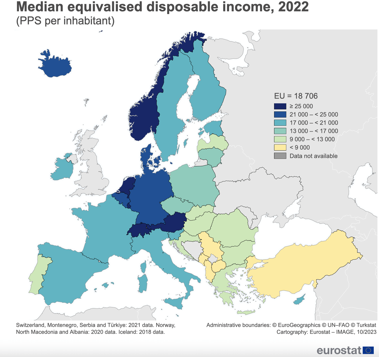
Its in PPS, not any real currency. PPS lets you compare earnings between countries by taking into account price differences. In other words, if prices for goods and services were the same everywhere, how would earnings in your country stack up against earnings in other countries.
And it’s median so half earn less. Quite good map to show overall living/earning conditions.
What the hell is this ridiculous map?! 9000 25000 of what? Because it sure as hell aint the euro.Turkey uses Turkish Lira which is far weaker than the euro, even in 2021 it was far weaker than the euro. Bulgaria uses the Lev, which is equal to 0.51 euro, Romania uses the Romanian leu which is equal to 0.20 euro.
Please stop posting such bullsh!t!
Why is it bullshit? First of all, this value doesn’t translate to any currency. The Yearly wage of the different countries is different and with different currency. For example – Bulgarians can’t have 9000 – 13 000 ??? of disposable income because the yearly wage is around 6000 euro, and what’s left after you pay all the bills is 3500 euro or less. Now make that example for Turkey, where their economy is on the decline and their currency is worthless – 1 TRY = 0.03271 EUR and you get the idea
“why do you want to go to Switzerland”
“[all the other reasons] and the leftover from several times that salary are still higher than whatever leftover I could hope for in Italy”
The drastic economic contrast along the borders in Central Europe is a massive and nearly inexhaustible source of power for shitty populists (on both sides).
Haven’t seen anyone explaining equivalised disposable income
>The equivalised disposable income is calculated in three steps:
>all monetary incomes received from any source by each member of a household are added up; these include income from work, investment and social benefits, plus any other household income; taxes and social contributions that have been paid, are deducted from this sum;
>in order to reflect differences in a household’s size and composition, the total (net) household income is divided by the number of ‘equivalent adults’, using a standard (equivalence) scale: the modified OECD scale; this scale gives a weight to all members of the household (and then adds these up to arrive at the equivalised household size):
>1.0 to the first adult;
>0.5 to the second and each subsequent person aged 14 and over;
>0.3 to each child aged under 14.
>finally, the resulting figure is called the equivalised disposable income and is attributed equally to each member of the household.
Well i clearly drag down my country. Thats for sure.
Bulgaria is very poor don’t believe this nonsense.
Have you guys tried speaking a Germanic language, this seems to help
Being an ignorant in economics, is this a good indicator of where to look for a job, if one has the freedom to move? I know that a choice like that would depend on many other things, but based on this I would think that working in Belgium or Denmark would be better, economically, than working in Ireland or Sweden for example
Really cool map. Probably based on actually declared income. Based on that assumption the map may be flawed a bit, as in eastern europe a lot of income is not declared at all, such as renting out real estate. But that is something that cannot be quantified i assume.0
And Eastern countries also work more hours on Avarage

14 comments
[Source: Eurostat](https://ec.europa.eu/eurostat/web/products-eurostat-news/w/ddn-20231103-1)
Ouch.
I don’t think the Icelandic data is correct.
As far as I know, they make more than they make in Norway.
Its in PPS, not any real currency. PPS lets you compare earnings between countries by taking into account price differences. In other words, if prices for goods and services were the same everywhere, how would earnings in your country stack up against earnings in other countries.
And it’s median so half earn less. Quite good map to show overall living/earning conditions.
What the hell is this ridiculous map?! 9000 25000 of what? Because it sure as hell aint the euro.Turkey uses Turkish Lira which is far weaker than the euro, even in 2021 it was far weaker than the euro. Bulgaria uses the Lev, which is equal to 0.51 euro, Romania uses the Romanian leu which is equal to 0.20 euro.
Please stop posting such bullsh!t!
Why is it bullshit? First of all, this value doesn’t translate to any currency. The Yearly wage of the different countries is different and with different currency. For example – Bulgarians can’t have 9000 – 13 000 ??? of disposable income because the yearly wage is around 6000 euro, and what’s left after you pay all the bills is 3500 euro or less. Now make that example for Turkey, where their economy is on the decline and their currency is worthless – 1 TRY = 0.03271 EUR and you get the idea
“why do you want to go to Switzerland”
“[all the other reasons] and the leftover from several times that salary are still higher than whatever leftover I could hope for in Italy”
The drastic economic contrast along the borders in Central Europe is a massive and nearly inexhaustible source of power for shitty populists (on both sides).
Haven’t seen anyone explaining equivalised disposable income
>The equivalised disposable income is calculated in three steps:
>all monetary incomes received from any source by each member of a household are added up; these include income from work, investment and social benefits, plus any other household income; taxes and social contributions that have been paid, are deducted from this sum;
>in order to reflect differences in a household’s size and composition, the total (net) household income is divided by the number of ‘equivalent adults’, using a standard (equivalence) scale: the modified OECD scale; this scale gives a weight to all members of the household (and then adds these up to arrive at the equivalised household size):
>1.0 to the first adult;
>0.5 to the second and each subsequent person aged 14 and over;
>0.3 to each child aged under 14.
>finally, the resulting figure is called the equivalised disposable income and is attributed equally to each member of the household.
Well i clearly drag down my country. Thats for sure.
Bulgaria is very poor don’t believe this nonsense.
Have you guys tried speaking a Germanic language, this seems to help
Being an ignorant in economics, is this a good indicator of where to look for a job, if one has the freedom to move? I know that a choice like that would depend on many other things, but based on this I would think that working in Belgium or Denmark would be better, economically, than working in Ireland or Sweden for example
Really cool map. Probably based on actually declared income. Based on that assumption the map may be flawed a bit, as in eastern europe a lot of income is not declared at all, such as renting out real estate. But that is something that cannot be quantified i assume.0
And Eastern countries also work more hours on Avarage