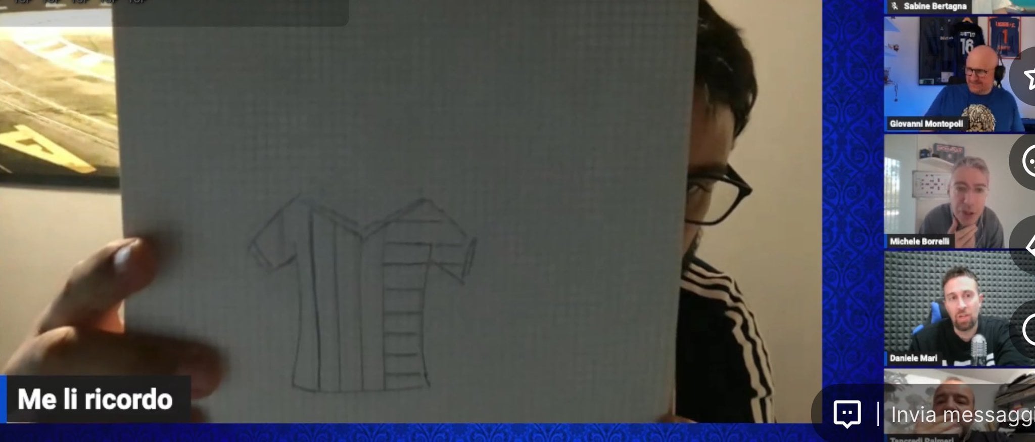
[Guarro] The Inter 24/25 home shirt with the Scudetto stitch and next year’s Second Star should be with black and blue stripes, 1/3 of the stripes will be horizontal and 2/3 of the stripes should be vertical.
by ForzaInter_1908
![[Guarro] The Inter 24/25 home shirt with the Scudetto stitch and next year's Second Star should be with black and blue stripes, 1/3 of the stripes will be horizontal and 2/3 of the stripes should be vertical.](https://www.europesays.com/wp-content/uploads/2024/04/KZEkohSEkN1kXrzTq_1ofX5NgHrqRIKZSoaBuTzVnoY-1920x874.jpg)
[Guarro] The Inter 24/25 home shirt with the Scudetto stitch and next year’s Second Star should be with black and blue stripes, 1/3 of the stripes will be horizontal and 2/3 of the stripes should be vertical.
by ForzaInter_1908
10 comments
🤢
This can’t be true. Please it is an important shirt, lets make a decent one!
I saw the pic and an intense urge to puke rushed through me.
Is this a fucking joke ☠️
Important shirt with 2 stars and they are gonna shit all over it with this design.
From a marketing pov, I understand. We all want the shirt with two stars, first they’ll make a fugly version, then later a standard kit. They figure we’ll buy the ugly one just to get our hands on a two star shirt, then buy the one we actually want once it’s available.
Proof positive that everyone in marketing needs to be fired into the sun
I like when risks are taken but the first season with the 2nd star should be a classic look imo
Ugliest desgign ever possible
I used the FM Kit Creator to create a mock-up of what it could look like with the rumoured sponsor and the scudetto (anulo mufa). Slevees are a bit janky.
https://preview.redd.it/flsetpszm8uc1.png?width=2000&format=png&auto=webp&s=7b8579da9ed0d84b40cd066fe492e0f55912efb6
I hope not.
First season with 2 stars needs to just be a “plain” classic look. Don’t try and get fancy.
Better than the ugly prototype i saw. This seems ok.
Nike sucks.