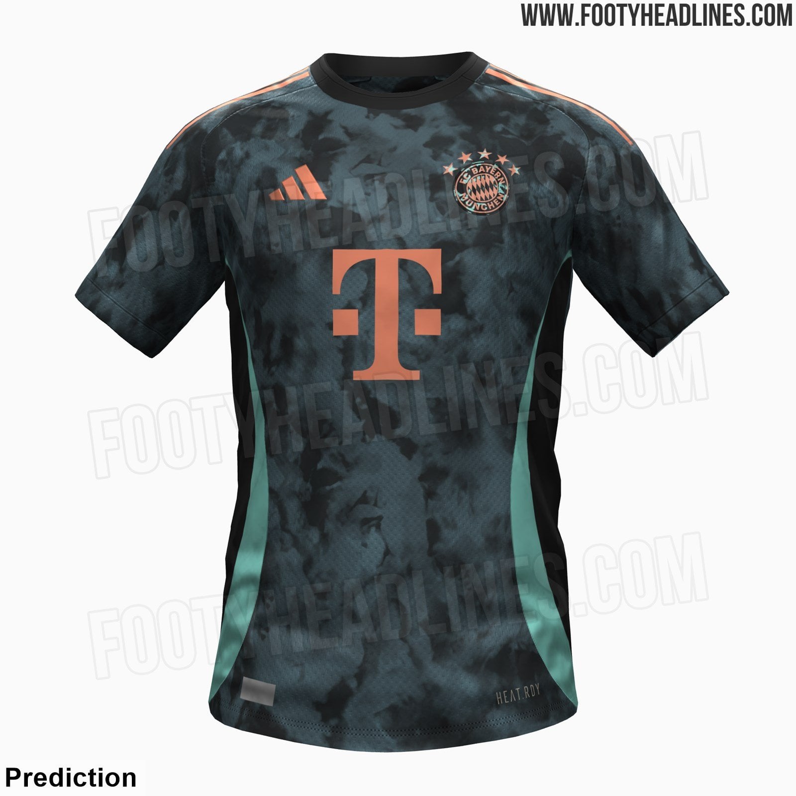
📸 Bayern’s 2024/25 away kit will feature a rust-inspired all-over pattern, paying homage to the Bavaria statue. Below is a more accurate prediction of the kit – it could be nearly identical to the final design [@Footy_Headlines]
by julesvr5
![📸 Bayern's 2024/25 away kit will feature a rust-inspired all-over pattern, paying homage to the Bavaria statue. Below is a more accurate prediction of the kit - it could be nearly identical to the final design [@Footy_Headlines]](https://www.europesays.com/wp-content/uploads/2024/05/bRl3jij3GanBWvJ8Fdzg0kd7wFc9HB2kpzOZv9Zrwo-1600x1024.jpg)
📸 Bayern’s 2024/25 away kit will feature a rust-inspired all-over pattern, paying homage to the Bavaria statue. Below is a more accurate prediction of the kit – it could be nearly identical to the final design [@Footy_Headlines]
by julesvr5
14 comments
At least the home kit is badass
I like the colour scheme, but personally, would’ve been better if the badge was entire copper colour and maybe the blue rust went over the T-Mobile logo
Somethin new, i like it
Meh, I don’t love it
Looks better than the home kit
It could look like shit; but I would love a third kit in blue and white lozenges inspired by the Bavarian flag. Something akin to Croatia’s kit.
More like paying homage to the team’s rusty form.
Why not keep the logo colors (blue, red, white) and golden stars ? But overall, it looks good
Black home and away is interesting
I really like it, rare to see teams these days have copper/brown on their kits yet alone the best club in the world to do it
How do they not have a graphic designer… we haven’t had a nice kit in foreeeever.
Ugh I feel like the kit designs have been so Mid for a couple years
I just want the real club logo…
I think I like it
I loved our away kits last year until I realized the diamonds werent evenly distributed and were in the shapes of continents. So I’ll hold until I see it on someone