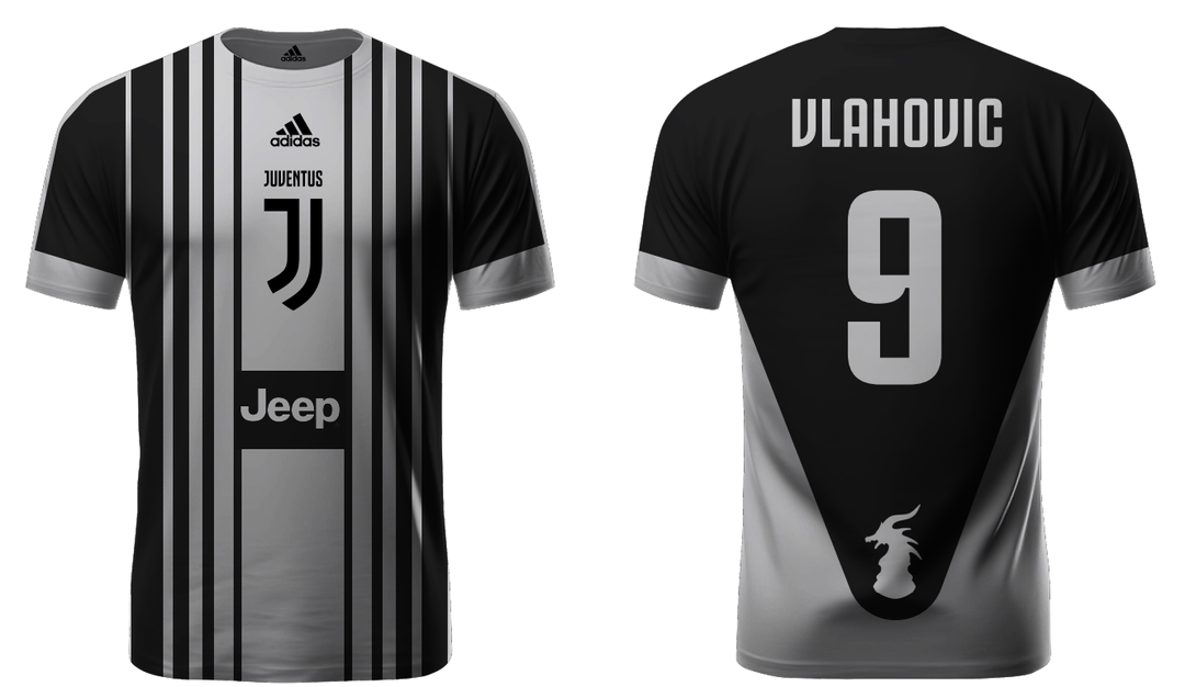
Jeep placment is weird, logo should be on the heart and way smaller, these stripes don’t look nice too. Meanwhile the back of the shirt isn’t bad I guess, looks unusual but it’s passable for me

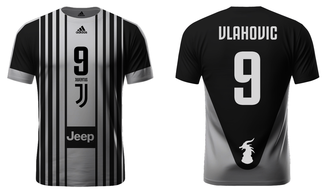
This is absolutely nice! Obviously the gray would be white. I love this and I would buy this!
Same size black and white stripes, at least 4 of each colour.
Main sponsor in the middle of the chest.
Club crest on the left, T-shirt maker logo on the right, slightly above nipple height.
If applicable, badges get added as follows:
Scudetto in the middle, aligned with clubs crest, Coppa patch under shirt manufacturer
Back is continued stripes with white box for the player’s name and number. Name goes on top. No sponsors.
If you want, extra marketing spots – those go on the sleeves in a way that it doesn’t collide with the league badges (i.e. the Champions league ball). Maybe a trampstamp sponsor is also OK, but it needs to be blended in well.
You have artistic freedom with the fill pattern of the stripes and the border (i.e. clean cut, fuzzy or some blending transition). For the letters on the back – Black is the safe bet, but I’ve seen bright yellow also working. The Adidas stripes’ colour, type of neck (classic V? Buttons? Something else) and accent colours are up for grabs too, but don’t go full rainbow style. This is a sports club T-shirt and not a circus outfit.
Anything else is a travesty for a first kit and should be hated.
5 comments
This aint it chief.
Jeep placment is weird, logo should be on the heart and way smaller, these stripes don’t look nice too. Meanwhile the back of the shirt isn’t bad I guess, looks unusual but it’s passable for me

This is absolutely nice! Obviously the gray would be white. I love this and I would buy this!
Same size black and white stripes, at least 4 of each colour.
Main sponsor in the middle of the chest.
Club crest on the left, T-shirt maker logo on the right, slightly above nipple height.
If applicable, badges get added as follows:
Scudetto in the middle, aligned with clubs crest, Coppa patch under shirt manufacturer
Back is continued stripes with white box for the player’s name and number. Name goes on top. No sponsors.
If you want, extra marketing spots – those go on the sleeves in a way that it doesn’t collide with the league badges (i.e. the Champions league ball). Maybe a trampstamp sponsor is also OK, but it needs to be blended in well.
You have artistic freedom with the fill pattern of the stripes and the border (i.e. clean cut, fuzzy or some blending transition). For the letters on the back – Black is the safe bet, but I’ve seen bright yellow also working. The Adidas stripes’ colour, type of neck (classic V? Buttons? Something else) and accent colours are up for grabs too, but don’t go full rainbow style. This is a sports club T-shirt and not a circus outfit.
Anything else is a travesty for a first kit and should be hated.