Bayern’s 2024/25 away shirt,to be launched later this month [@Footy_Headlines] by julesvr5 Tags:FC Bayern MunichFootballgermanySoccer 29 comments Idk how to feel about this It’s cool but i feel like it would have been better for white logos instead of copper ones Dont let this be true please I wanna see how it really looks, those footyheadline leaks always look a bit different Black, red, white, gold. No matter in which combination, these colours usually work. I really don’t like this one, i know they do it to offer something new but i think the recent kits have been really underwhelming. i like it Not terrible? I really like it. It looks like marble and I love the copper. It’s a very natural look, hope we will be tough as stone with these! it looks more like a prematch shirt than the prematch shirt for next season… I think i will also like it. Definitely better than last year’s Make it go away. Looks good. Looks like bronze to celebrate the 3rd place in the Bundesliga Way better than the one from last season much nicer than whatever the world black jersey was this year. My personal favs are the Black-gold/White-gold we had hate to say it but it looks stupid. Wouldn’t mind the badge colour if the shirt design was good atleast I like it, but I would prefer it to be the ucl kit and getting a white away shirt Looks like someone puked blue something on a shirt… Cum stains are an interesting choice 💀 Now I know why de Ligt is okay with a sale LOL look like dried semen. T Stands for third place Replace rose gold with gold and thats kit of the season for sure Thanks, I hate it ugly pictures look a bit off, but most of the leaked pictures do that. But I think the shirt can really work when its worn. Why is it covered in semen stains though.. Personally, I don’t hate it, but I just don’t like it. The Ultras are gonna be pissed tho. Welp im not getting this one Leave a ReplyYou must be logged in to post a comment.
Black, red, white, gold. No matter in which combination, these colours usually work. I really don’t like this one, i know they do it to offer something new but i think the recent kits have been really underwhelming.
I really like it. It looks like marble and I love the copper. It’s a very natural look, hope we will be tough as stone with these!
much nicer than whatever the world black jersey was this year. My personal favs are the Black-gold/White-gold we had
hate to say it but it looks stupid. Wouldn’t mind the badge colour if the shirt design was good atleast
pictures look a bit off, but most of the leaked pictures do that. But I think the shirt can really work when its worn.
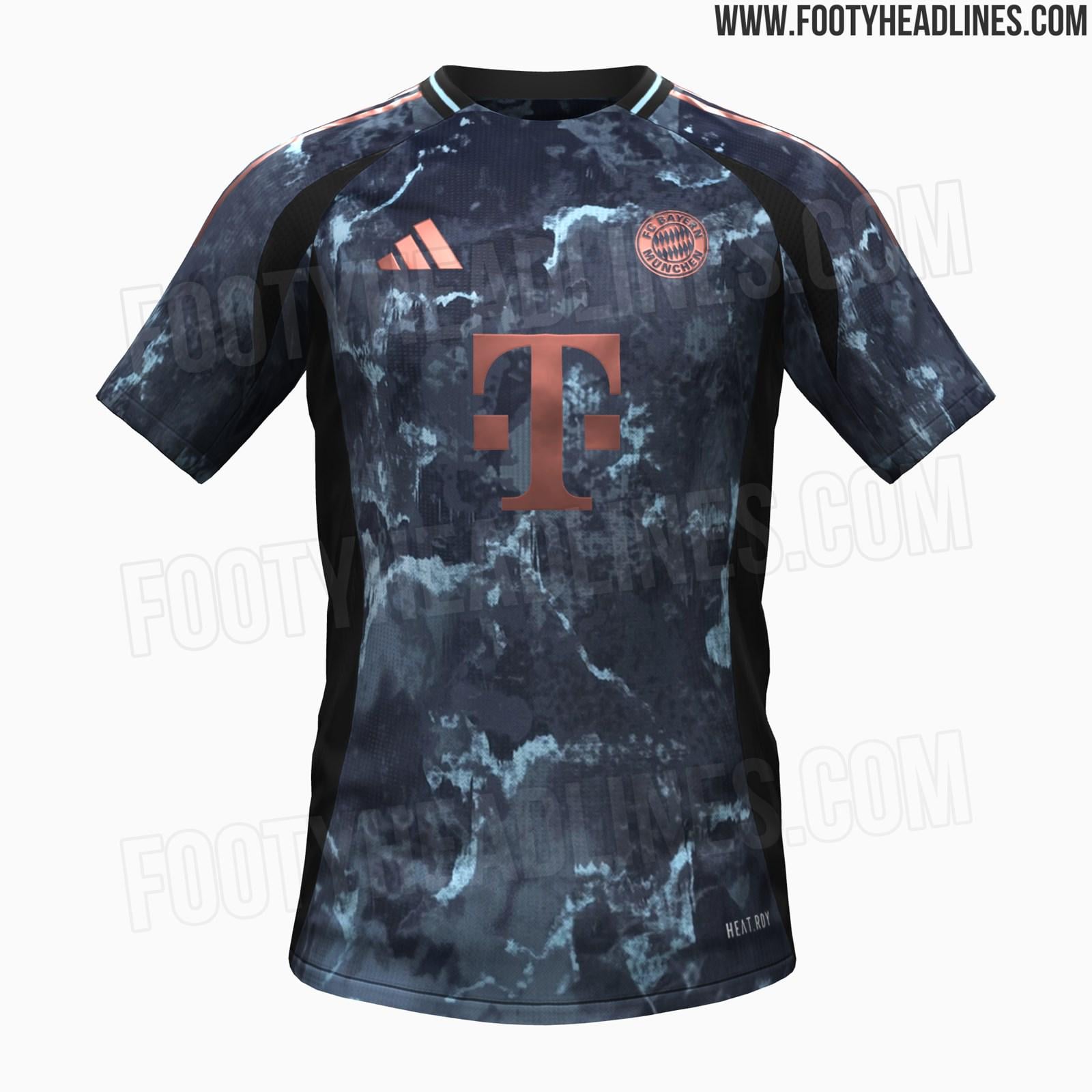
![Bayern's 2024/25 away shirt,to be launched later this month [@Footy_Headlines]](https://www.europesays.com/wp-content/uploads/2024/07/0wo8jo1hr9ad1-1600x1024.jpeg)
29 comments
Idk how to feel about this
It’s cool but i feel like it would have been better for white logos instead of copper ones
Dont let this be true please
I wanna see how it really looks, those footyheadline leaks always look a bit different
Black, red, white, gold. No matter in which combination, these colours usually work.
I really don’t like this one, i know they do it to offer something new but i think the recent kits have been really underwhelming.
i like it
Not terrible?
I really like it. It looks like marble and I love the copper. It’s a very natural look, hope we will be tough as stone with these!
it looks more like a prematch shirt than the prematch shirt for next season…
I think i will also like it. Definitely better than last year’s
Make it go away.
Looks good.
Looks like bronze to celebrate the 3rd place in the Bundesliga
Way better than the one from last season
much nicer than whatever the world black jersey was this year. My personal favs are the Black-gold/White-gold we had
hate to say it but it looks stupid. Wouldn’t mind the badge colour if the shirt design was good atleast
I like it, but I would prefer it to be the ucl kit and getting a white away shirt
Looks like someone puked blue something on a shirt…
Cum stains are an interesting choice 💀
Now I know why de Ligt is okay with a sale LOL
look like dried semen.
T Stands for third place
Replace rose gold with gold and thats kit of the season for sure
Thanks, I hate it
ugly
pictures look a bit off, but most of the leaked pictures do that.
But I think the shirt can really work when its worn.
Why is it covered in semen stains though..
Personally, I don’t hate it, but I just don’t like it. The Ultras are gonna be pissed tho.
Welp im not getting this one