Idk if the US states have live versions of their energy generation, but Kate morely created a really good overview tool for the UK that you may want to check out: https://grid.iamkate.com/
Around 40% of UK energy is fully renewable
I see the data. Where is the beautiful?
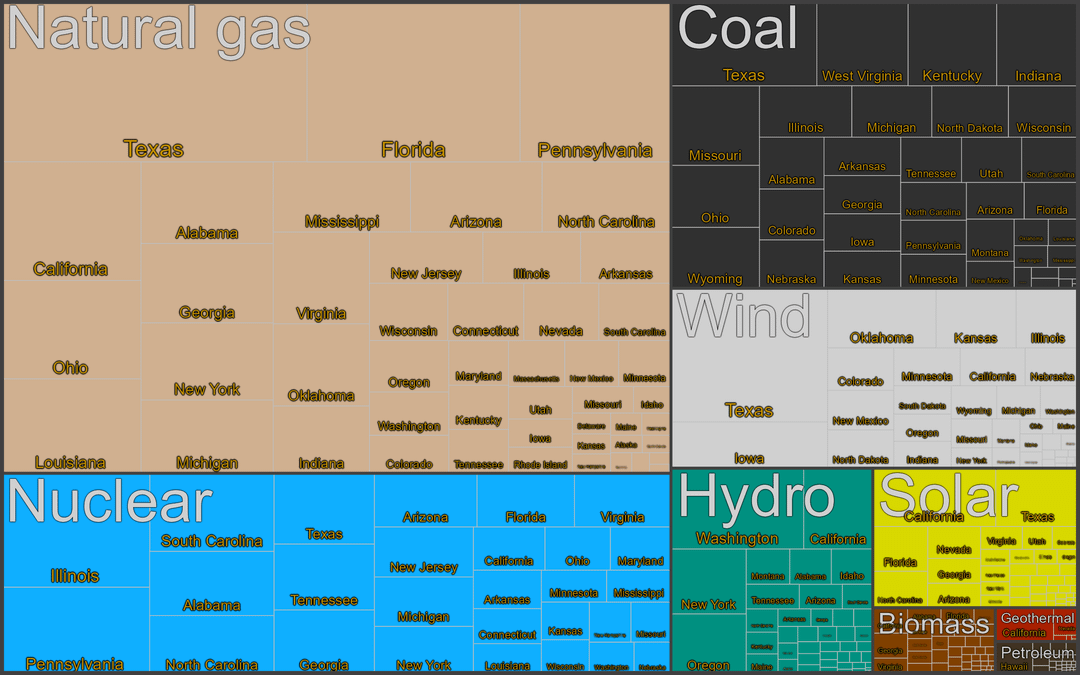
Data are from the EIA.[[1]](https://www.eia.gov/electricity/data/state/) (third excel link from the top, Net Generation by State by Type of Producer by Energy Source (EIA-906, EIA-920, and EIA-923))
Analysis: It’s almost true that “everything’s bigger in Texas”. Texas captures more sunshine than the Sunshine State, more wind than the Windy City’s state and outdoes everyone else in burning things. Illinois is first among many near-equals in the nuclear world. Just a few states have big hydro operations. Geothermal is almost entirely in California (for now). And Hawaii does things differently by burning oil to keep the lights on.
Thats insane how much energy TX uses over CA considering the population differences. I wonder what industry is consuming so much.
Go under the “[largest power stations](https://en.m.wikipedia.org/wiki/List_of_largest_power_stations_in_the_United_States)” tab and see if you notice any trends. Huge amounts of power at astonishing efficiency. Then remember that despite making up only 0.75% of total power plants in the USA, they accounted for 18.6% of the total electricity generated. Nuclear IS the only logical future.
I hate that you made nuclear blue and hydro green
Not beautiful, not easy to read (fonts are hilarious, no quantities). It’s a start, like a first draft but not ready to go.
I’m proud of California. All we need to do is keep the solar push going, harvest our natural gas from waste, and shut down Diablo Canyon, and we’ll be in a good place.
Someeone got the numbers and fancy squares for europe esp germany?
Love to see nuclear so high. Would love to see it higher but it does give me hope
At least I’m glad some states are utilizing their natural strengths like my state of CA really utilizing the amount of sunlight we get and generating a good amount of solar electricity while states like KS and NE are utilizing their wind energy that their states naturally contain.
What does Alabama do with all that power they are generating? They are very small in relative population size.
Interesting data, but I found the diagram very difficult to read.
How tf is California – with their enormous population – generating less energy than TX, FL, PA? Are TX, FL, and PA just super inefficient with how they consume what they generate?
Also, the minuscule amount of solar in so many sunny places boggles my mind.
This not at all pleasant for me to look at, nor beautiful by my opinion
It’s data, but it’s not very beautiful…
This is a grotesque presentation of what is otherwise useful data
20 comments
It’s sad Arizona hasn’t invested more into solar.
Idk if the US states have live versions of their energy generation, but Kate morely created a really good overview tool for the UK that you may want to check out: https://grid.iamkate.com/
Around 40% of UK energy is fully renewable
I see the data. Where is the beautiful?
Data are from the EIA.[[1]](https://www.eia.gov/electricity/data/state/) (third excel link from the top, Net Generation by State by Type of Producer by Energy Source (EIA-906, EIA-920, and EIA-923))
For definitions of each energy source, see https://www.eia.gov/energyexplained/what-is-energy/sources-of-energy.php
Analysis: It’s almost true that “everything’s bigger in Texas”. Texas captures more sunshine than the Sunshine State, more wind than the Windy City’s state and outdoes everyone else in burning things. Illinois is first among many near-equals in the nuclear world. Just a few states have big hydro operations. Geothermal is almost entirely in California (for now). And Hawaii does things differently by burning oil to keep the lights on.
I am making lots of new graphs with which to update wikipedia.[[2]](https://en.wikipedia.org/wiki/Energy_in_the_United_States) Questions and requests are welcome!
edit: forgot to say that this is [OC]. the tool used was R, especially ggplot2 and treemapify
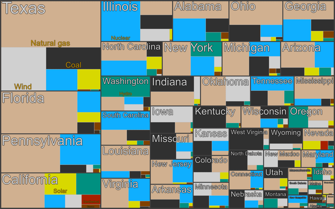
edit2: someone also asked me to do Europe. Here is 2023: https://imgur.com/a/YHOccud
Thats insane how much energy TX uses over CA considering the population differences. I wonder what industry is consuming so much.
Go under the “[largest power stations](https://en.m.wikipedia.org/wiki/List_of_largest_power_stations_in_the_United_States)” tab and see if you notice any trends. Huge amounts of power at astonishing efficiency. Then remember that despite making up only 0.75% of total power plants in the USA, they accounted for 18.6% of the total electricity generated. Nuclear IS the only logical future.
I hate that you made nuclear blue and hydro green
Not beautiful, not easy to read (fonts are hilarious, no quantities). It’s a start, like a first draft but not ready to go.
I’m proud of California. All we need to do is keep the solar push going, harvest our natural gas from waste, and shut down Diablo Canyon, and we’ll be in a good place.
Someeone got the numbers and fancy squares for europe esp germany?
Love to see nuclear so high. Would love to see it higher but it does give me hope
At least I’m glad some states are utilizing their natural strengths like my state of CA really utilizing the amount of sunlight we get and generating a good amount of solar electricity while states like KS and NE are utilizing their wind energy that their states naturally contain.
What does Alabama do with all that power they are generating? They are very small in relative population size.
Interesting data, but I found the diagram very difficult to read.
https://youtu.be/8HdVFE1sgys?si=Ycil-nOFVEp09B8c
[removed]
This is fascinating.
How tf is California – with their enormous population – generating less energy than TX, FL, PA? Are TX, FL, and PA just super inefficient with how they consume what they generate?
Also, the minuscule amount of solar in so many sunny places boggles my mind.
This not at all pleasant for me to look at, nor beautiful by my opinion
It’s data, but it’s not very beautiful…
This is a grotesque presentation of what is otherwise useful data
Comments are closed.