I pulled this data from the Social Security Administration’s web tool: ssa.gov/oact/babynames
Made with R, especially treemapify and ggplot2. I also used the ‘wesanderson’ package for the color scheme and ‘parallel’ to greatly speed up the process of drawing the images.
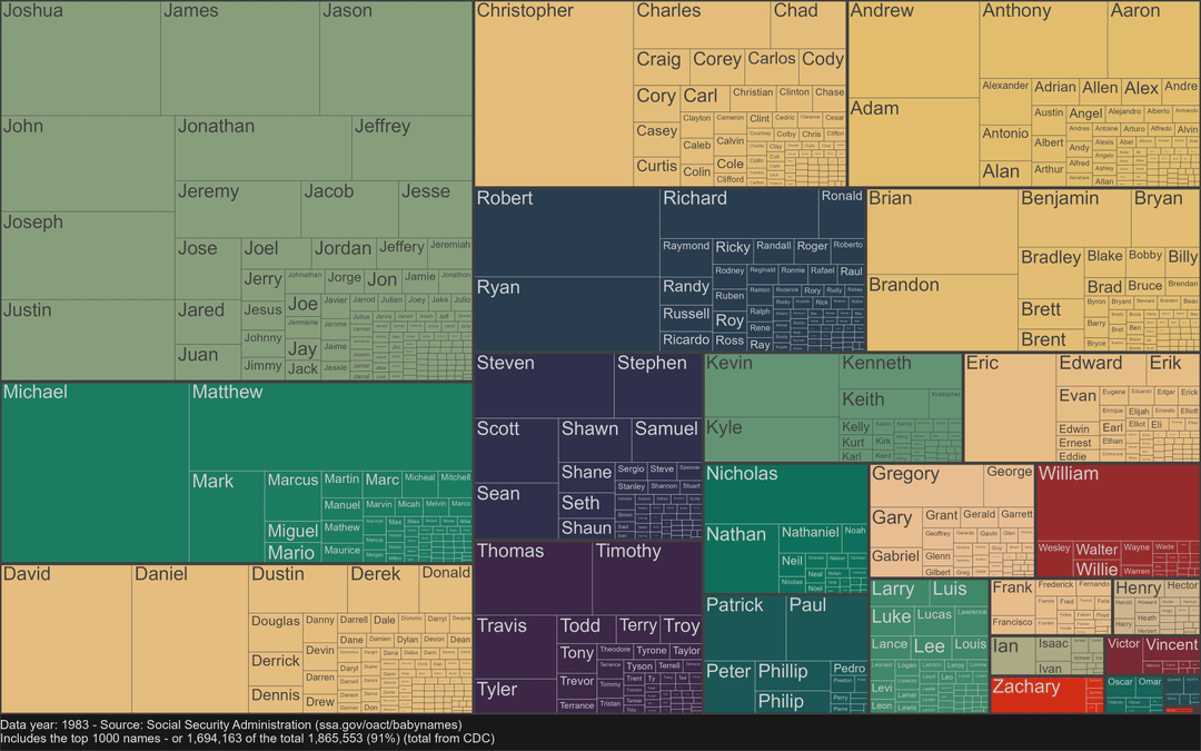
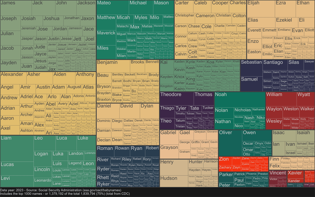
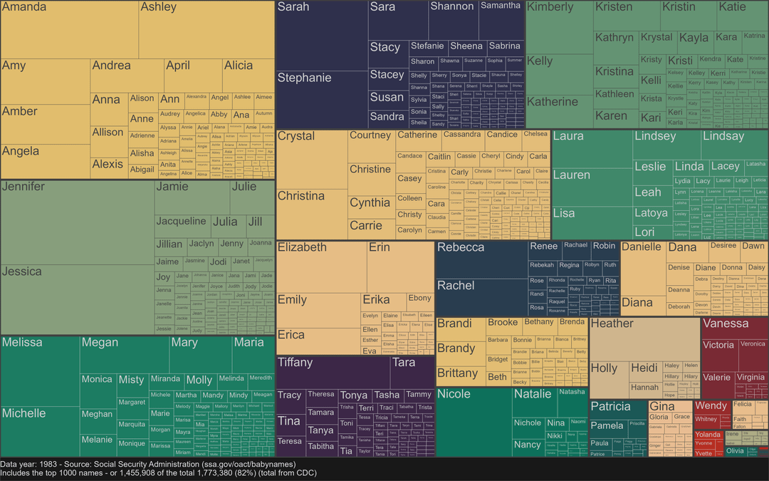
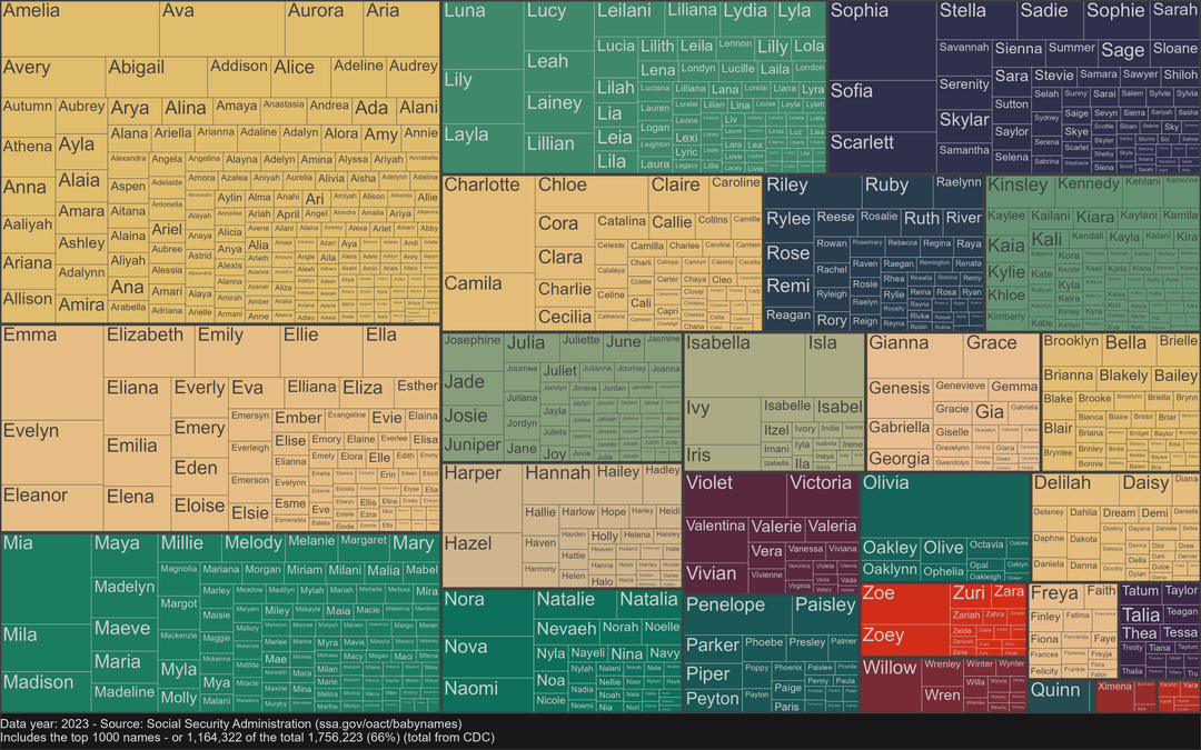
Over the course of 40 years, first names have become much more diffuse in the US. The top 1000 names used to account for 91% of boys and 82% of girls; now they are only 75% and 66%, respectively. The CDC has multiple overlapping tools to grab data on births: wonder.cdc.gov/natality.html, although I used a third-party website to find old data more easily: infoplease.com/us/population/births-sex-and-sex-ratio
I have seen visuals of name frequency before, and most did not allow for much detail. The treemap is great at providing way too much detail, which I think is fine for this case because each person will be curious about different names.
edit: By the way, if someone wants to see a particular year in between, I can probably upload it
Anything similar exists for last names?
Would be useful for me to generate test database tables.
Thiago is much more popular than I would have guessed.
It’s really hard to see from this presentation what’s changed.
Born in 1983, female. I see my name, my sisterŌĆÖs 1985 name, and all my close friends in large print. Haha
Why did our culture fall in love with names that start with J?
F
If you want your kid to have a standout name, start it with an F.
Totally normal common letter (unlike X and Q) but radically underused.
So, people really did go to school with 27 Jennifers.
This data ainŌĆÖt beautiful at all tbh
funny to think back to grade school. I can think of somebody I went to school with from the 80’s name with the most popular names from each group.
Funny to think those will be old people names, one day.
Myriel, Ethel, Eustace, haha.
I’d like to see older names by generation.
For generations this [buzzfeed video](https://youtu.be/IfYjGxI6AJ8?si=FqUwdyCkv45sXy5x) (it’s the only video I really know them for, haha. Regardless of their overall reputation this was pretty cool.)
Their year ranges combined would make a cool set of graphs.
how the hell is this organized?
Karen became non-existent in 2023
My name has gotten far less popular. IŌĆÖve mostly always been the only Roger in a setting, we like to spread out.
There is some straight up r/tragedeigh in here
I’m sorry but this is a horrible visualization
I find it interesting that John, James, and Joseph are in the 1983 female popular names but I canŌĆÖt find mine
Da fuq is this WinDirStat puke?
On the female 1983 slide, I see John, James, Joshua in the J section. Am I missing something?
This data is not beautiful
Who tf names their child juniper?
These “graphs”are horrible
This isn’t ugly or bad data but dude. What’s the point of this sub man? Why not post this in r/Infographics man?
24 comments
I pulled this data from the Social Security Administration’s web tool: ssa.gov/oact/babynames
Made with R, especially treemapify and ggplot2. I also used the ‘wesanderson’ package for the color scheme and ‘parallel’ to greatly speed up the process of drawing the images.
Over the course of 40 years, first names have become much more diffuse in the US. The top 1000 names used to account for 91% of boys and 82% of girls; now they are only 75% and 66%, respectively. The CDC has multiple overlapping tools to grab data on births: wonder.cdc.gov/natality.html, although I used a third-party website to find old data more easily: infoplease.com/us/population/births-sex-and-sex-ratio
I have seen visuals of name frequency before, and most did not allow for much detail. The treemap is great at providing way too much detail, which I think is fine for this case because each person will be curious about different names.
edit: By the way, if someone wants to see a particular year in between, I can probably upload it
Anything similar exists for last names?
Would be useful for me to generate test database tables.
Thiago is much more popular than I would have guessed.
It’s really hard to see from this presentation what’s changed.
Born in 1983, female. I see my name, my sisterŌĆÖs 1985 name, and all my close friends in large print. Haha
Why did our culture fall in love with names that start with J?
F
If you want your kid to have a standout name, start it with an F.
Totally normal common letter (unlike X and Q) but radically underused.
So, people really did go to school with 27 Jennifers.
This data ainŌĆÖt beautiful at all tbh
funny to think back to grade school. I can think of somebody I went to school with from the 80’s name with the most popular names from each group.
Funny to think those will be old people names, one day.
Myriel, Ethel, Eustace, haha.
I’d like to see older names by generation.
For generations this [buzzfeed video](https://youtu.be/IfYjGxI6AJ8?si=FqUwdyCkv45sXy5x) (it’s the only video I really know them for, haha. Regardless of their overall reputation this was pretty cool.)
Their year ranges combined would make a cool set of graphs.
how the hell is this organized?
Karen became non-existent in 2023
My name has gotten far less popular. IŌĆÖve mostly always been the only Roger in a setting, we like to spread out.
There is some straight up r/tragedeigh in here
I’m sorry but this is a horrible visualization
I find it interesting that John, James, and Joseph are in the 1983 female popular names but I canŌĆÖt find mine
Da fuq is this WinDirStat puke?
On the female 1983 slide, I see John, James, Joshua in the J section. Am I missing something?
This data is not beautiful
Who tf names their child juniper?
These “graphs”are horrible
This isn’t ugly or bad data but dude. What’s the point of this sub man? Why not post this in r/Infographics man?
This sub is supposed to be *beautiful data*
My sons name is also Bort.
Comments are closed.