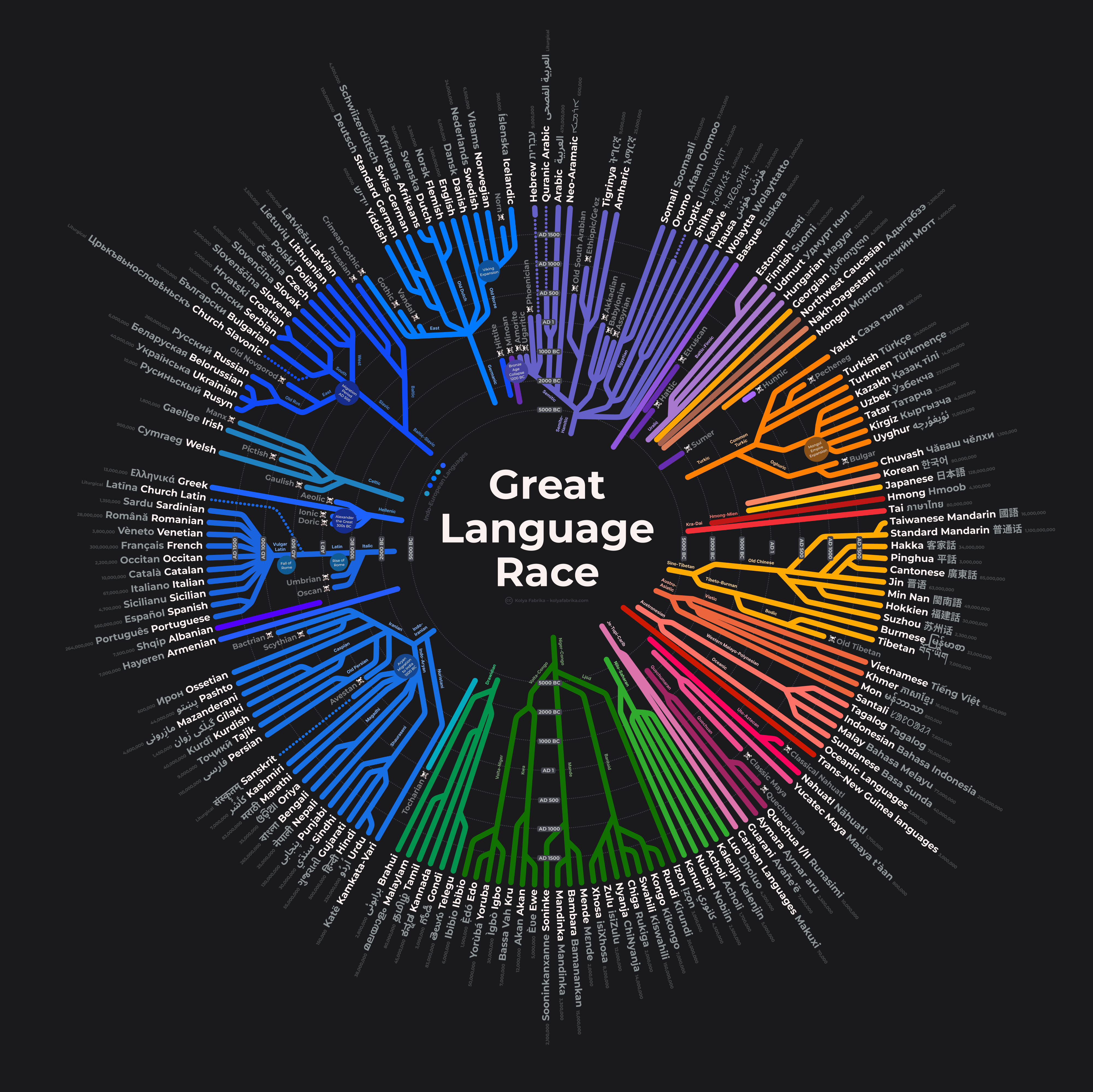
Imgur link with Flemish, Danish, Swedish, and Norwegian native names placed correctly
I absolutely love what you’ve done here and the image is striking! Thank you!
This is way too good,
Amazing job
Hamitic is not a scientific word, it is a biblical term.
The correct name is “AfroAsiatic” for the family that includes Semitic branch
LOL. Supports the “Aryan invasion” of the Indian subcontinent.
Why are the Indo-European languages not shown having a common ancestor?
The Germanic languages are mislabeled.
The selection of languages strikes me as odd. While some local variants like Flemish, Venetian and Occitan are included, national languages like Luxembourgish and Faroese are omitted. The very obscure and extinct language Norn is on there, so a smaller of speakers can’t really be the reason…
It’s a very beautiful graph, but the selection of data doesn’t make much sense to me.
This is amazing, but I’d love a higher quality version so i can read the event bubbles!!
This might be better suited to /r/Infographics. It’s pretty, but it does not fit the rules of this sub for automatically computer generated visualizations.
Doric didn’t go extinct. It’s still spoken in a few isolated villages where it’s known as Tsakonian
Theres no fucking way i zoom in on a chart about all Languages in the history of Mankind and the very first Word i see is the N-Word
![Global Language Evolution Chart [OC]](https://www.europesays.com/wp-content/uploads/2025/01/el2nksy80eae1-1920x1024.png)
16 comments
> Be sure to add a comment that states the data source AND tool(s) used to create the visualization.
Wikipedia, Figma. Happy New Year!
That’s a cool graphic. Unsure what to do with this information, but thanks.
Uh the native names of Norwegian Swedish Flemish and Dutch are mixed up. But very interesting graph!
svenska and dutch are flipped
The difference in lengths between Sumer and Hebrew is essentially the entire plot of the cyberpunk novel *Snow Crash*.
It’s a weird book.
https://imgur.com/gallery/global-language-evolution-chart-Bo8zUqk
Imgur link with Flemish, Danish, Swedish, and Norwegian native names placed correctly
I absolutely love what you’ve done here and the image is striking! Thank you!
This is way too good,
Amazing job
Hamitic is not a scientific word, it is a biblical term.
The correct name is “AfroAsiatic” for the family that includes Semitic branch
LOL. Supports the “Aryan invasion” of the Indian subcontinent.
Why are the Indo-European languages not shown having a common ancestor?
The Germanic languages are mislabeled.
The selection of languages strikes me as odd. While some local variants like Flemish, Venetian and Occitan are included, national languages like Luxembourgish and Faroese are omitted. The very obscure and extinct language Norn is on there, so a smaller of speakers can’t really be the reason…
It’s a very beautiful graph, but the selection of data doesn’t make much sense to me.
This is amazing, but I’d love a higher quality version so i can read the event bubbles!!
This might be better suited to /r/Infographics. It’s pretty, but it does not fit the rules of this sub for automatically computer generated visualizations.
Doric didn’t go extinct. It’s still spoken in a few isolated villages where it’s known as Tsakonian
Theres no fucking way i zoom in on a chart about all Languages in the history of Mankind and the very first Word i see is the N-Word
“Global” except for the entire Western Hemisphere
Comments are closed.