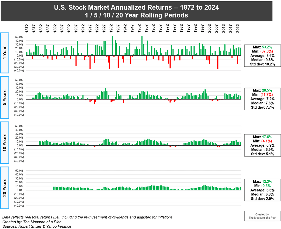
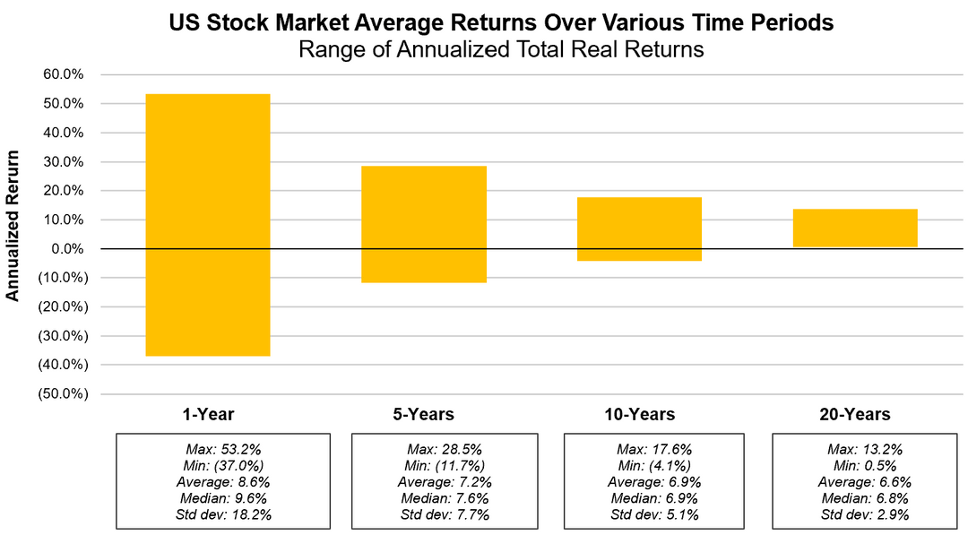
* Simple Average: the average return of the U.S. stock market has been 8.6% per year over the past ~150 years (1872 to 2024)
* Annualized Average: the return of the U.S. stock market has been 7.1% per year on an annualized average basis, over the past ~150 years
* The market has grown in 69% of all years, and declined in 31% of all years on record
* While the range of returns across 1-year periods has varied significantly (from negative 37.0% to +53.2%), the annualized returns across 20-year periods have a much tighter range (from +0.5% to +13.2%)
* The U.S. stock market has never declined over any 20-year period in history
Tools used: excel, powerpoint
Data sources: Robert Shiller dataset, Yahoo Finance
the less you look, the more you win
ELI5? Does that mean the longer the time period, the more the…?
Are the values adjusted by inflation?
An average return of 0.5% per year over 20 years is pretty scary to think about. I get that it’s a worst case outcome, but still. Cool chart though!
Why are the “average” values different for each period? They should all be the same as the average return for the entire 1972-2024 range, other than some minor edge effects for the start and end of the range.
Jack Bogle (Vanguard founder): “don’t just do something, stand there”
I love that it pays to be lazy when it comes to investing
Y-axis needs to be log-scale. A -40% loss is the same magnitude swing as a +67% gain, and should have the same size bar.
Using a linear scale on percent change visually distorts the data, artificially emphasizing gains and minimizing losses. The green on this chart is like Greenland on a Mercator map. Not as big as it looks.
Nice data. However, it’s not obvious if this is the price return or the total return, i.e. with dividends reinvested. This is an important distinction and could be clarified. I’m also assuming this is nominal prices and not inflation adjusted, but again it would be nice if this was clarified. For example calling it “nominal total return” or “nominal total return with dividends reinvested”.
What is the next super growing country with a stable government? Or will the US keep bombing poorer countries to keep hegemony and a strong dollar?
9 comments
All charts and analysis: [https://themeasureofaplan.com/us-stock-market-returns-1870s-to-present/](https://themeasureofaplan.com/us-stock-market-returns-1870s-to-present/)
Key insights:
* Simple Average: the average return of the U.S. stock market has been 8.6% per year over the past ~150 years (1872 to 2024)
* Annualized Average: the return of the U.S. stock market has been 7.1% per year on an annualized average basis, over the past ~150 years
* The market has grown in 69% of all years, and declined in 31% of all years on record
* While the range of returns across 1-year periods has varied significantly (from negative 37.0% to +53.2%), the annualized returns across 20-year periods have a much tighter range (from +0.5% to +13.2%)
* The U.S. stock market has never declined over any 20-year period in history
Tools used: excel, powerpoint
Data sources: Robert Shiller dataset, Yahoo Finance
the less you look, the more you win
ELI5? Does that mean the longer the time period, the more the…?
Are the values adjusted by inflation?
An average return of 0.5% per year over 20 years is pretty scary to think about. I get that it’s a worst case outcome, but still. Cool chart though!
Why are the “average” values different for each period? They should all be the same as the average return for the entire 1972-2024 range, other than some minor edge effects for the start and end of the range.
Jack Bogle (Vanguard founder): “don’t just do something, stand there”
I love that it pays to be lazy when it comes to investing
Y-axis needs to be log-scale. A -40% loss is the same magnitude swing as a +67% gain, and should have the same size bar.
Using a linear scale on percent change visually distorts the data, artificially emphasizing gains and minimizing losses. The green on this chart is like Greenland on a Mercator map. Not as big as it looks.
Nice data. However, it’s not obvious if this is the price return or the total return, i.e. with dividends reinvested. This is an important distinction and could be clarified. I’m also assuming this is nominal prices and not inflation adjusted, but again it would be nice if this was clarified. For example calling it “nominal total return” or “nominal total return with dividends reinvested”.
What is the next super growing country with a stable government? Or will the US keep bombing poorer countries to keep hegemony and a strong dollar?
Comments are closed.