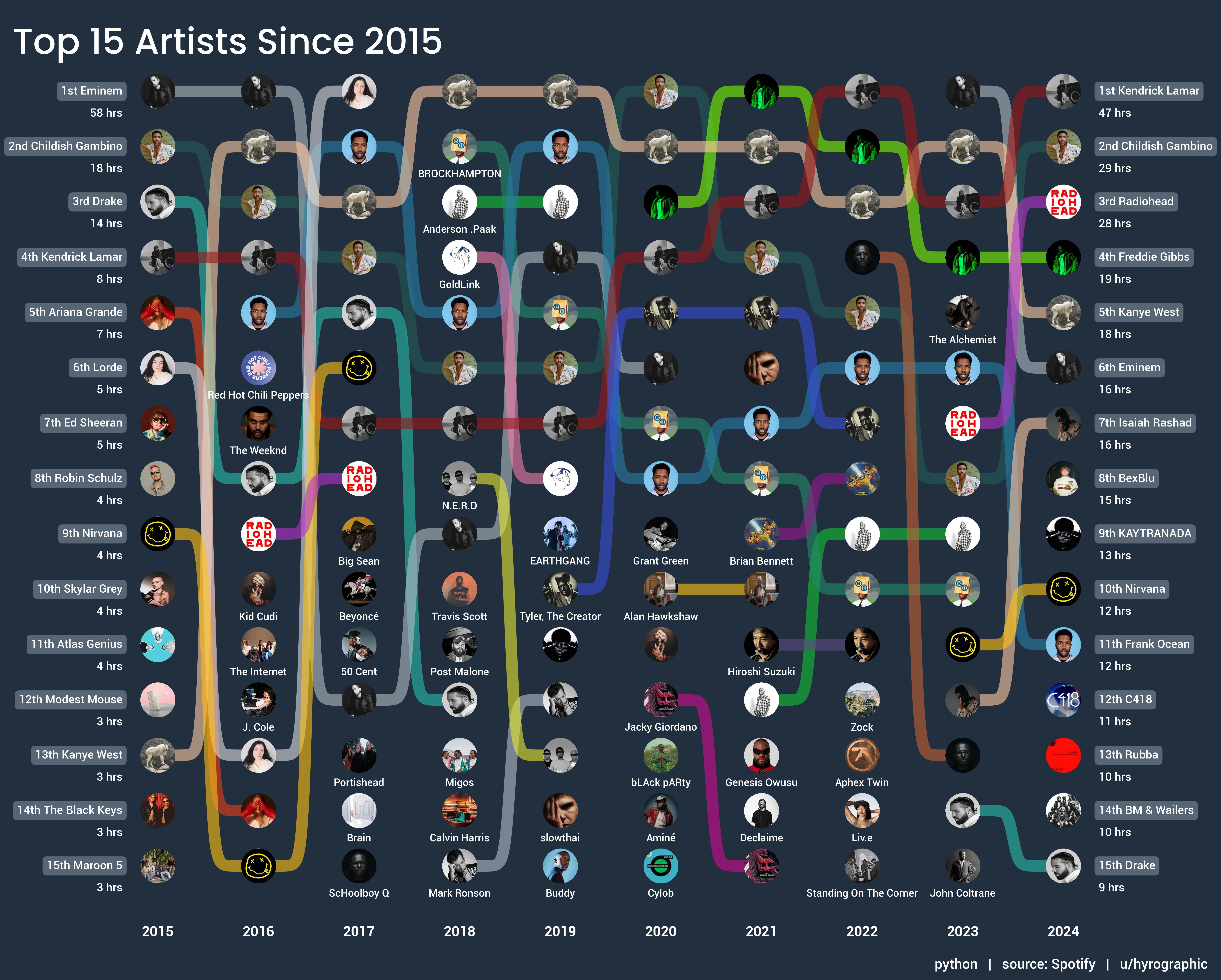
I requested this data from Spotify using their account data download feature. The data prep and chart creation was done in Python (matplotlib to create the chart).
How fried I am right now… I thought that was a circuit board.
Dude Rubba – Way Star slaps
love the visualization, nice job
You forgot about radiohead for 5 years haha? What brought you back, checking out a new album?
Oh cool. I wanna run this for my account
Radiohead and Nirvana come and go then show back up as if nothing changed, like an old friend.
I love the representation of the data!
Very neat and clear. Great work
Wow. You started out with significant saturation of Eminem as a share of total listening (market leader by a long shot). Towards the end your listening was more fragmented among the artists.
– I am not a bot. Beep beep boop
![A decade of my top Spotify artists [OC]](https://www.europesays.com/wp-content/uploads/2025/01/vbvgautmddbe1-1920x1024.jpeg)
10 comments
I requested this data from Spotify using their account data download feature. The data prep and chart creation was done in Python (matplotlib to create the chart).
How fried I am right now… I thought that was a circuit board.
Dude Rubba – Way Star slaps
love the visualization, nice job
You forgot about radiohead for 5 years haha? What brought you back, checking out a new album?
Oh cool. I wanna run this for my account
Radiohead and Nirvana come and go then show back up as if nothing changed, like an old friend.
I love the representation of the data!
Very neat and clear. Great work
Wow. You started out with significant saturation of Eminem as a share of total listening (market leader by a long shot). Towards the end your listening was more fragmented among the artists.
– I am not a bot. Beep beep boop
Comments are closed.