what is this distribution chart called? i want to learn how to make this.
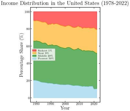
I dont think this data is correct lol i think the richest 10% own something like 60% of all assets and 20% is like 80%
Edit: whoops i apologize this is income not assets or wealth. I was gonna say the poor own way less than that too
Many, many people do not produce enough to support themselves. We, as a society, have to financially support them. Our productivity had increased a lot and so the income level needed to survive is going down as a %. This graph is not only completely logical, but I would say inevitable.
US doesn’t have a left vs right problem, nor does it have a race problem, or a religion problem, or a gender problem. US has a class problem.
All news medias and influential people keeps talking about all the other problems, because they want to distract the bottom 50% from the actual problem. And bottom 50% are too tired and too dumb to focus on anything other than survival. They only focus on the spoon-fed hate so that top 1% can increase the gap even further.
What happened right before 2020 that made the poorest 50%’s share drop so sharply?
Do assets / net worth… that’s where it gets comically bad.
How does this compare to real take-home buying power or standard of living?
This just says the richest 1% had their income grow more rapidly than other tranches, not that effective take-home buying power or standard of living had eroded.
How has overall real income and purchasing power changed though? The distribution doesn’t matter as long as the middle and lower classes continue to do better over time. Income and wealth are not zero sum.
I’m not sure if I like this visualisation. It’s hard to tell if the green and yellow bands have changed size. It seems like it’s just the very rich who have got richer and the very poor have got poorer. The middle have remained the same. Is that right?
What does this mean?
The top 1% has 20% of all the money?
So more rich but less poor… Thats blowing some minds
21 comments
If that’s OC, why’s the resolution so shitty?
This implies the 40% and 9% haven’t really changed and it’s just been the 1% taking from the 50%.
And at the same time, Americans are getting richer.
In 1978, the median American made $27,240 a year. Now the median American makes $42,220 a year.
Real, not nominal, figures.
https://fred.stlouisfed.org/series/MEPAINUSA672N
also this [https://assets.motherjones.com/politics/2011/inequality-page25_actualdistribwithlegend.png?w=640](https://assets.motherjones.com/politics/2011/inequality-page25_actualdistribwithlegend.png?w=640)
https://preview.redd.it/vhavh60j77ce1.png?width=630&format=png&auto=webp&s=1834f907530b28c8cb1ad1fcc2743b85b0973951
“Trickle Down Economics” btw.
More like parasite economics.
What’s this look like for other countries?
what is this distribution chart called? i want to learn how to make this.
I dont think this data is correct lol i think the richest 10% own something like 60% of all assets and 20% is like 80%
Edit: whoops i apologize this is income not assets or wealth. I was gonna say the poor own way less than that too
Many, many people do not produce enough to support themselves. We, as a society, have to financially support them. Our productivity had increased a lot and so the income level needed to survive is going down as a %. This graph is not only completely logical, but I would say inevitable.
US doesn’t have a left vs right problem, nor does it have a race problem, or a religion problem, or a gender problem. US has a class problem.
All news medias and influential people keeps talking about all the other problems, because they want to distract the bottom 50% from the actual problem. And bottom 50% are too tired and too dumb to focus on anything other than survival. They only focus on the spoon-fed hate so that top 1% can increase the gap even further.
What happened right before 2020 that made the poorest 50%’s share drop so sharply?
Do assets / net worth… that’s where it gets comically bad.
How does this compare to real take-home buying power or standard of living?
This just says the richest 1% had their income grow more rapidly than other tranches, not that effective take-home buying power or standard of living had eroded.
https://wtfhappenedin1971.com/
Trends like this only end one way…
…in bloody revolution.
This looks like a Balatro Joker card
https://preview.redd.it/zn99xhxuk7ce1.jpeg?width=2950&format=pjpg&auto=webp&s=1e535a5b638995b4056dd6eb7b238d83c693d2fc
I like this version better
How has overall real income and purchasing power changed though? The distribution doesn’t matter as long as the middle and lower classes continue to do better over time. Income and wealth are not zero sum.
I’m not sure if I like this visualisation. It’s hard to tell if the green and yellow bands have changed size. It seems like it’s just the very rich who have got richer and the very poor have got poorer. The middle have remained the same. Is that right?
What does this mean?
The top 1% has 20% of all the money?
So more rich but less poor… Thats blowing some minds
Comments are closed.