These plots were about a year in the making, just working on OpenSkiStats as a side hobby project with my family.
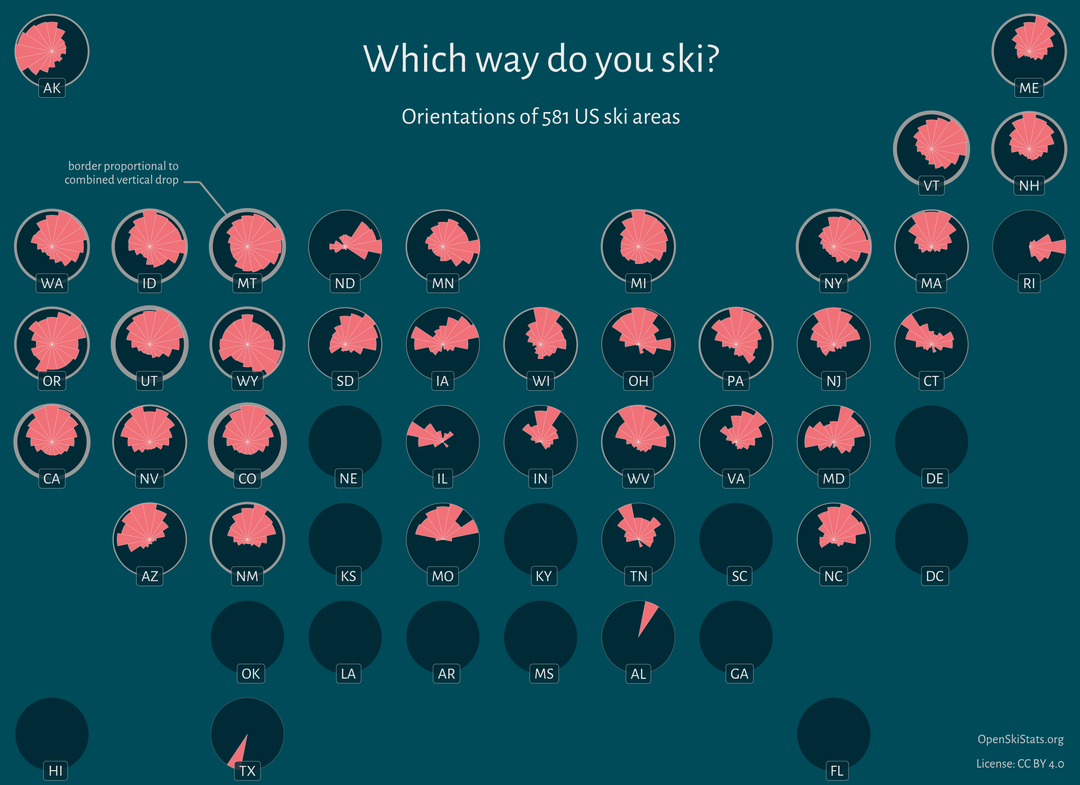
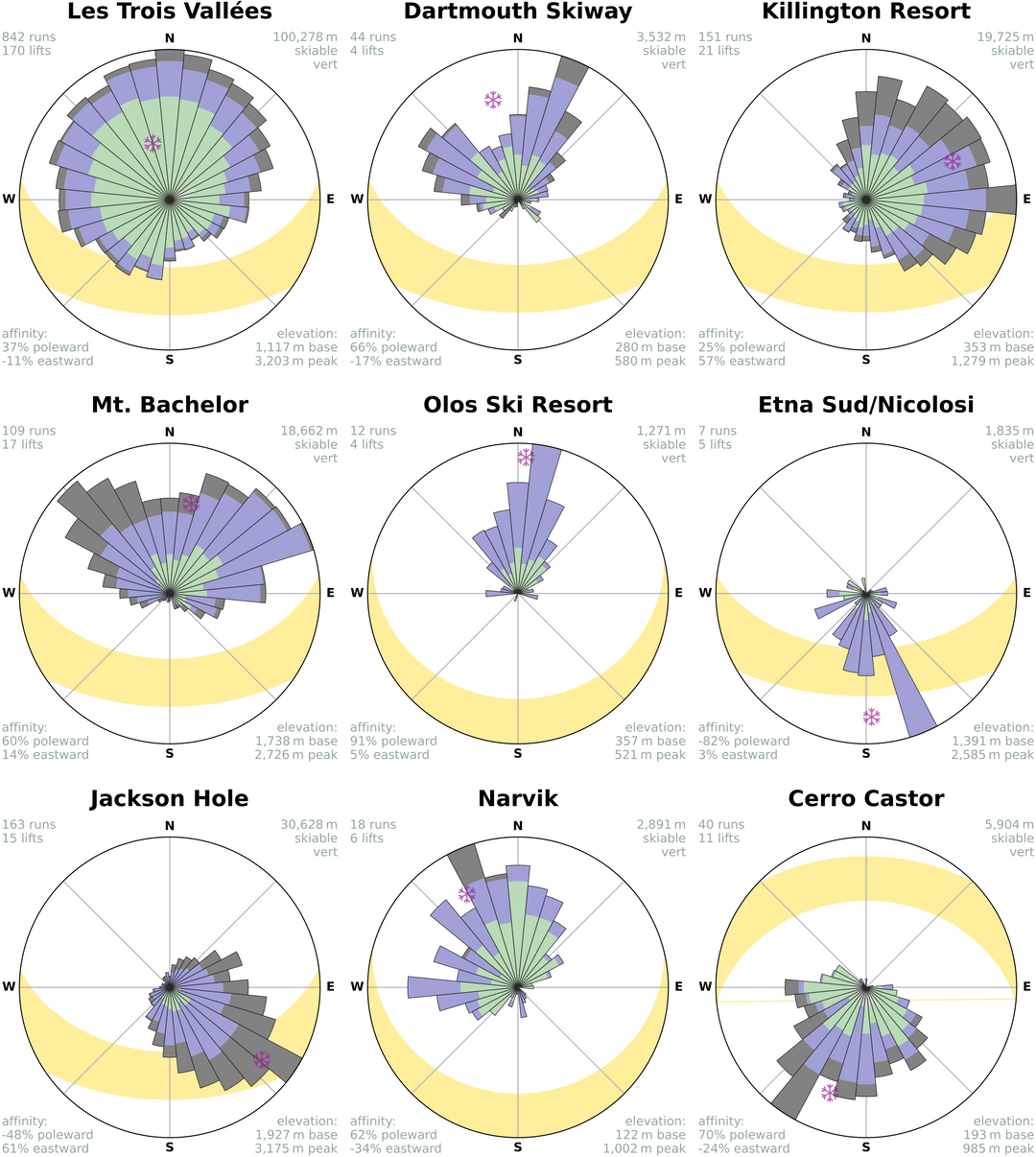
Most the data analysis was done in Python, with heavy use of polars with patito/pydantic schemas. Some calculations in numpy and pvlib. The individual ski area roses were made in matplotlib… still waiting for plotnine to add support for polar coordinates haha. The US state plot was made in R with ggplot2. The analysis is entirely scripted and is re-executed on a scheduled basis via GitHub actions.
interesting topic, very nice visualization, fun to look at. Thanks for great content
“All alpine ski areas in the world” – did you forget that other countries exist?
What does the yellow area indicate?
I wanna know more about this Texas skiing….. I knew Alabama had some but Texas!?
Must have been that ice storm a few years ago /s
Cool graph! Makes sense that most slopes are northward facing in the Northern hemisphere, that way they don’t melt away under the sun.
I think the south face of Big Sky single handedly skews the statistics for Montana. It’s a big chunk of country out there.
So whereŌĆśs the actual Alps? You know, as in ALPINE?
It would be nice if you showed which ski resorts are located on north and which on south hemisphere. As the north side on north hemisphere should have more snow as there is less sun on north slope.
Edit. NVM I just noticed it’s just ski resort in us, still you can see a bias towards north side.
It’s interesting data, but takes a while to figure out what in the world it’s trying to show. I didn’t know if it was sexual orientation or some ratio of vertical drop to something else (based on the only label).
It took the second slide and reading the comments to figure out that it’s the directions that the slopes face for the ski resorts in each state. The data is beautiful – the labelling/description could be more clear…
Ski areas in the northern hemisphere are more likely to take up the north slope of mountains because these sides get less direct sunlight and therefore have less snow melt off, meaning trails stay covered with snow and open longer.
Where is Utah? Am I missing it?
I understand why you did it, but making the chart look square and neat is a ratio, but having Nevada in the four corners spot hurts my brain. Colorado needs Utah!
The ŌĆśworldŌĆÖ being North America and one ski resort in France.
Really cool graphic. Only thing missing is actual compass showing North, IMO.
Bro posted a bunch of american ski resorts and called it “the world” thinking we wouldn’t notice
17 comments
More information at **<https://openskistats.org/>**. Data from OpenStreetMap and OpenSkiMap. Source code at <https://github.com/dhimmel/openskistats>.
These plots were about a year in the making, just working on OpenSkiStats as a side hobby project with my family.
Most the data analysis was done in Python, with heavy use of polars with patito/pydantic schemas. Some calculations in numpy and pvlib. The individual ski area roses were made in matplotlib… still waiting for plotnine to add support for polar coordinates haha. The US state plot was made in R with ggplot2. The analysis is entirely scripted and is re-executed on a scheduled basis via GitHub actions.
Also [posted](https://www.reddit.com/r/skiing/comments/1i03r3c/which_way_do_you_ski_introducing_openskistats/) to r/skiing
interesting topic, very nice visualization, fun to look at. Thanks for great content
“All alpine ski areas in the world” – did you forget that other countries exist?
What does the yellow area indicate?
I wanna know more about this Texas skiing….. I knew Alabama had some but Texas!?
Must have been that ice storm a few years ago /s
Cool graph! Makes sense that most slopes are northward facing in the Northern hemisphere, that way they don’t melt away under the sun.
I think the south face of Big Sky single handedly skews the statistics for Montana. It’s a big chunk of country out there.
So whereŌĆśs the actual Alps? You know, as in ALPINE?
It would be nice if you showed which ski resorts are located on north and which on south hemisphere. As the north side on north hemisphere should have more snow as there is less sun on north slope.
Edit. NVM I just noticed it’s just ski resort in us, still you can see a bias towards north side.
It’s interesting data, but takes a while to figure out what in the world it’s trying to show. I didn’t know if it was sexual orientation or some ratio of vertical drop to something else (based on the only label).
It took the second slide and reading the comments to figure out that it’s the directions that the slopes face for the ski resorts in each state. The data is beautiful – the labelling/description could be more clear…
Ski areas in the northern hemisphere are more likely to take up the north slope of mountains because these sides get less direct sunlight and therefore have less snow melt off, meaning trails stay covered with snow and open longer.
Where is Utah? Am I missing it?
I understand why you did it, but making the chart look square and neat is a ratio, but having Nevada in the four corners spot hurts my brain. Colorado needs Utah!
The ŌĆśworldŌĆÖ being North America and one ski resort in France.
Really cool graphic. Only thing missing is actual compass showing North, IMO.
Bro posted a bunch of american ski resorts and called it “the world” thinking we wouldn’t notice
Red states need to try harder.
Comments are closed.