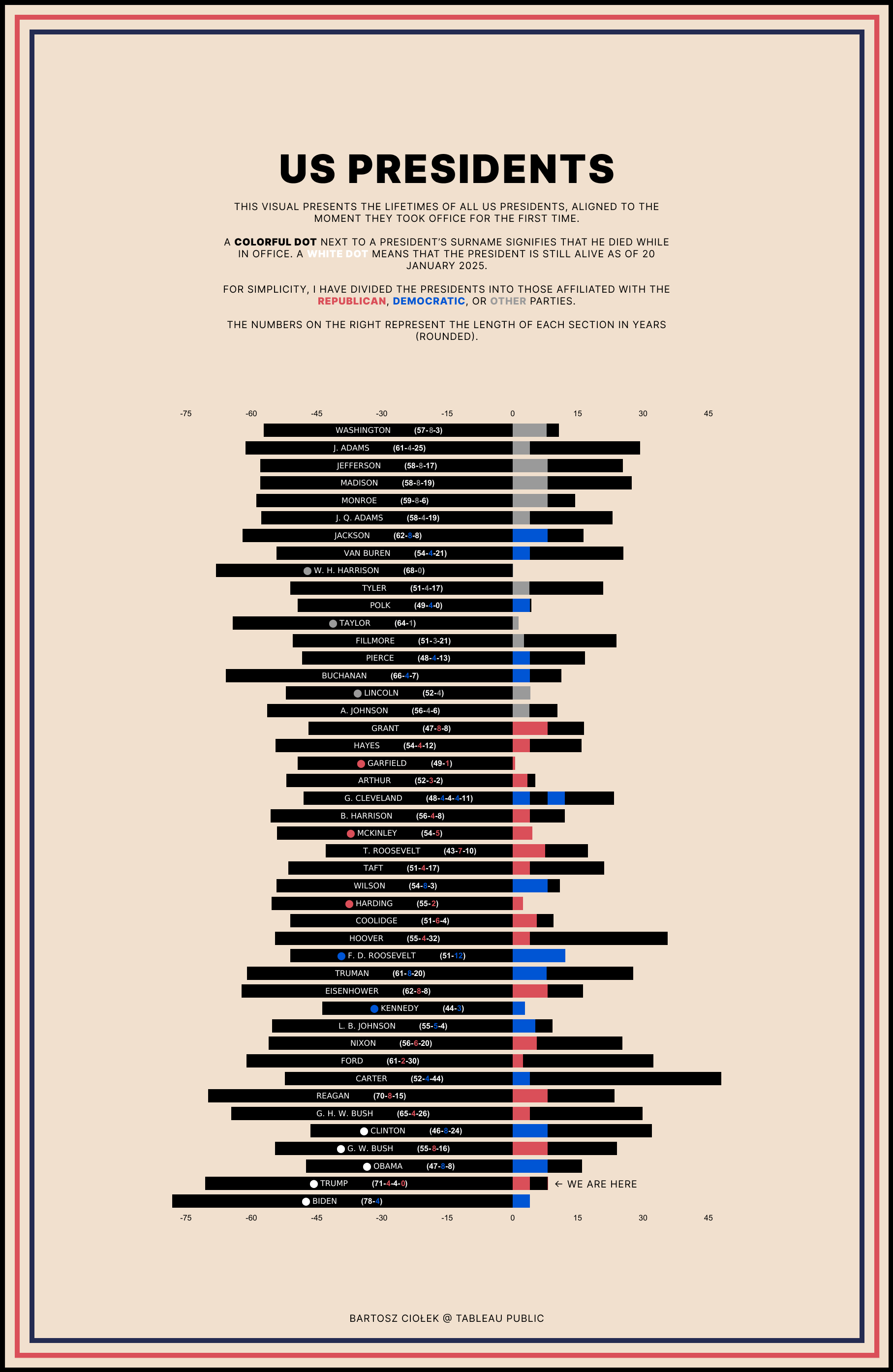
Some time ago, I came across a [Presidents’ timeline infographic ](https://www.reddit.com/r/dataisbeautiful/comments/1hxg4hw/oc_timelines_birth_to_death_of_us_presidents/)here and challenged myself to recreate it in a way that would make it easier to compare presidents’ age at inauguration, the length of their terms, and how much time they lived after their service (+ stylized with some old US propaganda poster vibes).
Eventually, I also decided to include information on whether they finished their term and how many years it lasted in total.
What do you think? Is it understandable?
P.S. I used tomorrow’s date as the end date in the text, so fingers crossed! 🙂
I think it needs something to denote which presidents are alive still. I can be a little misleading otherwise.
Pretending Lincoln wasn’t an R?
I hate the modern GOP, but I think it’s intellectually dishonest not to list Lincoln as an R.
You think Ulysses S Grant was the first Republican president?
Hey Kennedy’s post-presidency isn’t on there
The “We are here” is confusing. I would suggest putting that at the bottom, with a vertical arrow, to point to the x-axis point, instead of the y-axis.
lol Harrison. Crazy he only made it a month lol so technically not 0
This honestly feels like a terrible way to represent this data. We are here? Aren’t we actually “here” for every white dot president? Those bars will all grow.
Also I understand why you would zero them at the point their presidency starts, but it makes it a bit hard to compare. Like you have to look to the left and the right to draw any conclusion. Take Obama, for instance.
![[OC] US Presidents: Lifespans and Timelines vs. Inauguration](https://www.europesays.com/wp-content/uploads/2025/01/7bya4cx0ezde1-1815x1024.png)
9 comments
Some time ago, I came across a [Presidents’ timeline infographic ](https://www.reddit.com/r/dataisbeautiful/comments/1hxg4hw/oc_timelines_birth_to_death_of_us_presidents/)here and challenged myself to recreate it in a way that would make it easier to compare presidents’ age at inauguration, the length of their terms, and how much time they lived after their service (+ stylized with some old US propaganda poster vibes).
Eventually, I also decided to include information on whether they finished their term and how many years it lasted in total.
What do you think? Is it understandable?
P.S. I used tomorrow’s date as the end date in the text, so fingers crossed! 🙂
Data: [here](https://www.kaggle.com/datasets/harshitagpt/us-presidents), [here](https://www.kaggle.com/datasets/zsinghrahulk/us-presidents-age-state-health-and-wealth) and [here](https://en.wikipedia.org/wiki/List_of_presidents_of_the_United_States)
Tools: Figma / Tableau
Tableau Public link: [here](https://public.tableau.com/app/profile/bartoszciolek/viz/USPresidents_17372959517650/USPRESIDENTS)
Thanks for the comments – updated version below
https://preview.redd.it/r9plwq2gkzde1.png?width=2269&format=png&auto=webp&s=013ae487923509ebd2f5a603747be7d745964d88
I think it needs something to denote which presidents are alive still. I can be a little misleading otherwise.
Pretending Lincoln wasn’t an R?
I hate the modern GOP, but I think it’s intellectually dishonest not to list Lincoln as an R.
You think Ulysses S Grant was the first Republican president?
Hey Kennedy’s post-presidency isn’t on there
The “We are here” is confusing. I would suggest putting that at the bottom, with a vertical arrow, to point to the x-axis point, instead of the y-axis.
lol Harrison. Crazy he only made it a month lol so technically not 0
This honestly feels like a terrible way to represent this data. We are here? Aren’t we actually “here” for every white dot president? Those bars will all grow.
Also I understand why you would zero them at the point their presidency starts, but it makes it a bit hard to compare. Like you have to look to the left and the right to draw any conclusion. Take Obama, for instance.
Comments are closed.