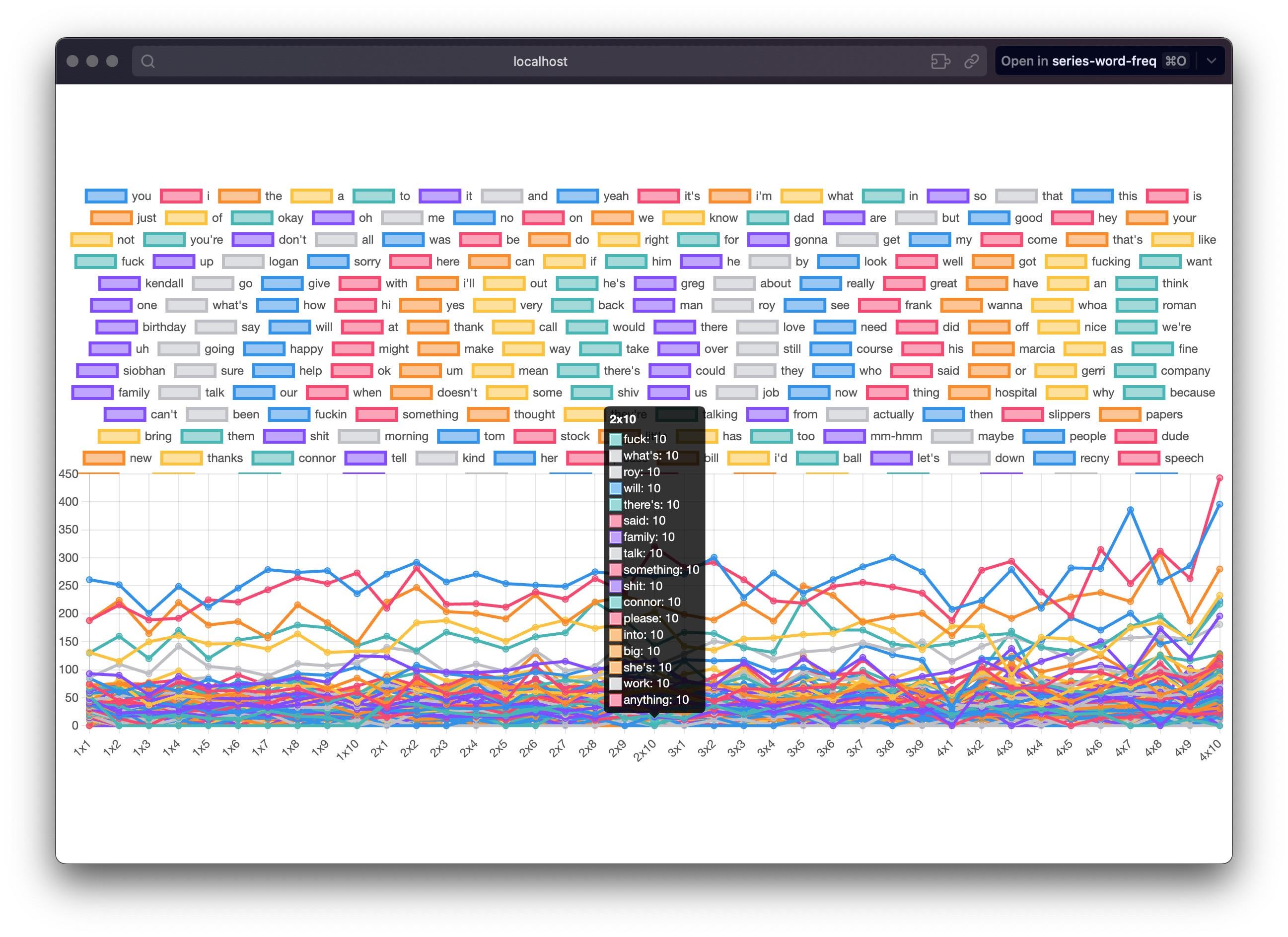
[OC] Word frequency across the TV show Succession. Created using https://github.com/martinshaw/series-word-freq
Posted by martinshawreddit
![[OC] Word frequency across the TV show Succession. Created using https://github.com/martinshaw/series-word-freq](https://www.europesays.com/wp-content/uploads/2025/02/1nyjzm6rq1ie1-1920x1024.jpeg)
[OC] Word frequency across the TV show Succession. Created using https://github.com/martinshaw/series-word-freq
Posted by martinshawreddit
3 comments
This is pretty bad data visualization. I’m not trying to just shit on the plot, but hoping to guide improvement.
There is too *much* information, really. All the legend entries and overlapping lines make it hard to pick out any trends.
Relatedly, the legend is barely better than no legend at all because there is no way to disambiguate which of the many lines of a certain color correspond to which exact word.
And perhaps most importantly, it doesn’t really show… anything. As a viewer, someone can’t easily determine the most common words, how much more often they’re said than other words, or any other interesting/useful info.
It’s just a data dump in a visual format, not a visualization. A sorted excel sheet of the data would be more helpful tbh.
If I worked in MDR I would sort this entire data visualization into the bin.
If is this a final output then I don’t understand it. If this interactive somewhere then a gif/video of it in action might show it off better
Comments are closed.