This stacked area chart, created using the ggplot2 package in R, visualizes the composition of U.S. import goods by country over time. The data from the Federal Reserve Economic Data (FRED) displays the percentage of total U.S. imports attributed to major trading partners—Canada, [China](https://fred.stlouisfed.org/series/IMPCH), Mexico, and Germany—while the “Other” category represents imports from all remaining countries.
This illustrates the problem of bilateral tariffs, or slapping tariffs on one country at a time. Because we do not actually reduce our overall demand for imports by doing so, we simply begin importing from other countries. As long as there are countries making way more than they are consuming, they will find someone to soak up that extra production. As long as there are countries—like ours, but also Canada and Mexico, funny enough—that consume more than they make, we will import.
other
hmm
ramping up cash to
Abu Dhabi
UAE
Kuwait
Burma
The Democratic People’s Republic of Vietnam
Malaysia
Singapore
the Russian Federation [ laundered through the above, and via the state of India ]
Interesting. Some feedback:
• Percentage by what? Value? Mass?
• Where do the numbers shown in the legend come from? The end of the chart?
• Good for at least including your source in the image (this should be a basic requirement for the sub), but just “FRED” is not clear enough.
While accompanying descriptions are always nice, answers to these basic questions should be clear and contained within the graphic itself, since these images often make their way around the internet alone.
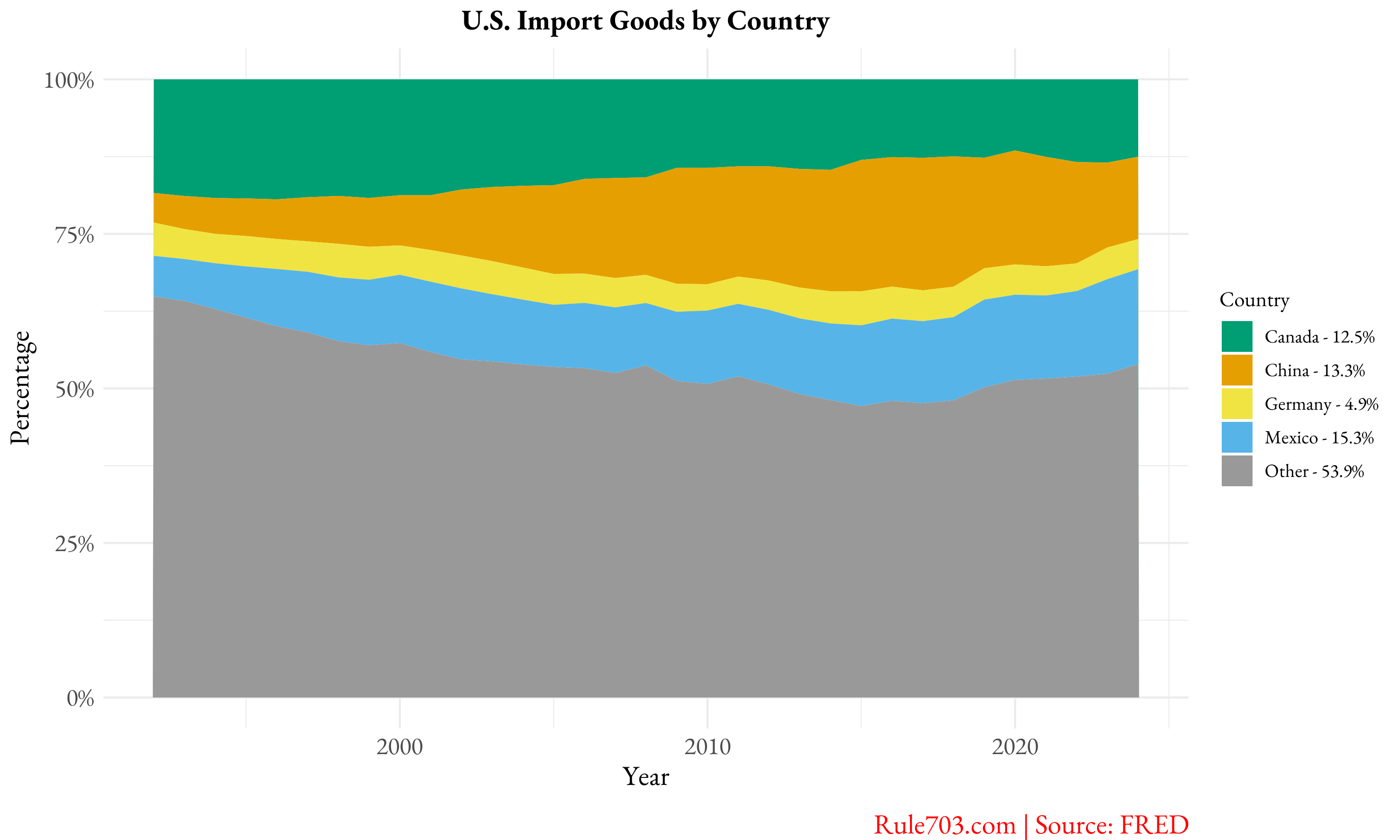
![The Changing Landscape of U.S. Imports by Country [OC]](https://www.europesays.com/wp-content/uploads/2025/02/fho66dak5rie1-1920x1024.png)
4 comments
This stacked area chart, created using the ggplot2 package in R, visualizes the composition of U.S. import goods by country over time. The data from the Federal Reserve Economic Data (FRED) displays the percentage of total U.S. imports attributed to major trading partners—Canada, [China](https://fred.stlouisfed.org/series/IMPCH), Mexico, and Germany—while the “Other” category represents imports from all remaining countries.
This illustrates the problem of bilateral tariffs, or slapping tariffs on one country at a time. Because we do not actually reduce our overall demand for imports by doing so, we simply begin importing from other countries. As long as there are countries making way more than they are consuming, they will find someone to soak up that extra production. As long as there are countries—like ours, but also Canada and Mexico, funny enough—that consume more than they make, we will import.
other
hmm
ramping up cash to
Abu Dhabi
UAE
Kuwait
Burma
The Democratic People’s Republic of Vietnam
Malaysia
Singapore
the Russian Federation [ laundered through the above, and via the state of India ]
Interesting. Some feedback:
• Percentage by what? Value? Mass?
• Where do the numbers shown in the legend come from? The end of the chart?
• Good for at least including your source in the image (this should be a basic requirement for the sub), but just “FRED” is not clear enough.
While accompanying descriptions are always nice, answers to these basic questions should be clear and contained within the graphic itself, since these images often make their way around the internet alone.
Comments are closed.