Recently, I came across a Hans Rosling chart with an amazing style and that inspired me to work on a data visualization project. I wanted to explore how wealth and inequality are distributed across European Union countries in a visually engaging way.
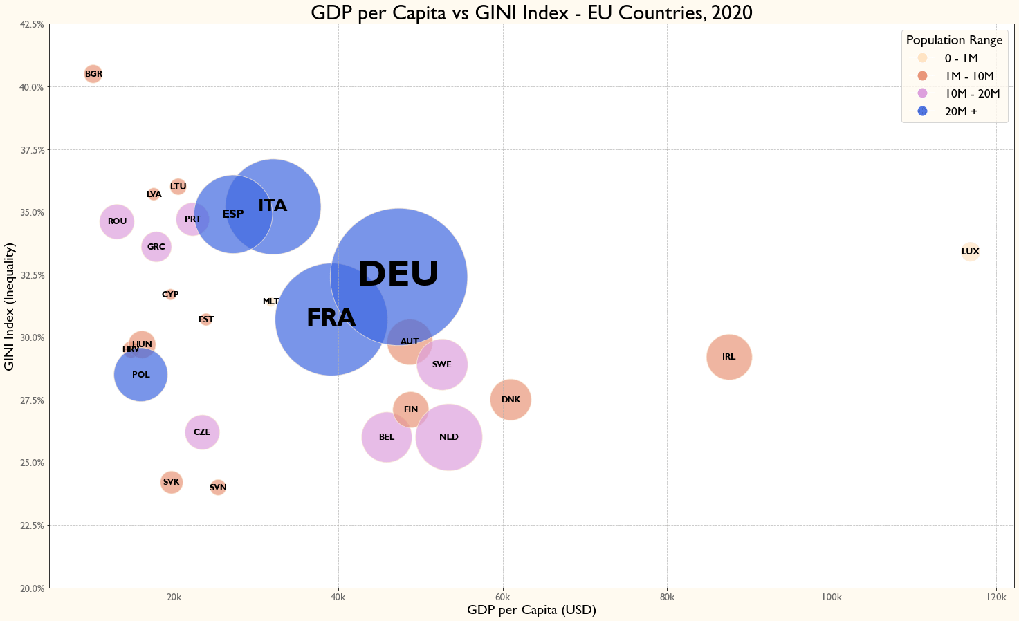
What’s in the chart?
– GDP per capita (X-axis) – how rich a country is per person
– GINI Index (Y-axis) – measures income inequality (higher = more unequal)
– Bubble size – Total GDP of each country
– Bubble colors – population size
🔍 What Does It Show?
– Nordic countries (Denmark, Finland, Sweden) have strong economies with relatively low inequality
– Germany, France and Italy are economic powerhouses (biggest bubbles), but their inequality levels vary
– Luxembourg & Ireland stand out for their high GDP per capita
– Southern & Eastern European countries (Bulgaria, Romania, Baltics) tend to have higher inequality and lower GDP per capita – poorer countries and a smaller proportion of the population control a larger share of the economy
Hans Rosling made data fun and accessible, and I hope this chart does the same! 🌟
📌 Data Source: World Bank
What do you think? Any surprises?
Posted by Specific-Ship-3268
3 comments
Made with Python (Spyder)
Data source: https://data.worldbank.org/region/european-union
Full project: https://github.com/Irinel47/data-viz-projects/tree/main/EU_GINI_GDPPC
There is something interesting about Ireland. They are not exactly a low population country like Luxembourg, but they have outsized GDP per capita, especially if you consider their median/mean income is not that much of a outlier.
I asked ChatGPT to explain why that was case and to paraphrase: it is basically the Delaware of global multinational corporations. Lot of MNCs funnel their profits through Ireland to take advantage of their generous tax policies, leading to high GDP figures.
This is completely off the point but gosh the abbreviations are so wrong made my brain hurt
Comments are closed.