But, okay, correlate it with how much RAM is required to do all the same things…
Should be on a log scale to make visual sense. Any long-term growth chart is going to look parabolic at some point.
thanks for providing the second non-gif complete chart. its super annoying when you have to hit pause at the right time to see final bits.
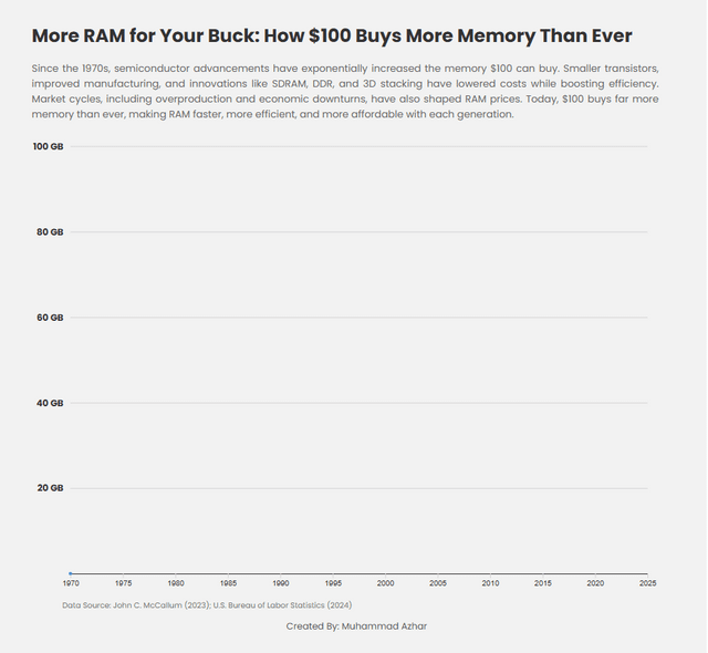
Is this wholesale pricing? Where can one get 94GB for $100? The retail markup must be huge…
You’re just plotting Moore’s Law
I’m pretty sure theres a minimum price to produce ram and I’m pretty sure its not 94gb for $100. I’m curious to know exactly how this was calculated because ram sizes haven’t increased their performance has however. But you can’t make a false equivalency like that.
Is this nominal or real dollars? If it’s not inflation adjusted that makes this even more impressive, nice visualization!
Alternative idea, stacks of ram icons could also be used to make it even more visual than the line
Now do a chart of Apple RAM pricing.
Was thinking Dodge RAM and was quite confused for a second
I just paid under $200 for 64 GB of DDR5 RAM. It does have pretty RGB lights on it though. Must not be retail prices.
This is maybe RAM manufacturing costs but now way this is the price of RAM.
I payed $300 for 32GB DDR5 on release in 2022… It was not worth it.
Apple must have missed the memo.
This is cool and all but why even show pre-1995 data?
Just have to point out the Mac mini from 16GB to 24GB is a $200 upgrade. So $100 gets you 4GB. Apple should be embarrassed, but probably enjoy their mountain of money more.
My notebook has 64 GB and I paid about 400 Euros for that amount of RAM. Good to hear that prices go down, because I want 128 GB for my next notebook.
Should’ve used a log scale, but yeah, Moore’s law is cool
What’s the point of the animation? To make the graph disappear the moment it’s complete? It’s not only useless, but actively making things worse for no good reason whatsoever.
Exponential trends like Moore’s Law are much easier to see and compare on log plots than linear plots.
RAM is incredibly cheap and yet Apple doesn’t give af about its customers
FYI, the $ goes in front of the number. Like this: $100.
It’s easy! Feel free to practice on these:
1.25
300
50,000
Click to reveal the correct answers below:
>!$1.25!<
>!$300!<
>!$50,000!<
Has this ever not been the case?
The first time I bought ram (well, my mom bought it for me) was in 1994. It was for 4MB (doubled the amount I had) and cost just a bit over $100.
That computer felt so snappy afterwards.
I wish the font was a little smaller, I can almost read it
When you don’t use a log scale, everything price related just looks like a curve which was flat forever and recently is shooting up to infinity. If you’ve generated a graph like that, use a log scale.
Please can we just get rid of animated charts, for the love of god. They almost always add absolutely nothing and almost always make it worse. At least OP provided the static chart in frame 2.
Yeah, this doesn’t explain shit. What kind of ram, how much the entire assembly costs? Is this consumer or is this bulk or industrial rates? Per chip, or integrated? This is so misleading it’s aggravating and I’ll say it. UGLY.
Release a new one with included statistics and compensations and I’ll be happy.

28 comments
Data Source: [https://ourworldindata.org/grapher/historical-cost-of-computer-memory-and-storage](https://ourworldindata.org/grapher/historical-cost-of-computer-memory-and-storage)
Tool(s): D3
Firstly, beautiful and simple, I love it.
But, okay, correlate it with how much RAM is required to do all the same things…
Should be on a log scale to make visual sense. Any long-term growth chart is going to look parabolic at some point.
thanks for providing the second non-gif complete chart. its super annoying when you have to hit pause at the right time to see final bits.
Is this wholesale pricing? Where can one get 94GB for $100? The retail markup must be huge…
You’re just plotting Moore’s Law
I’m pretty sure theres a minimum price to produce ram and I’m pretty sure its not 94gb for $100. I’m curious to know exactly how this was calculated because ram sizes haven’t increased their performance has however. But you can’t make a false equivalency like that.
Is this nominal or real dollars? If it’s not inflation adjusted that makes this even more impressive, nice visualization!
Alternative idea, stacks of ram icons could also be used to make it even more visual than the line
Now do a chart of Apple RAM pricing.
Was thinking Dodge RAM and was quite confused for a second
I just paid under $200 for 64 GB of DDR5 RAM. It does have pretty RGB lights on it though. Must not be retail prices.
This is maybe RAM manufacturing costs but now way this is the price of RAM.
I payed $300 for 32GB DDR5 on release in 2022… It was not worth it.
Apple must have missed the memo.
This is cool and all but why even show pre-1995 data?
Just have to point out the Mac mini from 16GB to 24GB is a $200 upgrade. So $100 gets you 4GB. Apple should be embarrassed, but probably enjoy their mountain of money more.
My notebook has 64 GB and I paid about 400 Euros for that amount of RAM. Good to hear that prices go down, because I want 128 GB for my next notebook.
Should’ve used a log scale, but yeah, Moore’s law is cool
What’s the point of the animation? To make the graph disappear the moment it’s complete? It’s not only useless, but actively making things worse for no good reason whatsoever.
Exponential trends like Moore’s Law are much easier to see and compare on log plots than linear plots.
RAM is incredibly cheap and yet Apple doesn’t give af about its customers
FYI, the $ goes in front of the number. Like this: $100.
It’s easy! Feel free to practice on these:
1.25
300
50,000
Click to reveal the correct answers below:
>!$1.25!<
>!$300!<
>!$50,000!<
Has this ever not been the case?
The first time I bought ram (well, my mom bought it for me) was in 1994. It was for 4MB (doubled the amount I had) and cost just a bit over $100.
That computer felt so snappy afterwards.
I wish the font was a little smaller, I can almost read it
When you don’t use a log scale, everything price related just looks like a curve which was flat forever and recently is shooting up to infinity. If you’ve generated a graph like that, use a log scale.
Please can we just get rid of animated charts, for the love of god. They almost always add absolutely nothing and almost always make it worse. At least OP provided the static chart in frame 2.
Yeah, this doesn’t explain shit. What kind of ram, how much the entire assembly costs? Is this consumer or is this bulk or industrial rates? Per chip, or integrated? This is so misleading it’s aggravating and I’ll say it. UGLY.
Release a new one with included statistics and compensations and I’ll be happy.
Comments are closed.