Nice. I’d love to see this but relative to US workforce.
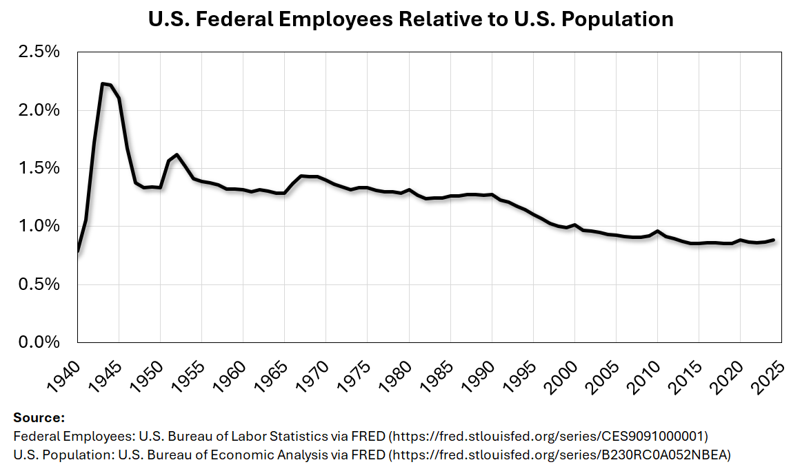
I dislike the starting date for this graph, why did you pick 1940? Why didn’t you start at 1900? Or 1950? You added world war 2 to the sample which makes everything else look like its decreasing but is an outlier because America was in a wartime economy.
This is interesting info and definitely paints a different picture than that suggested by those saying the government is bloated. I feel like it would be interesting to compare this to a few other charts for example: Federal Spending as a % of GDP, federal employee wages/benefits expense as a % of GDP, and federal tax receipts as a % of GDP. The government clearly has a deficit problem, the question is that due to low revenue? Too many highly paid employees? Or too much spending on programs?
Reduction of consumers in a supply-side economy
Now do the military budget
It’s interesting seeing the little baby spikes in census years
Even though it’s true that there really aren’t that many federal employees, it’s undeniable that the US gov’t funds a lot of the work that is done privately. After all, the US spends about 25% of the annual GDP. But that can go many places and much of that is not necessarily *jobs.*
This is exactly what Dr. Heather Cox Richardson who is a writer and historian says. America is being gaslit. After they destroy every government agency they will say the government doesn’t work and that’s why the US needs a dictator with an authoritarian regime to run the country properly.
I doubt this is nearly as meaningful as it appears, given the trend to move services from directly-employed staff to contractors over the years.
Even with expenses that aren’t directly purchasing services, using the military as an example where stupid amounts of the expenditure there is on equipment, in practice that is largely paying for employees across the entire supply chain.
Last year the U.S. Federal government employed 2,735,000 people. That’s about 1 Federal employee for every 123 citizens, all departments, all locations, all units, all desks and cars, etc. In contrast, state and local governments in the U.S. employed 20,217,000 people, about 1 for every 17 citizens. (That’s 1 local or state employee for the 18 people who live on my block. And 1 for the next block. And the next. Etc. Let’s keep things in perspective.)
Would be good to see this plus state workforce, since the federal government also pays the states to implement a lot of of its policy. In order to truly be apples to apples, you would also need to include employment from organizations the federal government gives to implement programs. And that would need to be standardized over time so that you’re comparing the same thing over time.
TLDR; just because the federal government employment rate has been declining, doesn’t mean that other people aren’t being employed other places and paid by the federal government indirectly.
Here’s % of gov’t employment as % of total employment for OECD countries – we’re in the bottom third:
13 comments
Nice. I’d love to see this but relative to US workforce.
I dislike the starting date for this graph, why did you pick 1940? Why didn’t you start at 1900? Or 1950? You added world war 2 to the sample which makes everything else look like its decreasing but is an outlier because America was in a wartime economy.
This is interesting info and definitely paints a different picture than that suggested by those saying the government is bloated. I feel like it would be interesting to compare this to a few other charts for example: Federal Spending as a % of GDP, federal employee wages/benefits expense as a % of GDP, and federal tax receipts as a % of GDP. The government clearly has a deficit problem, the question is that due to low revenue? Too many highly paid employees? Or too much spending on programs?
Reduction of consumers in a supply-side economy
Now do the military budget
It’s interesting seeing the little baby spikes in census years
Even though it’s true that there really aren’t that many federal employees, it’s undeniable that the US gov’t funds a lot of the work that is done privately. After all, the US spends about 25% of the annual GDP. But that can go many places and much of that is not necessarily *jobs.*
This is exactly what Dr. Heather Cox Richardson who is a writer and historian says. America is being gaslit. After they destroy every government agency they will say the government doesn’t work and that’s why the US needs a dictator with an authoritarian regime to run the country properly.
I doubt this is nearly as meaningful as it appears, given the trend to move services from directly-employed staff to contractors over the years.
Even with expenses that aren’t directly purchasing services, using the military as an example where stupid amounts of the expenditure there is on equipment, in practice that is largely paying for employees across the entire supply chain.
Last year the U.S. Federal government employed 2,735,000 people. That’s about 1 Federal employee for every 123 citizens, all departments, all locations, all units, all desks and cars, etc. In contrast, state and local governments in the U.S. employed 20,217,000 people, about 1 for every 17 citizens. (That’s 1 local or state employee for the 18 people who live on my block. And 1 for the next block. And the next. Etc. Let’s keep things in perspective.)
Would be good to see this plus state workforce, since the federal government also pays the states to implement a lot of of its policy. In order to truly be apples to apples, you would also need to include employment from organizations the federal government gives to implement programs. And that would need to be standardized over time so that you’re comparing the same thing over time.
TLDR; just because the federal government employment rate has been declining, doesn’t mean that other people aren’t being employed other places and paid by the federal government indirectly.
Would be good to see this plus state workforce, since the federal government also pays the states to implement a lot of of its policy. In order to truly be apples to apples, you would also need to include employment from organizations the federal government gives to implement programs. And that would need to be standardized over time so that you’re comparing the same thing over time.
TLDR; just because the federal government employment rate has been declining, doesn’t mean that other people aren’t being employed other places and paid by the federal government indirectly.
Here’s % of gov’t employment as % of total employment for OECD countries – we’re in the bottom third:
https://preview.redd.it/2rgsx3wu0tje1.png?width=801&format=png&auto=webp&s=1cb61c63a84e98d997d1f6b01dd165691873e21e
Lots of other data in this OECD report – [OECD – Size and composition of public employment](https://www.oecd.org/content/dam/oecd/en/publications/reports/2024/12/size-and-composition-of-public-employment-data-sources-methods-and-gaps_f6c2babd/32c747be-en.pdf)
Comments are closed.