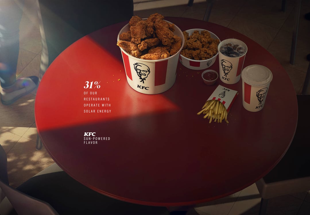
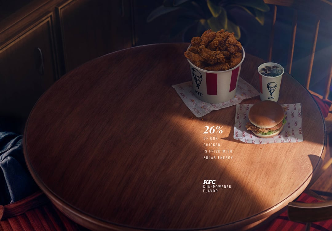
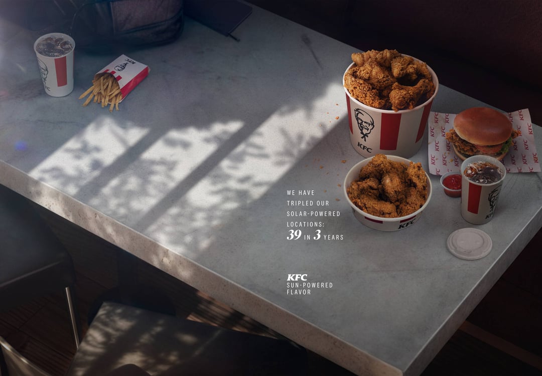
Sun Stats – Beautiful KFC ads from Ecuadorian ad agency Punto 99 (Source: Ads of the World) Posted by rosszember Tags:DataData Is BeautifulDataIsBeautiful 7 comments Would be nice if the light actually reflected the percentages. because I need more ads in my life What’s the point of doing this if the light doesn’t actually reflect the percentage and they use white font on such bright part of the table. Horrible ad design with poor readability Clever idea but the amount of sun doesn’t even remotely reflect the percentage. That kind of ruins it. This is not beautiful data. This does not appear to correctly represent data in any way The name of this sub appears to mean nothing anymore. It should just be called data at this point And 0% of their chicken ever gets to see the sun Comments are closed.
What’s the point of doing this if the light doesn’t actually reflect the percentage and they use white font on such bright part of the table.
Clever idea but the amount of sun doesn’t even remotely reflect the percentage. That kind of ruins it.
This is not beautiful data. This does not appear to correctly represent data in any way The name of this sub appears to mean nothing anymore. It should just be called data at this point
7 comments
Would be nice if the light actually reflected the percentages.
because I need more ads in my life
What’s the point of doing this if the light doesn’t actually reflect the percentage and they use white font on such bright part of the table.
Horrible ad design with poor readability
Clever idea but the amount of sun doesn’t even remotely reflect the percentage. That kind of ruins it.
This is not beautiful data. This does not appear to correctly represent data in any way
The name of this sub appears to mean nothing anymore. It should just be called data at this point
And 0% of their chicken ever gets to see the sun
Comments are closed.