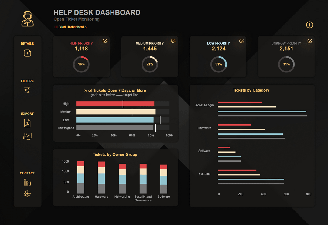
This dashboard is gorgeous. I would recommend adding the numbers for the different columns that don’t have a target tied to it. Yes, it may not look at clean, but losing functionality and seeing the actual numbers is more important than something looking better.
The categories and priorities is a really cool design as well, but keep in mind if people want to filter by a particular category but may not know what all the symbols mean
2 comments
This dashboard is gorgeous. I would recommend adding the numbers for the different columns that don’t have a target tied to it. Yes, it may not look at clean, but losing functionality and seeing the actual numbers is more important than something looking better.
The categories and priorities is a really cool design as well, but keep in mind if people want to filter by a particular category but may not know what all the symbols mean
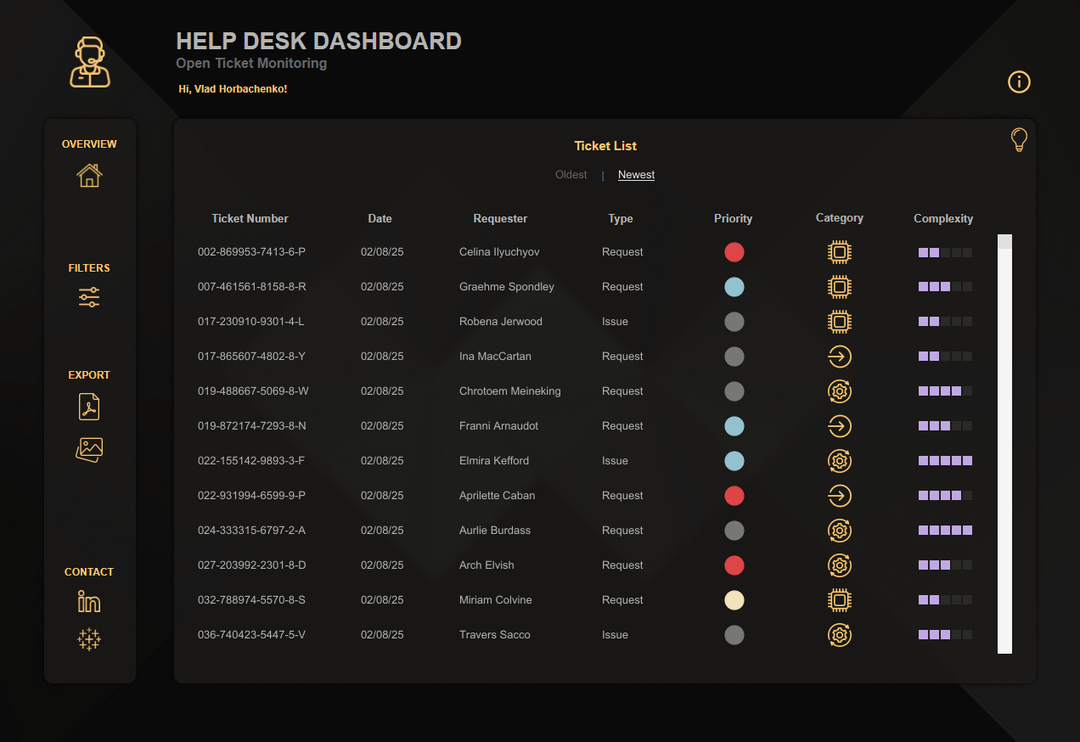
Who assigns the priority for each ticket?
Comments are closed.