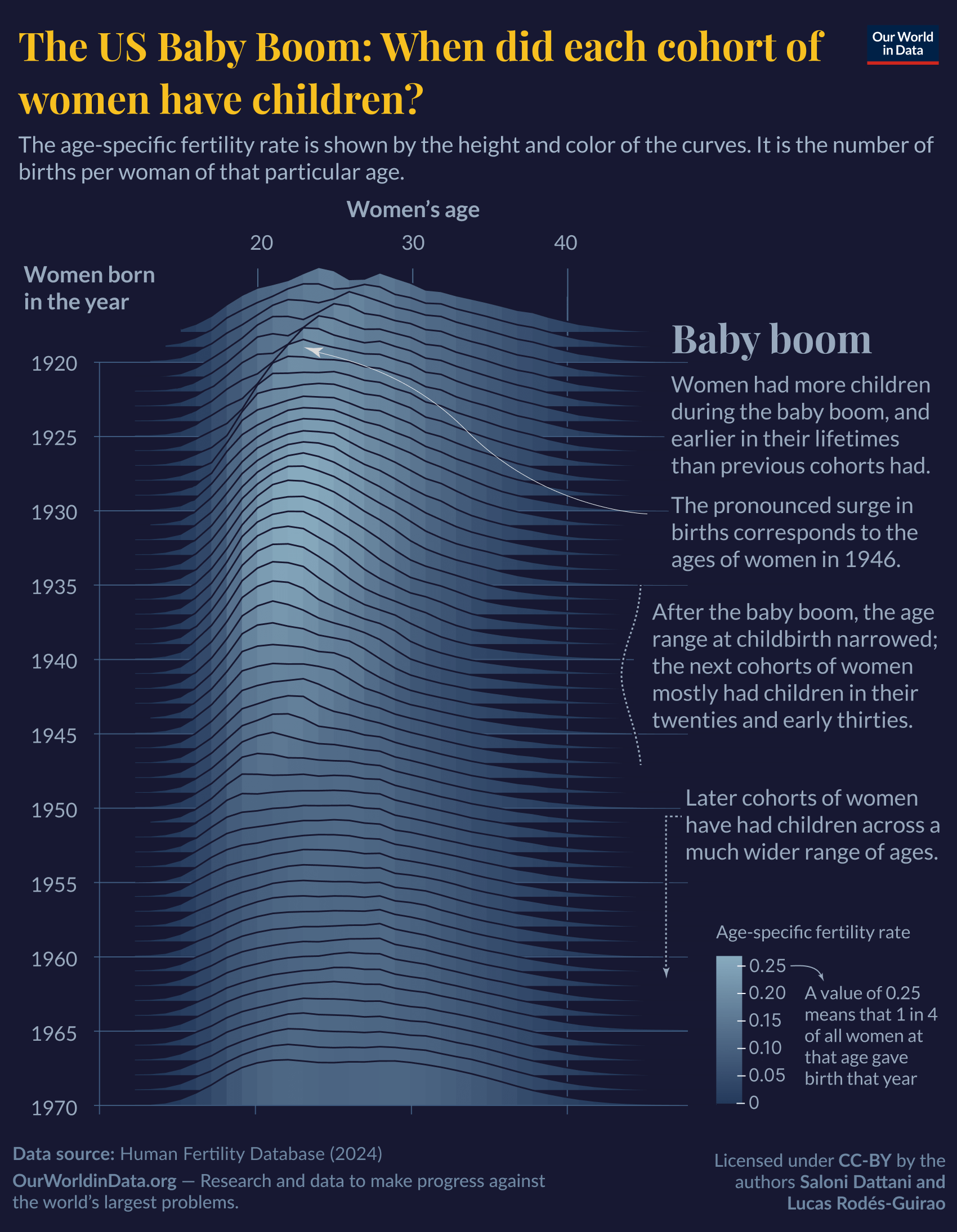
[OC] I made this chart with my colleague Lucas Rodés-Guirao using ggplot2, Adobe Illustrator, and Figma, with data from the Human Fertility Database.
It’s part of an article I wrote called [The baby boom in seven charts](https://ourworldindata.org/baby-boom-seven-charts), published on Our World in Data. In the article, you can find the data and scripts to recreate the chart.
This is by far the best simulation of an age cohort that I’ve ever seen.
Good job OP!
Finally some beautiful data.
Original? Actually beautiful? Interesting? Not a repost/troll? Nice work
Does it include all births, or only a woman’s first child?
The pronounced ridge you put an arrow to is the post war baby boom. Are the smaller similar shapes lines 20-25 years and a very faint one 45 years later ‘echoes’ of the baby boom? Like the boomer women born in the late 40s hitting 20 and then their daughters hitting 20?
I was all ready to say this graph wasn’t beautiful at all and was hard to interpret until I realised it’s a 3d surface, so you can see the peak of the fertility mountain that was the baby boom between women born in 1930 and 1945.
What I wonder though is what the later stripes of faint increased fertility later on were about – there appears to be a band for women born in 1950 who had babies at around 30 down to women born in 1960 at around 20, suggesting there was a mini boom in 1980. And there’s a similar band for women born in 1960 who had babies at age 30 and women born in 1970 at around 20, suggesting another mini boom in 1990.
![[OC] The US Baby Boom: When did each cohort of women have children?](https://www.europesays.com/wp-content/uploads/2025/03/kwa5h1ifm5me1-1700x1024.png)
7 comments
[OC] I made this chart with my colleague Lucas Rodés-Guirao using ggplot2, Adobe Illustrator, and Figma, with data from the Human Fertility Database.
It’s part of an article I wrote called [The baby boom in seven charts](https://ourworldindata.org/baby-boom-seven-charts), published on Our World in Data. In the article, you can find the data and scripts to recreate the chart.
This is by far the best simulation of an age cohort that I’ve ever seen.
Good job OP!
Finally some beautiful data.
Original? Actually beautiful? Interesting? Not a repost/troll? Nice work
Does it include all births, or only a woman’s first child?
The pronounced ridge you put an arrow to is the post war baby boom. Are the smaller similar shapes lines 20-25 years and a very faint one 45 years later ‘echoes’ of the baby boom? Like the boomer women born in the late 40s hitting 20 and then their daughters hitting 20?
I was all ready to say this graph wasn’t beautiful at all and was hard to interpret until I realised it’s a 3d surface, so you can see the peak of the fertility mountain that was the baby boom between women born in 1930 and 1945.
What I wonder though is what the later stripes of faint increased fertility later on were about – there appears to be a band for women born in 1950 who had babies at around 30 down to women born in 1960 at around 20, suggesting there was a mini boom in 1980. And there’s a similar band for women born in 1960 who had babies at age 30 and women born in 1970 at around 20, suggesting another mini boom in 1990.
Comments are closed.