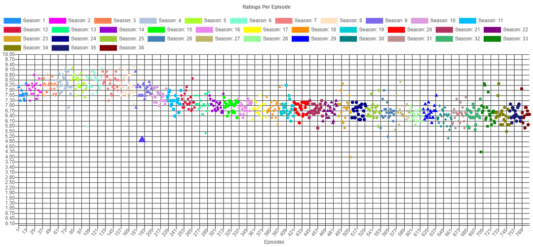
This is pretty beautiful, but the y axis should be season numbers
I’d personally love if it were possible to see the ratings on the right side of the graph.
X axis should be years not episodes.
I love that you can tell which episode is The Principal and The Pauper just from the thumbnail
Meh. The data is interesting, but the presentation is not particularly compelling.
* There is no label for the vertical axis. This can be assumed, but not confirmed, from the title. It’s also not clear *who’s* ratings are being plotted.
* The vertical axis is far too busy. Is there really a need to mark every tenth given the purpose of the chart (seems to be) is relative values? A label every point, and some fainter partial indexes would be much easier to read. If I’m in the middle of the chart, it’s hard to follow one index across so many horizontal indexes to a value on the axis.
* Seasons as categories aren’t really valuable. I can differentiate consecutive seasons by color–which is valuable–but the actual color is basically impossible to relate to a category because there are so many of them. It would be better to mark the horizontal axis in broad seasons instead of episode number.
* Similarly, episode number doesn’t really mean anything to a reader. “Episode 433” doesn’t really provide any contextual information.
* Why is one data point larger? It’s not a show minimum or maximum, and other seasons don’t have outliers marked.
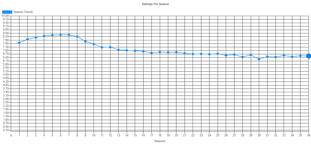
* In the second chart, the horizontal axis is much better and cleaner as a comparison to the first, but again, why is one data point larger? and why does the axis start at zero?
6 comments
Generated from [here](https://www.neetcoder.com/app/graph/tt0096697/The%20Simpsons)
This is pretty beautiful, but the y axis should be season numbers
I’d personally love if it were possible to see the ratings on the right side of the graph.
X axis should be years not episodes.
I love that you can tell which episode is The Principal and The Pauper just from the thumbnail
Meh. The data is interesting, but the presentation is not particularly compelling.
* There is no label for the vertical axis. This can be assumed, but not confirmed, from the title. It’s also not clear *who’s* ratings are being plotted.
* The vertical axis is far too busy. Is there really a need to mark every tenth given the purpose of the chart (seems to be) is relative values? A label every point, and some fainter partial indexes would be much easier to read. If I’m in the middle of the chart, it’s hard to follow one index across so many horizontal indexes to a value on the axis.
* Seasons as categories aren’t really valuable. I can differentiate consecutive seasons by color–which is valuable–but the actual color is basically impossible to relate to a category because there are so many of them. It would be better to mark the horizontal axis in broad seasons instead of episode number.
* Similarly, episode number doesn’t really mean anything to a reader. “Episode 433” doesn’t really provide any contextual information.
* Why is one data point larger? It’s not a show minimum or maximum, and other seasons don’t have outliers marked.
* In the second chart, the horizontal axis is much better and cleaner as a comparison to the first, but again, why is one data point larger? and why does the axis start at zero?
Comments are closed.